Warner Bros. Site Redesign
Warnerbros.com Redesign #4
We intended to shake up conventional WB.com navigation techniques in this site redesign initiative. Instead of category pages, we let the user choose what to look for by allowing them to filter all the content.
This idea came from conducting user research sessions with studio tour visitors, diving into the culture of our fan base, and conducting a two-day workshop with crucial WB employees and executive leadership.
My tasks on this project ranged from UX team management, managing and conducting user interviews, co-analyzing the data, leading the persona creation, creating and running the workshop, hands-on leading the wireframe creation, and visual design art direction.
At the beginning of this process, we needed to update the knowledge of our users and fan base.
Tasks:
User Research, Personas, Workshop Design, Information Architecture, UX Design, Visual Design
Time to Update our User Knowledge
In 2014 executive leadership requested a redesign of warnerbros.com to reflect the latest technological changes since the last iteration was back in 2009/2010.
We needed to understand how our customer/user population interacts with technology that has evolved over the years. Our personas were from 2009 and needed to be updated. The given time frame did not allow us a fully drawn-out research phase. However, we needed to update our understanding.
In a conversation with a teammate, we realized that millions of people visit the WB studio lot every year. I found out who was in charge of the tour department, contacted them, and asked to get access to their tourists for user interviews. In exchange, I promised them to include questions on studio tour behavior in my interviews. The head of the department agreed and was even willing to provide a tour guide uniform for me to wear to elicit the tourists’ trust.
In two days, I interviewed 40 tourists, and combined with the results of our social media research, we had enough information to update our personas to reflect current technology choices.
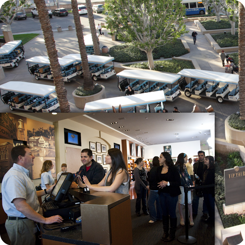
The studio tour lounge were I conducted the interviews.
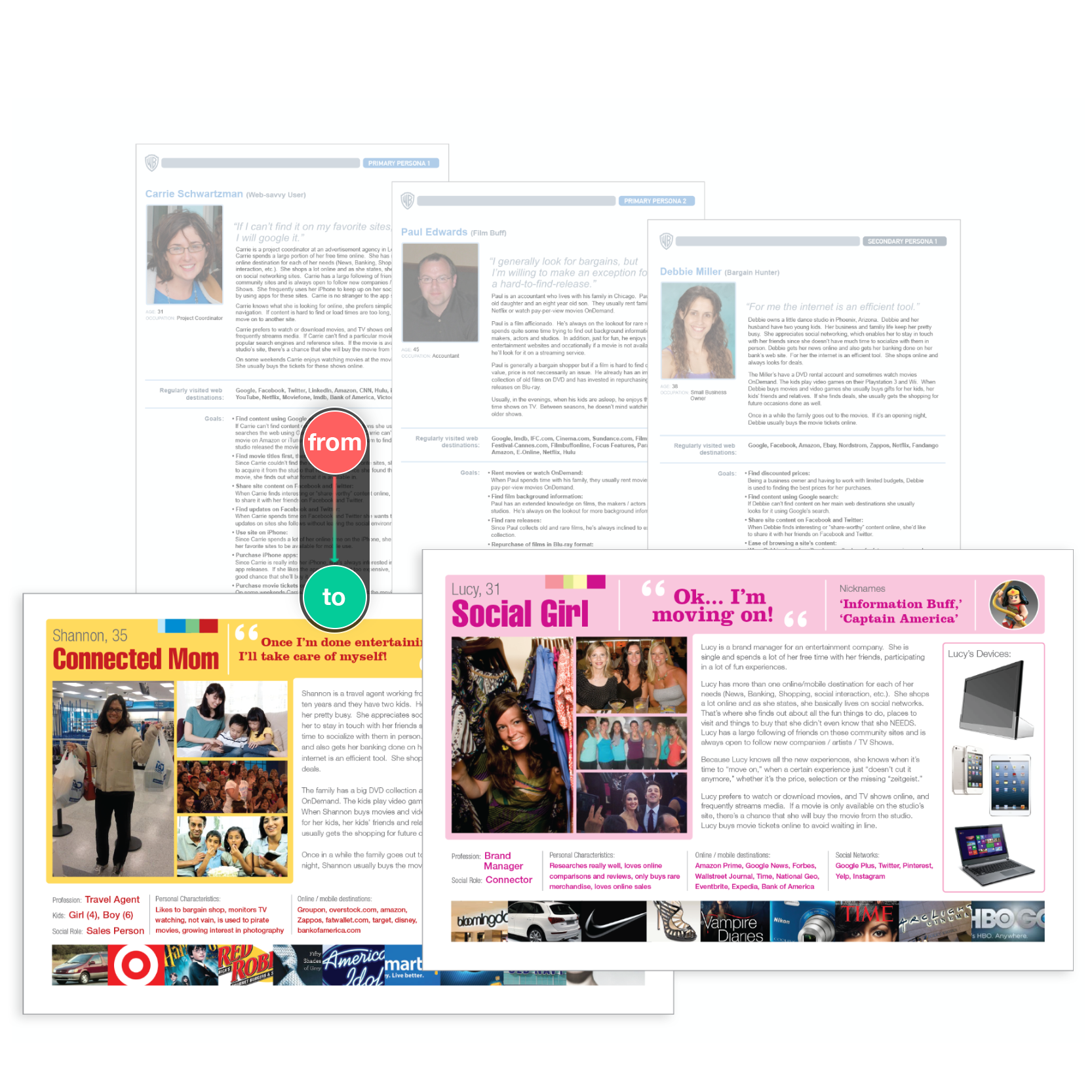
Two of our new personas with the initial base personas in the background.
Updated Personas
Realizing the need for ‘combo-personas’ (UX personas with marketing aspects), not limiting them to the interaction with a particular site/app but rather with Warner Bros. as a brand, we took our existing UX personas, included brand/lifestyle choices and added color/images for optimal stakeholder engagement. Each persona was accompanied by a document that provided precise detail in writing.
These new personas reflected social media use and current technology choices. However, we still needed a strong vision since this redesign was dear to the hearts of upper management because it was supposed to represent a brand-new approach.
We had the idea to create a workshop, inviting representatives of the departments with a stake in the project, including a few representatives from executive leadership. This was a good move because all stakeholders voiced opinions, preferences, and wishes. Engaging them in playful activities, and collaborating in a team effort, was an impactful idea to come up with one unified vision.
The Workshop
I created and conducted a two-day workshop with about 15 participants. I guided them in exploring the future of WB’s user/fan engagement while keeping the site redesign in mind. We started the workshop on a Friday, setting the stage, grounding the participants in our current efforts, and introducing the team to our newly developed personas. As a homework assignment, we asked each participant to pick a persona role and walk in their shoes over the weekend, exploring different ways of media consumption. We continued the workshop on Monday, collected their experiences, and conducted creative activities to explore innovative media consumption possibilities further. We ended up with lots of intriguing ideas for the online engagement of WB fans/users. In contrast, our exercises (cover story, user journeys, affinity diagrams) provided many hand-drawn diagrams, which the team translated into digital versions.
We all walked away from this workshop with a better understanding of the challenges, needs, goals, and overall entertainment behavior of WB fans/users. In addition, this unified understanding gave the product and UX team a sense of ease that we didn’t have to convince leadership and adjacent stakeholder departments of the overall design direction.
We were clear that conventional website-building methods didn't work for this audience.
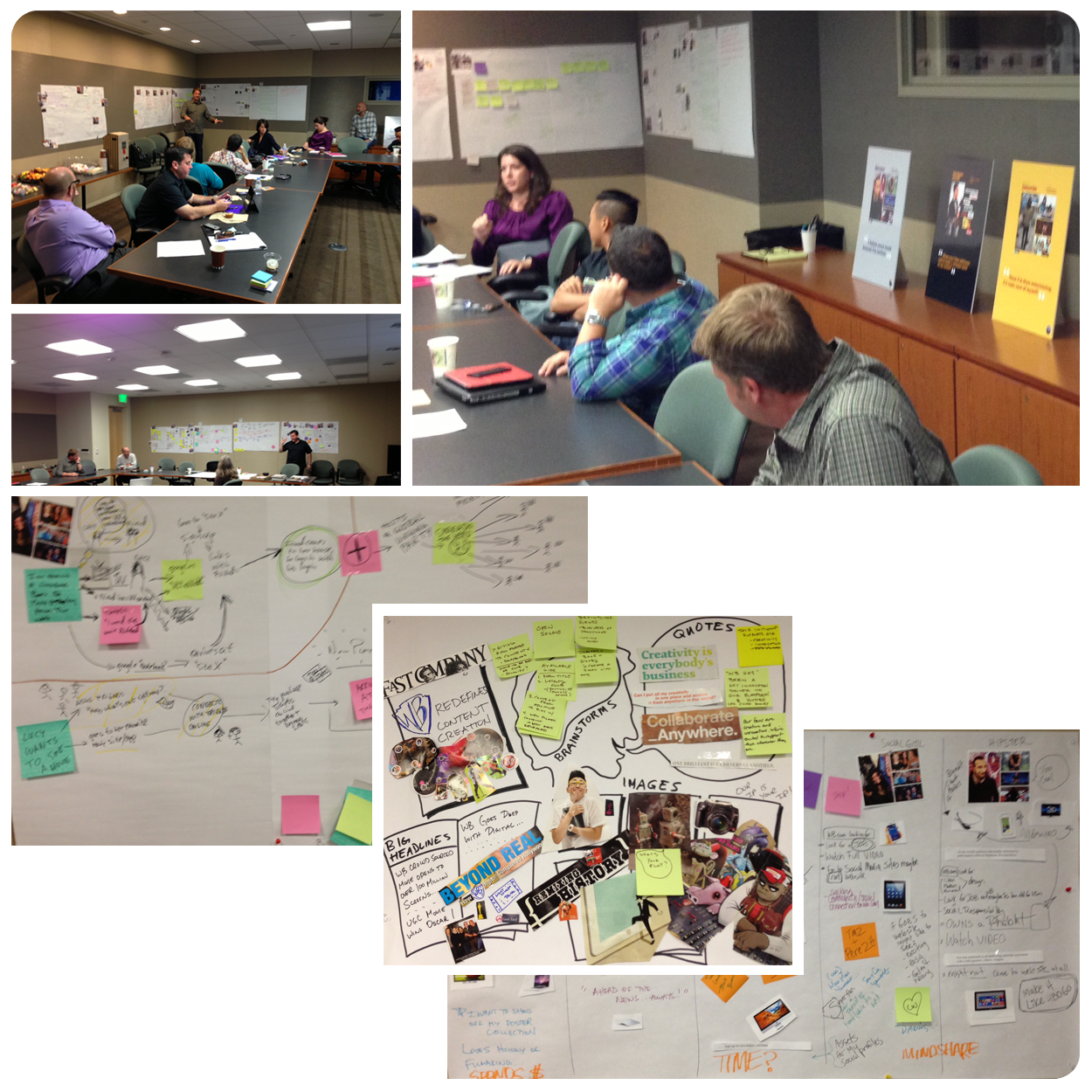
2-day workshop photos with diagrams from our activities.
Two digital versions of our workshop activity diagrams.
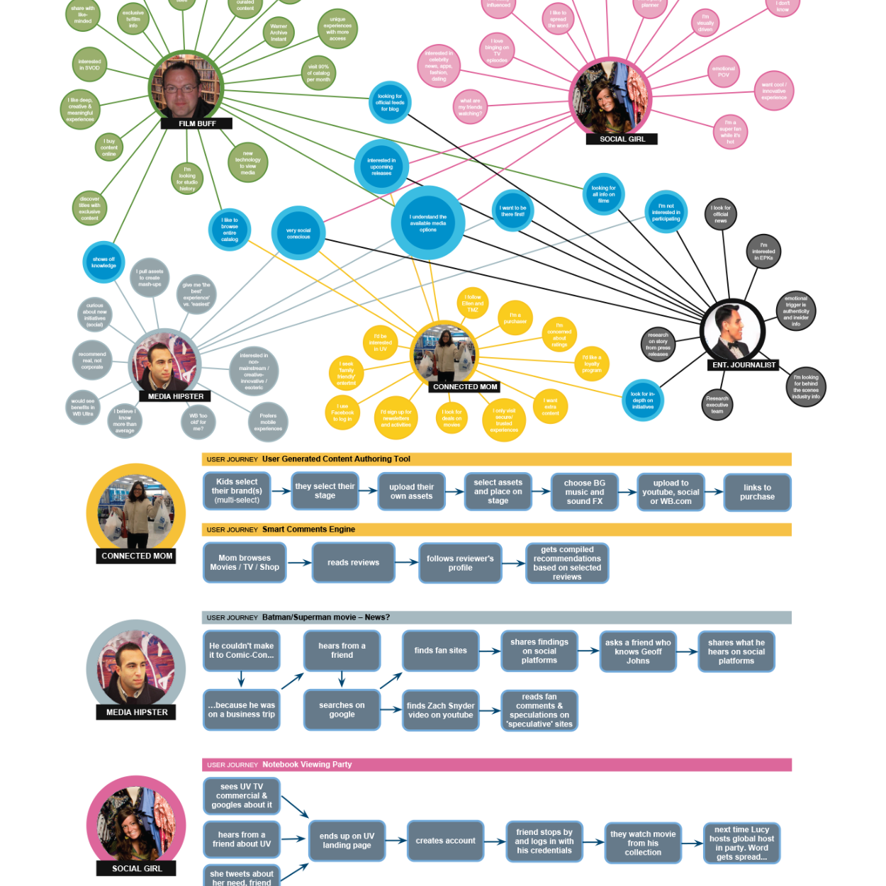
Diagrams from our Activities
The workshop activities provided helpful information on our personas’ journeys and entertainment choices.
The top of the image shows an affinity diagram that shows all our personas' overlapping needs/desires, and underneath is one of our user journey maps.
These diagrams from the workshop, in connection with our personas, guided us through our ideation phase by reminding us of their needs, goals, and overall entertainment-related behavior.
Site Wireframes
These wireframes were the outcome of our ideation phase and are presenting the idea of stepping away from our traditional navigation method heavily driven by category pages that would ‘box someone in’ without understanding their need at that moment.
We wanted to allow users to choose their path and experience by opening up our entire catalog for them to explore while providing guidance when needed.
In this single-page site model, we would initially push one editorial movie title and, right underneath, allow the user to filter through the entire WB catalog.
The top left image populates related items associated with the editorial piece, including social media. The initial editorial image will be replaced by what the user selects when browsing the catalog below. The right image demonstrates how the filter bar would be anchored to the top of the screen when scrolling past the editorial content.
The bottom row presents a version with a navigation bar that allows the user to navigate through content associated with the editorial piece, which will be replaced by any item the user selects when browsing the catalog.
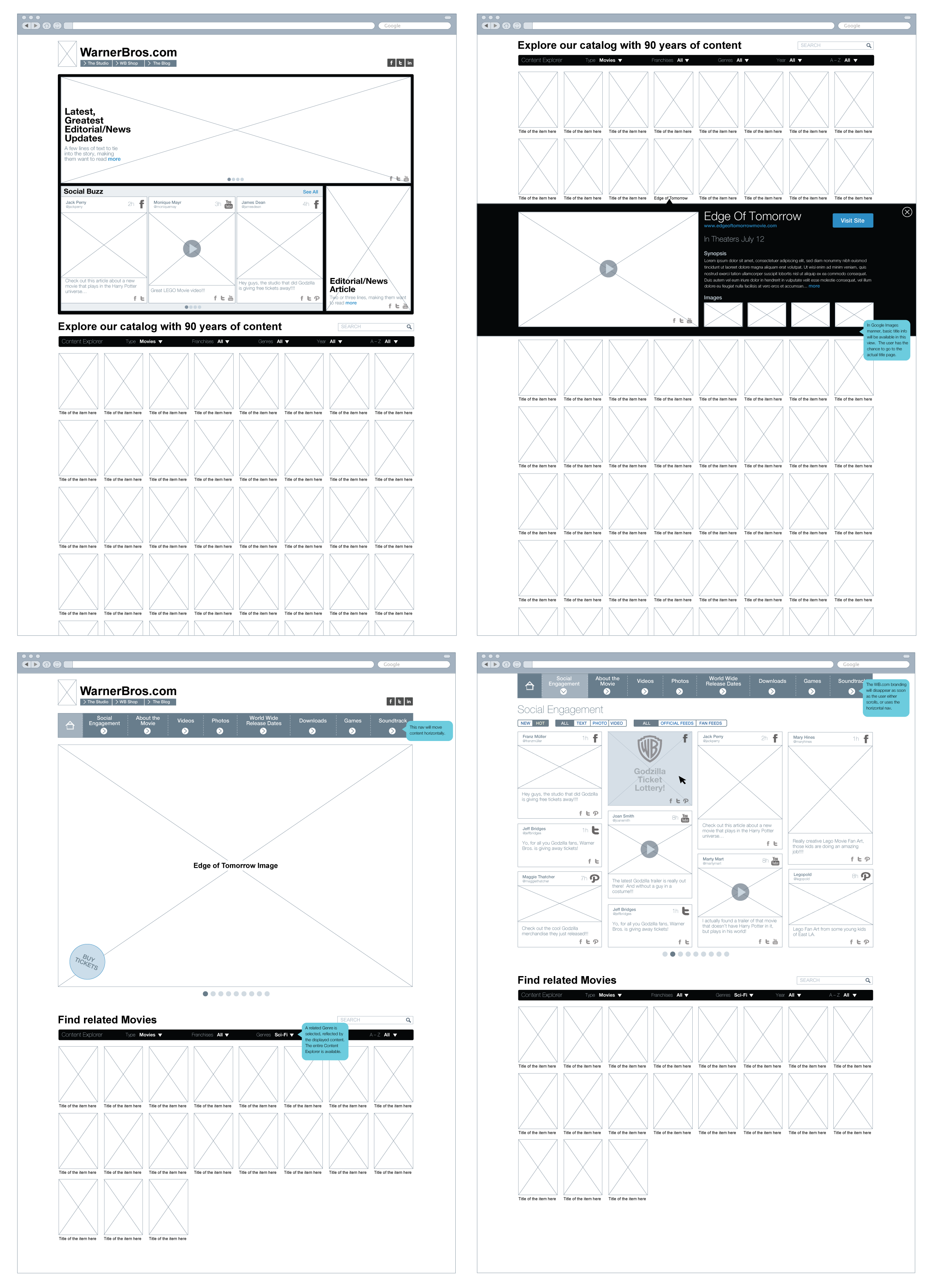
Two different wireframe options of the redesign.
Social Media Grouping/Filtering
Wireframes exploring new ways of grouping, filtering and branding social media content.
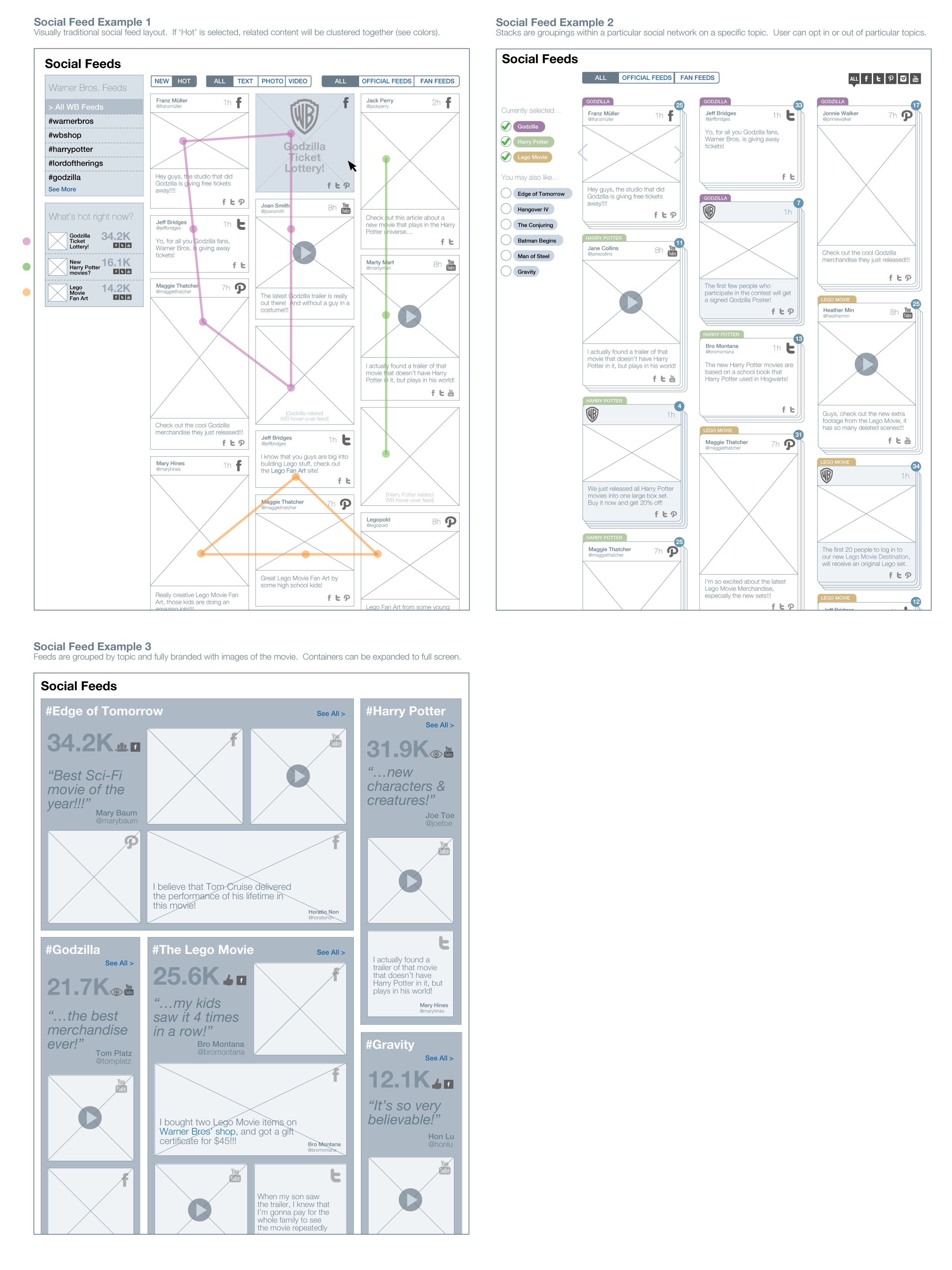
Social media grouping/filtering exploration.
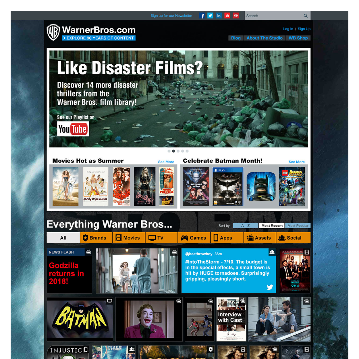
Visual Design Comps
Final visual design comps for the launched site.
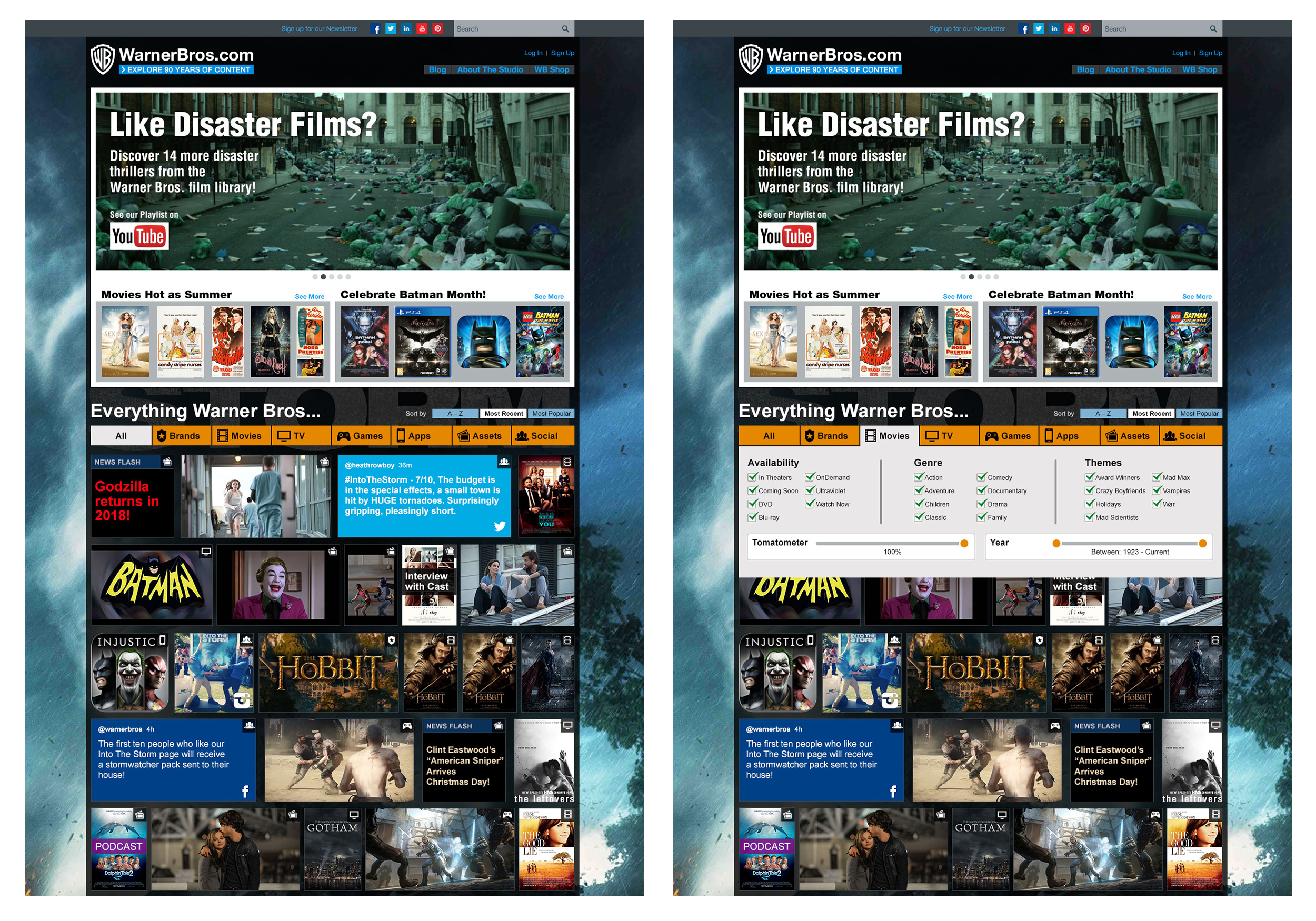
Visual design comps for the site redesign.