[this project is also available in the Case Studies section]
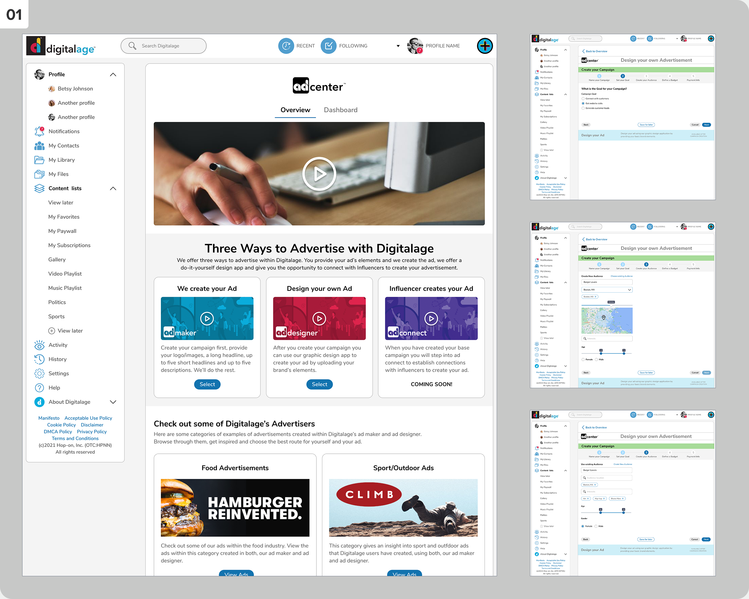
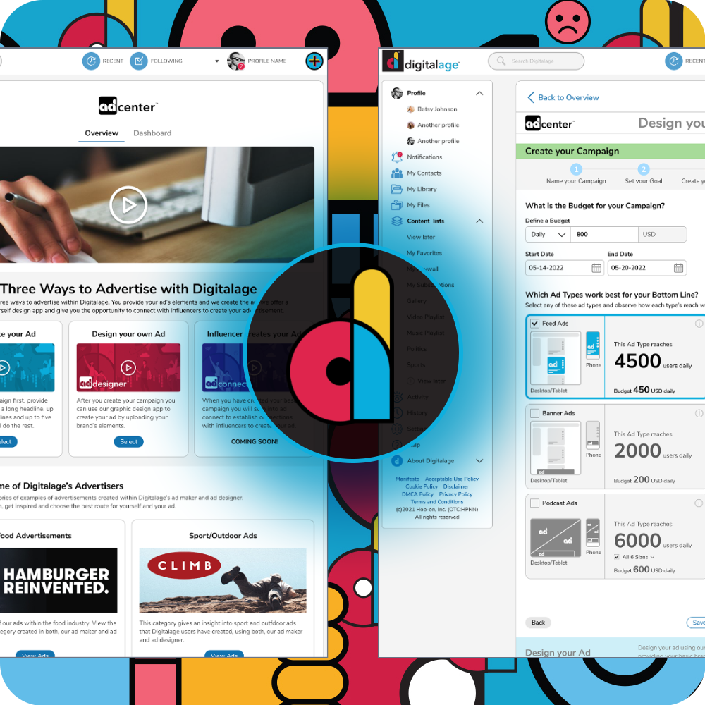
This Web3 startup aimed to provide a one-stop Ad Center experience that allows users to advertise in an easy-to-understand and guided manner. After initial competitive research and interviewing advertisers, I created and tested the interface with potential users.
01
The Ad Center home page offers three ways to advertise with Digitalage and three campaign creation pages.
02
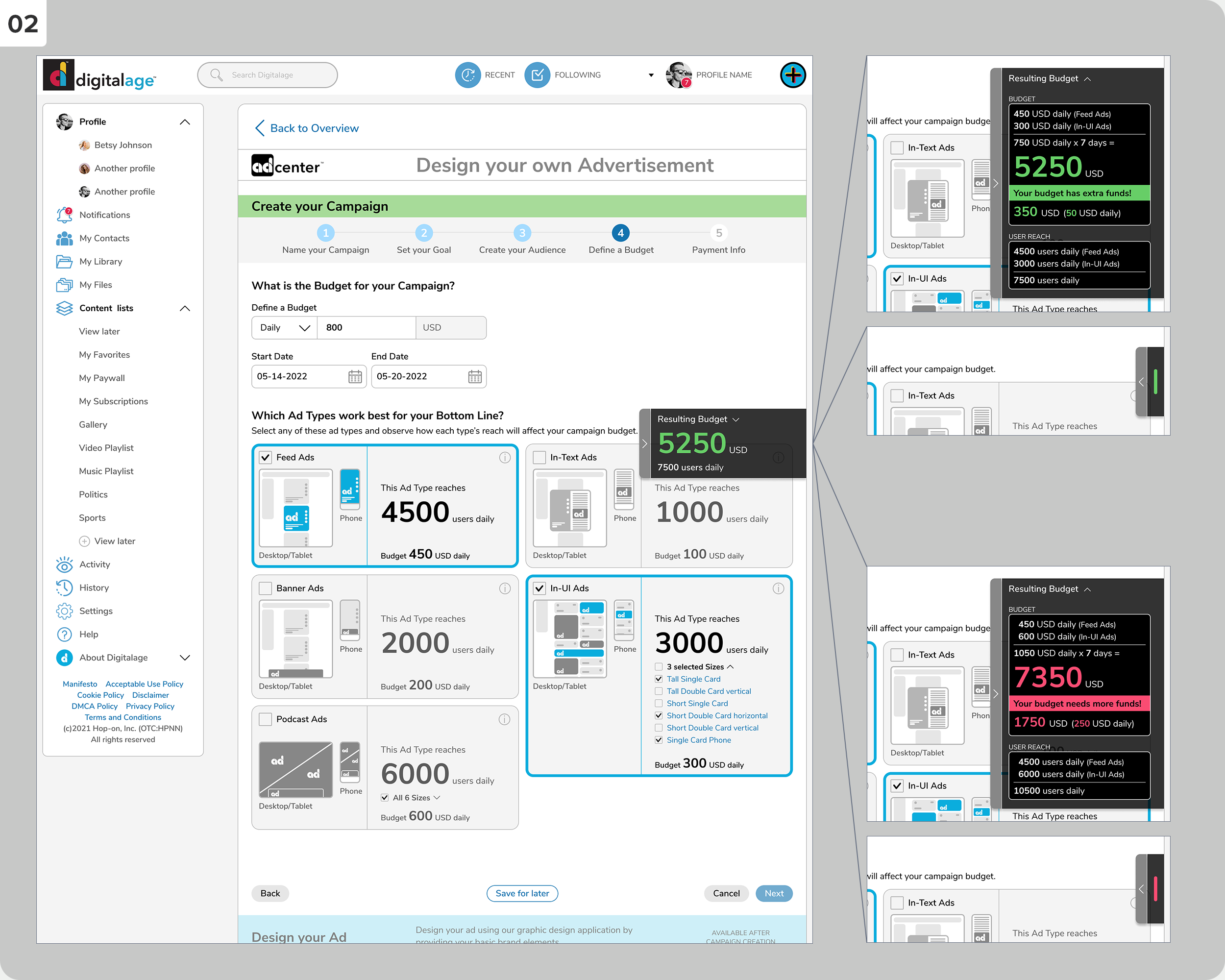
The budget definition screen shows the budget calculator tab on the right side of the screen, which stays anchored when the page scrolls. This tab can be expanded to offer the budget calculation or collapsed.
03
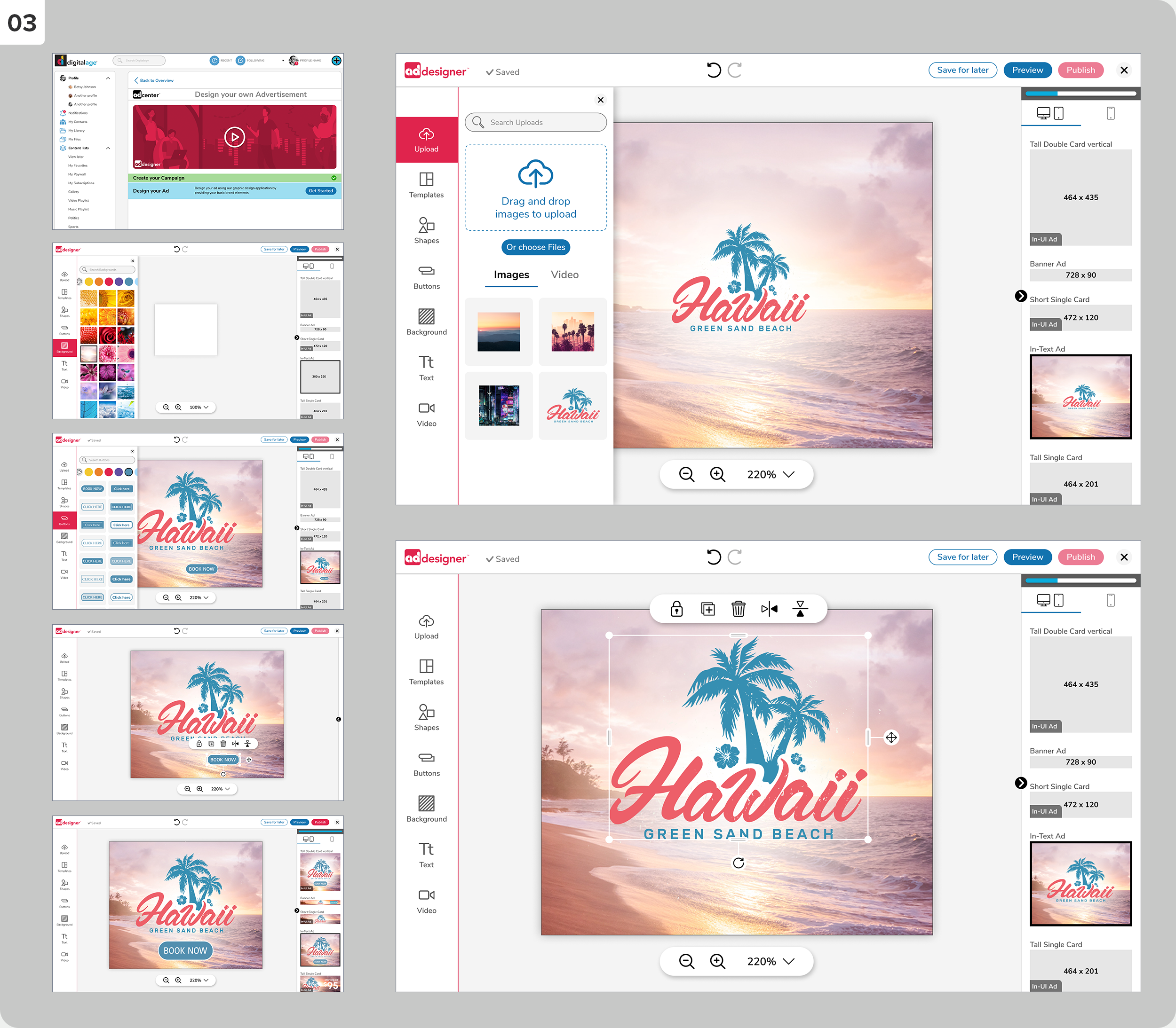
A few screens of the Ad Designer interface for users who create their ads.
04
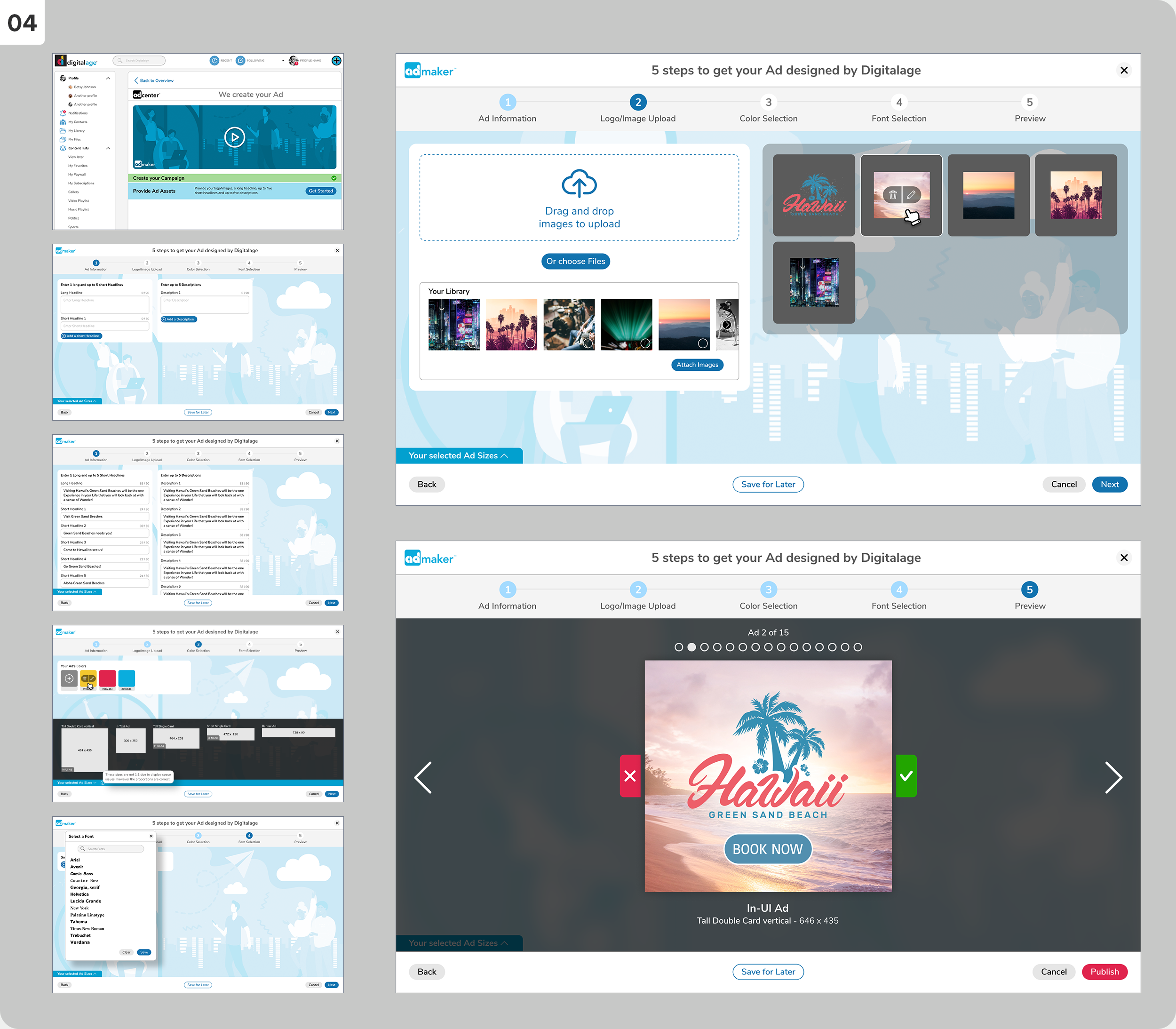
The Ad Maker interface is for users who prefer to provide their branding elements to get their ads designed.
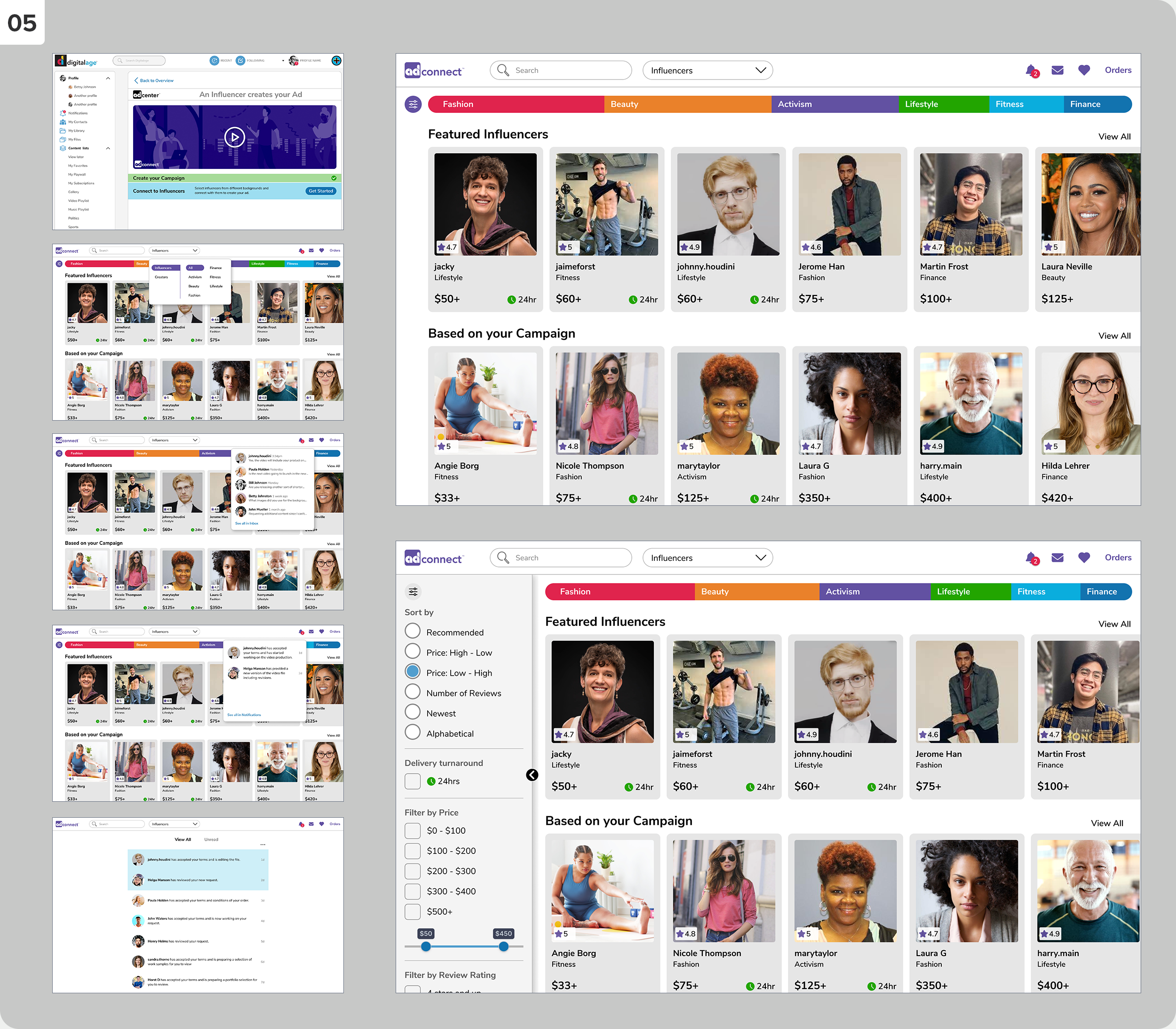
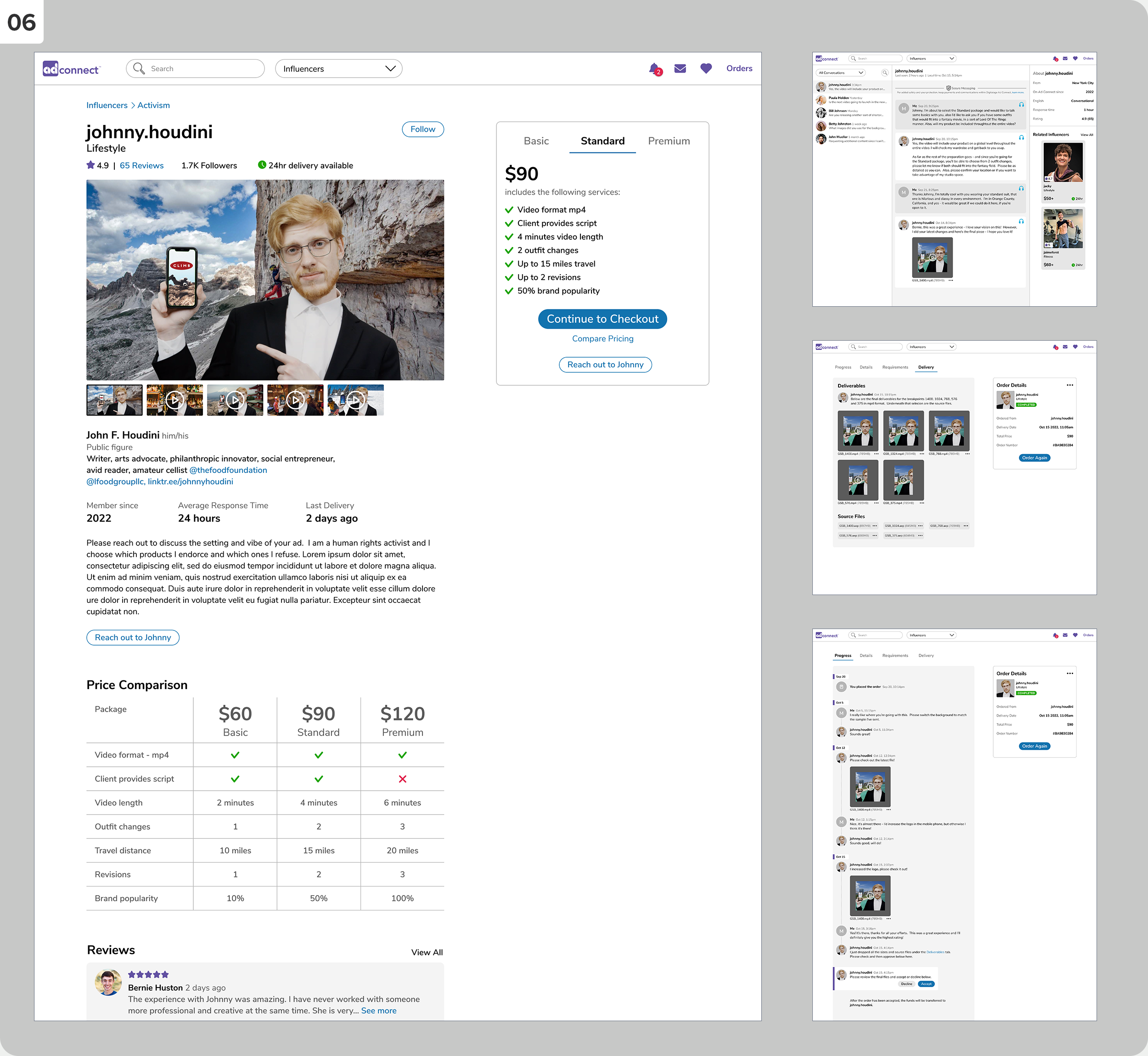
05 + 06
The Ad Connect interface allows users to connect with Influencers who will create advertisement videos.
Tasks: Conceptual Design, Information Architecture, Product Design, Visual Design, Competitive Research, User Research
The Profile section was more than account management — it was the trust layer of the entire NaviNet Open platform. For healthcare office staff juggling multiple roles, health plans, and workflows daily, the profile needed to feel like a reliable anchor: always accurate, always accessible, and never in the way. The redesign replaced a fragmented legacy experience with a cohesive drawer-based interface that surfaces the right identity and contact information at the right moment — without pulling users out of their primary task flow.
Built on Feather DS, NantHealth's accessibility-first design system, and validated through user testing with real NaviNet users. Part of a broader platform redesign informed by ethnographic field research, accessibility audits, and cross-functional workshops.
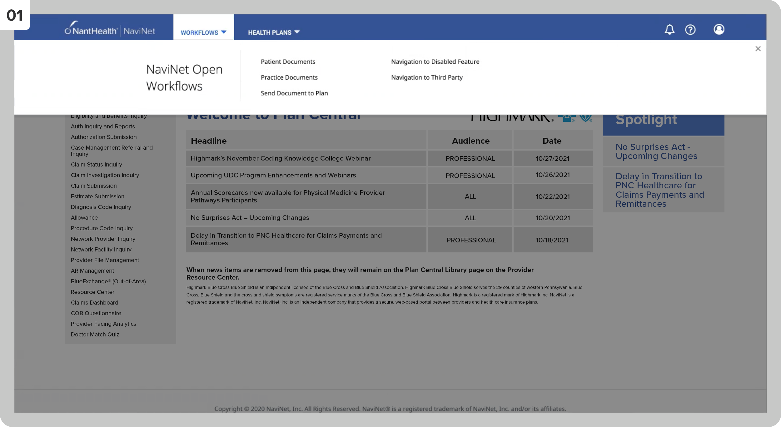
01
NaviNet’s Workflow selection interface.
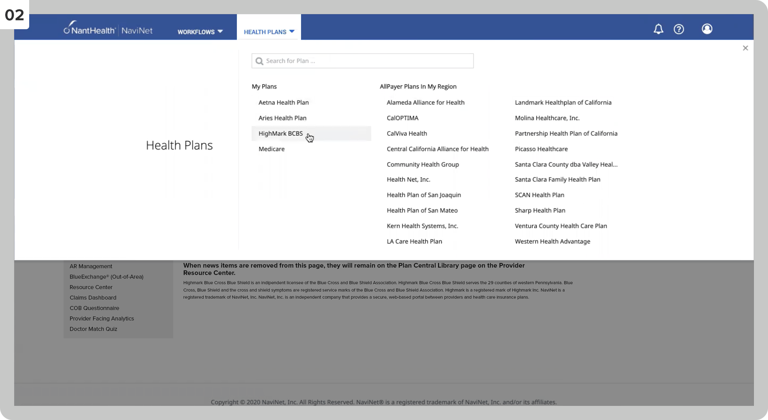
02
This feature allows the user to select their health plan.
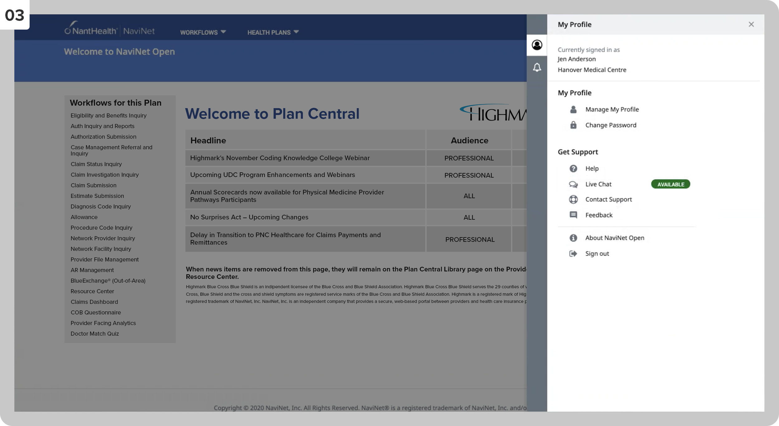
03
The drawer with the actual profile section.
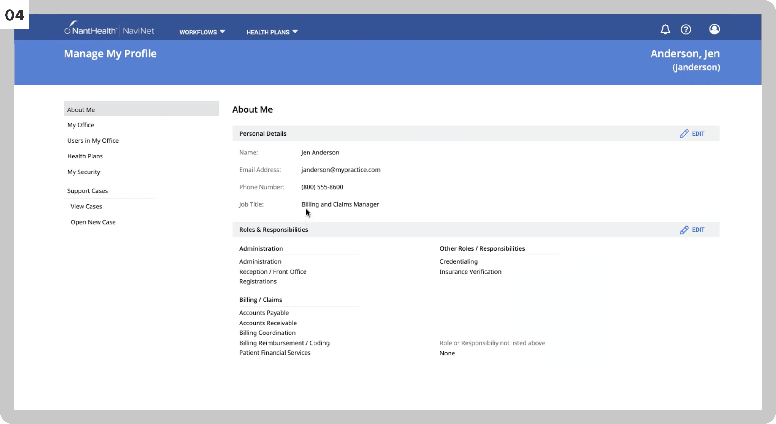
04
The About Me section of the user’s profile.
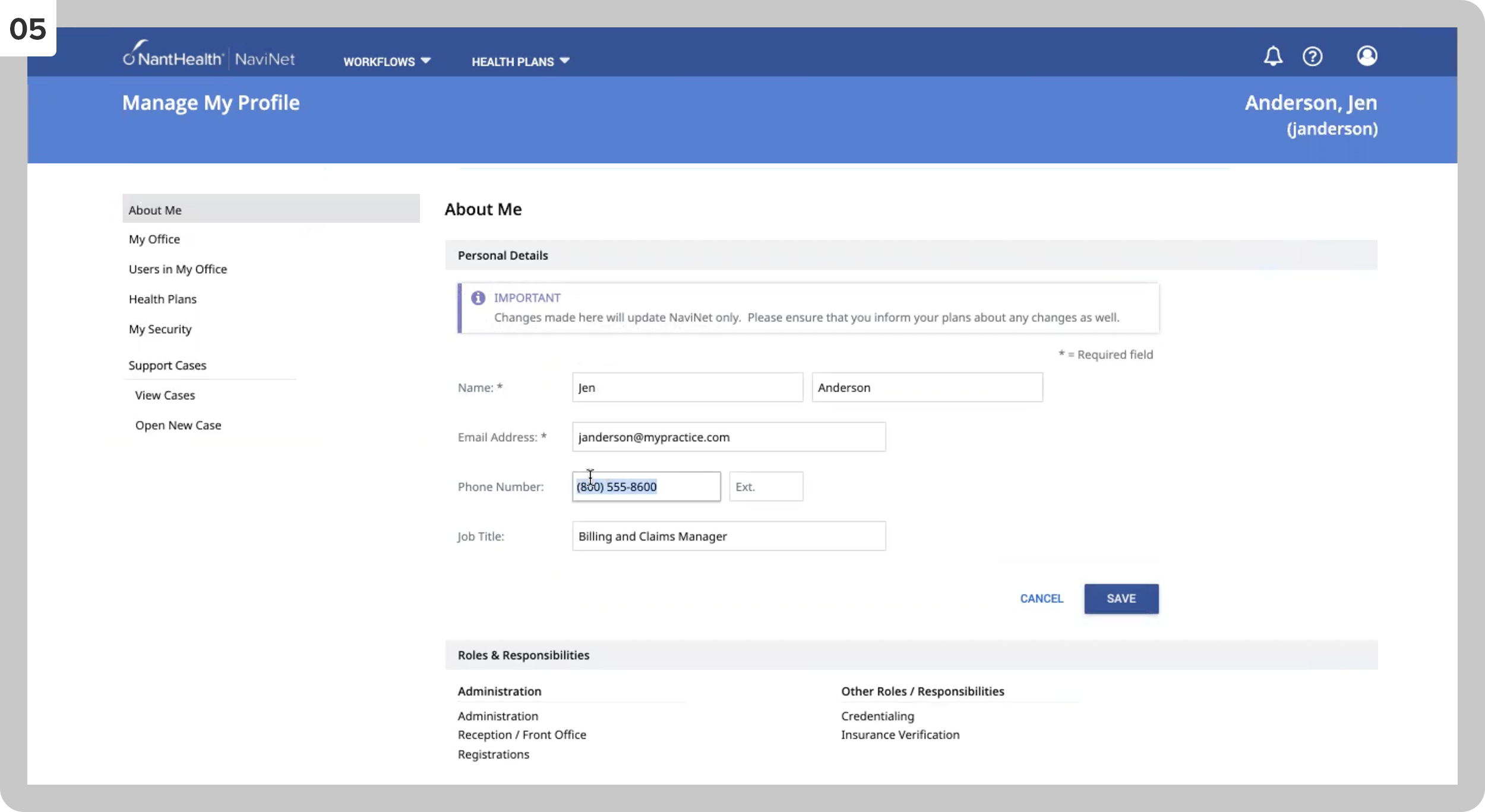
05
Editing the Personal Details section.
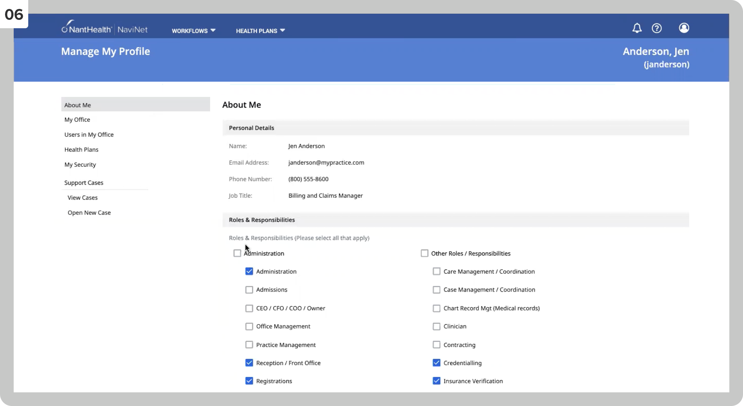
06
Editing the Roles & Responsibilities section.
07
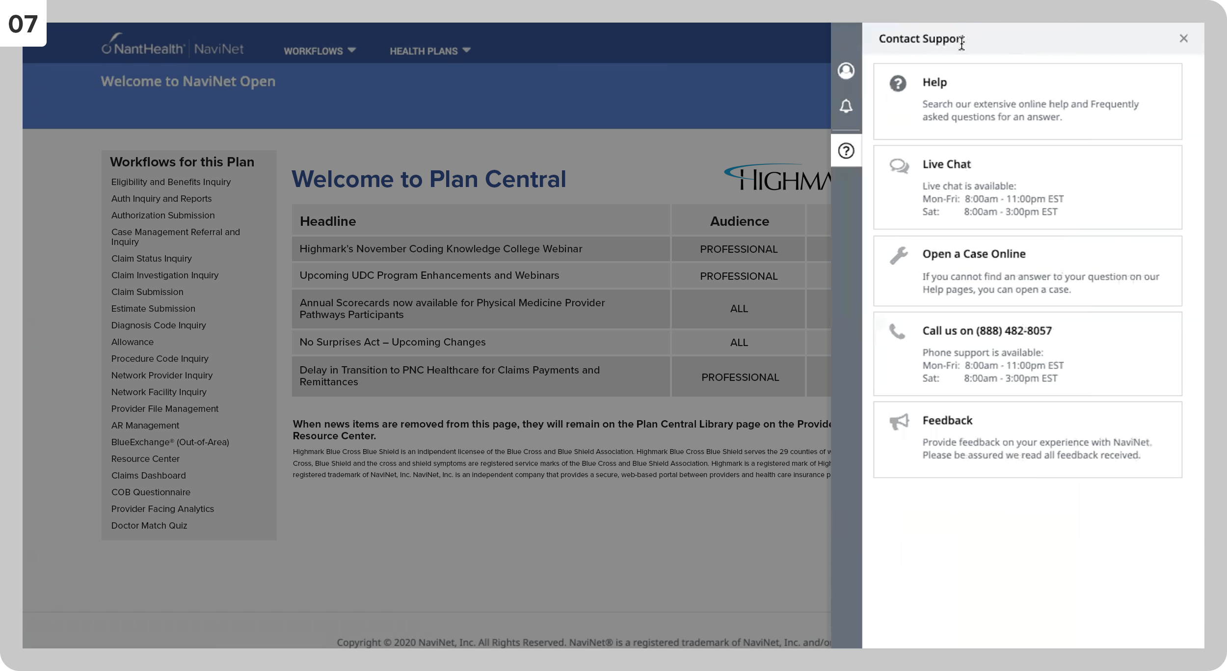
The drawer slides out when clicking the ‘Contact’ tab.
08
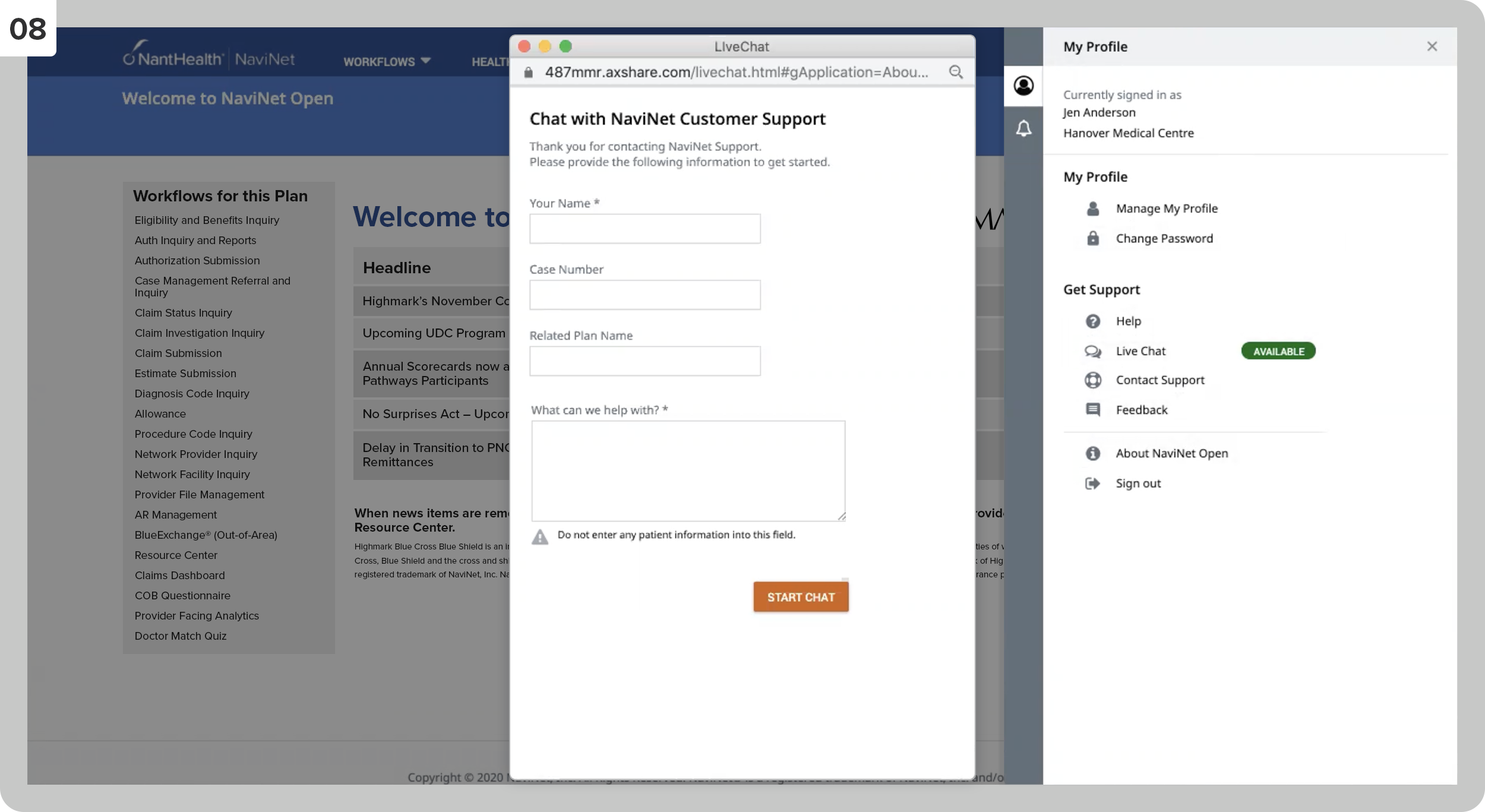
The window that appears when clicking ‘Live Chat.’
09
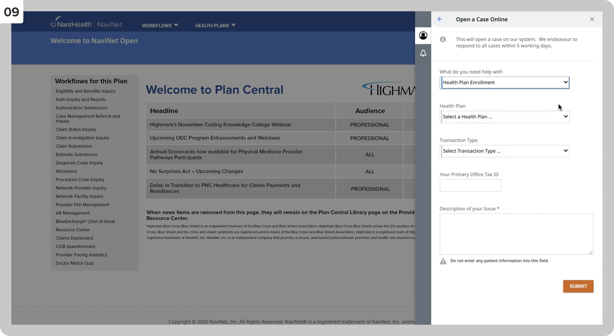
The interface for opening a case online.
Tasks: Ethnographic Field Studies, Accessibility Design, User Testing, Personas + User Journeys
[this project is also available in the Case Studies section]
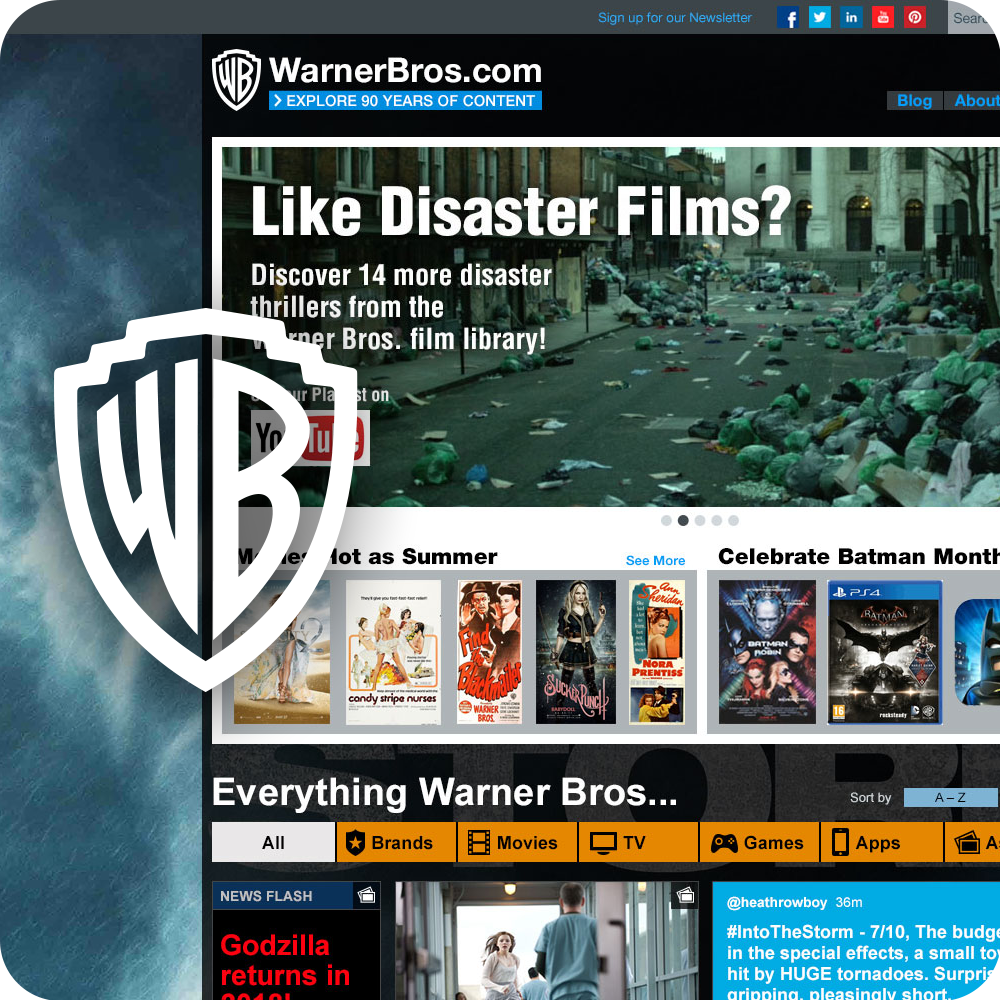
In this responsive site redesign initiative, we intended to shake up conventional WB.com navigation techniques. Instead of category pages, we let the user choose what to look for by allowing them to filter all the content. This idea came from conducting user research sessions with studio tour visitors, diving into the culture of our fan base, and conducting a two-day workshop with crucial WB employees and executive leadership.
01
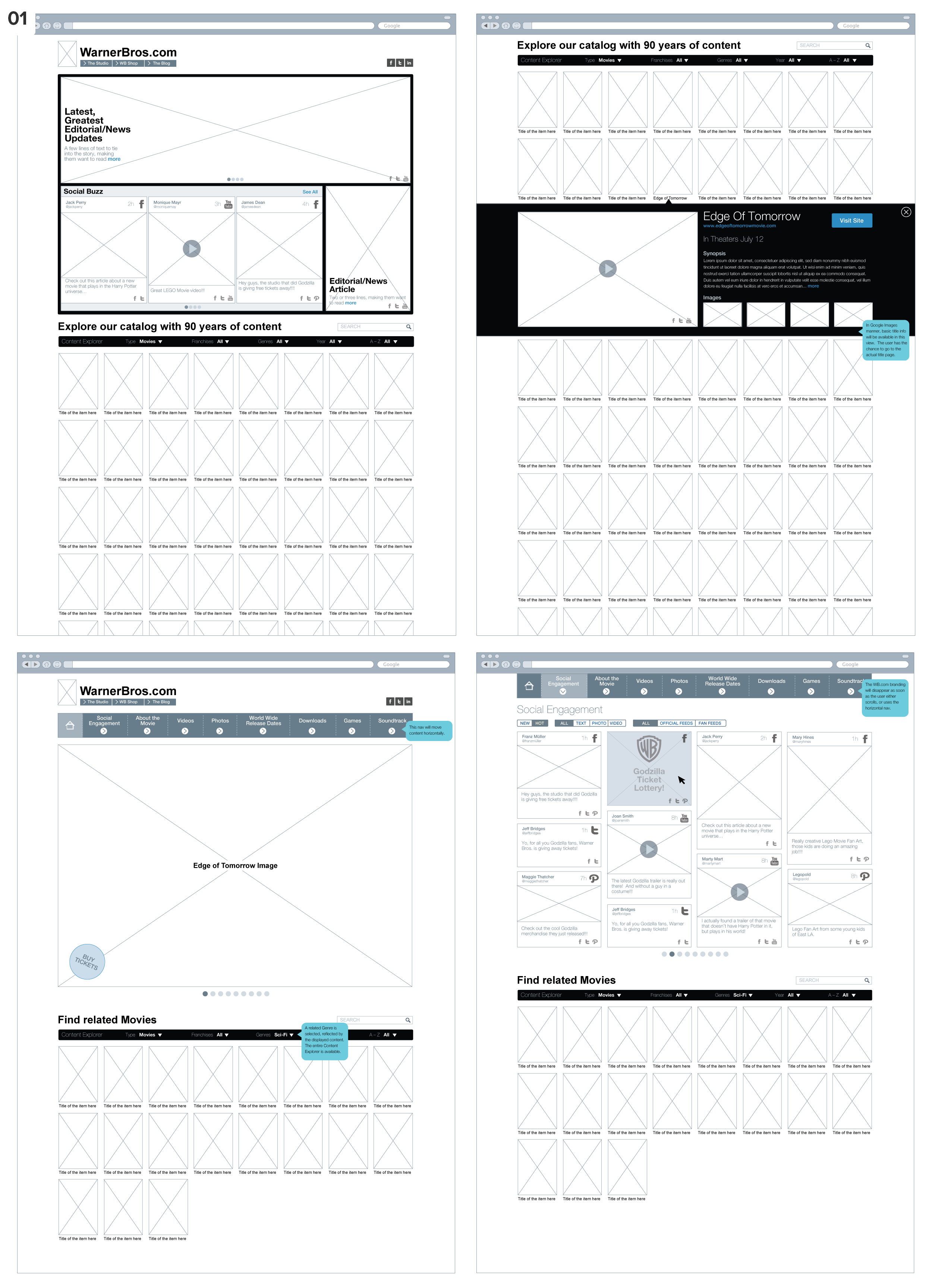
Wireframes presents the idea of stepping away from our traditional navigation method. In this single-page site model, we would initially push one editorial movie title and, right underneath, allow the user to filter through the entire WB catalog. The right image in the top row demonstrates how the filter bar would be anchored to the top of the screen when scrolling past the editorial content. The bottom row presents a version with top navigation centered around one particular editorial piece to be replaced by any item the user selects when browsing the catalog.
02
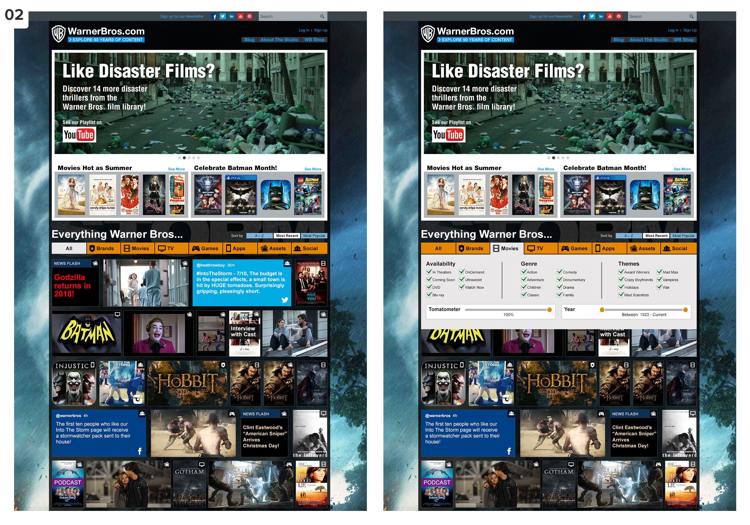
Visual design comps of the launched version.
03
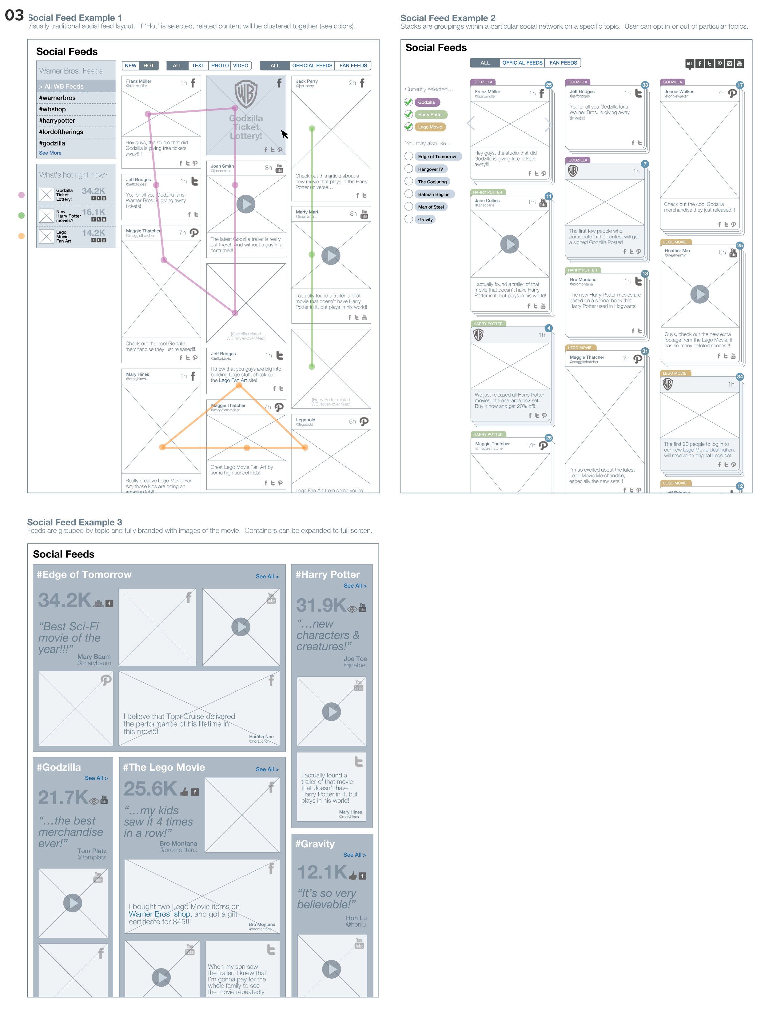
Wireframes are exploring new ways of grouping, filtering, and branding social media content.
04
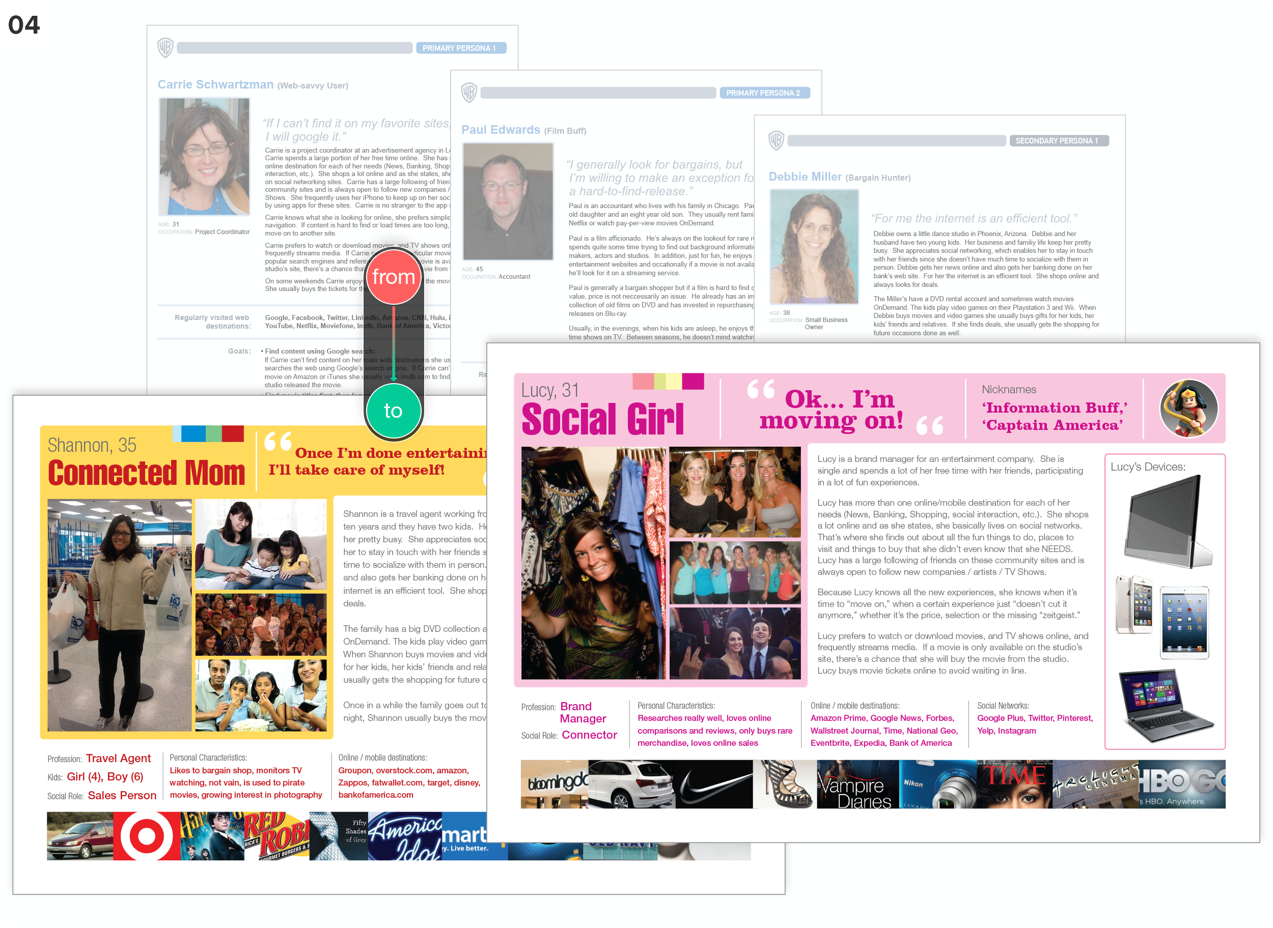
Realizing the need for ‘combo-personas’ (UX personas with marketing aspects), not limiting them to the interaction with a particular site/app but rather with Warner Bros. as a brand, I took our existing UX personas, included brand/lifestyle choices and added color/images for optimal stakeholder engagement. Each persona was accompanied by a document that provided precise detail in writing.
05
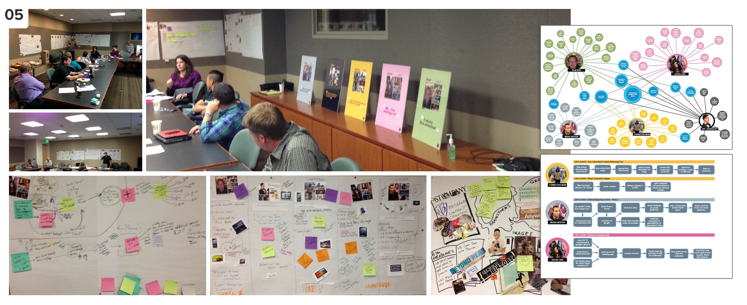
I created/conducted a two-day workshop with stakeholders and WB leadership. I guided the participants in exploring the future of WB’s user/fan engagement while keeping the site redesign in mind. We started the workshop on a Friday, setting the stage, grounding the participants in our current efforts, and introducing the team to our newly developed personas. As a homework assignment, we asked each participant to pick a persona role and walk in their shoes over the weekend, exploring different ways of media consumption. We continued the workshop on Monday, collected their experiences, and conducted creative activities to explore innovative media consumption possibilities further. We ended up with lots of intriguing ideas for the online engagement of WB fans/users. In contrast, our exercises (cover story, user journeys, affinity diagrams) provided many hand-drawn diagrams, which I translated into digital versions. On the right side of the photos, you can see a resulting affinity diagram that shows all the overlapping needs/desires of our personas, and underneath is one of our user journey maps.
Tasks: UX Design, User Research, Personas, Workshop Design, Information Architecture, Visual Design
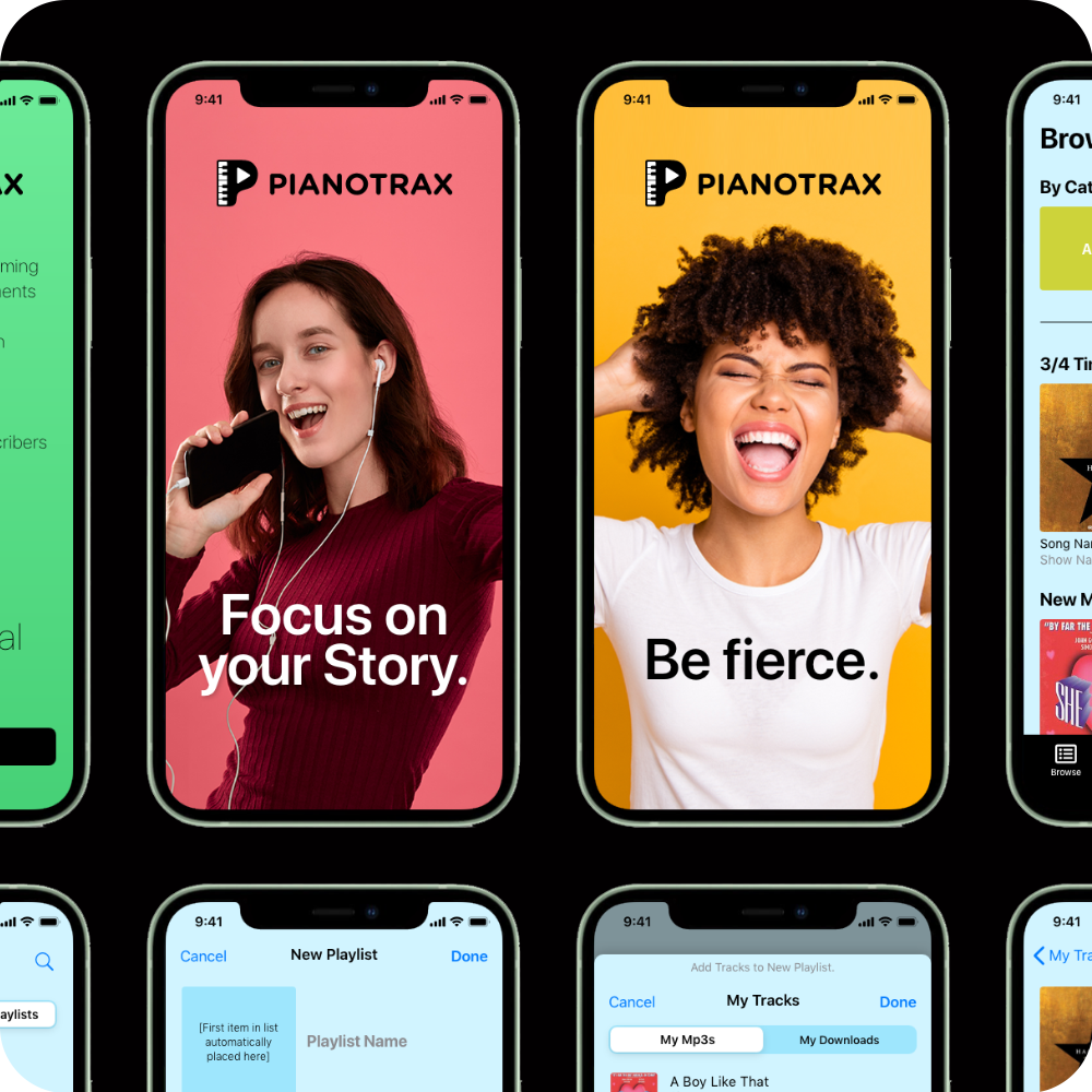
I created this iOS mobile app for a personal client who specializes in providing piano accompaniment tracks to individuals for auditions or educational purposes. The user can choose between a subscription model or purchase individual tracks and create playlists of the selected content without a subscription. In addition, they can change the key/tempo of the way and set rehearsal markers.
The challenge was that a song was not the root data item but broken into multiple tracks, and these tracks could be modified in several non-standard ways. The goal was to provide another option for their users besides the well-performing website. In the first year after launch, the app alone was responsible for a 17% increase in new users for the business, with a 40% retention rate for the app.
01
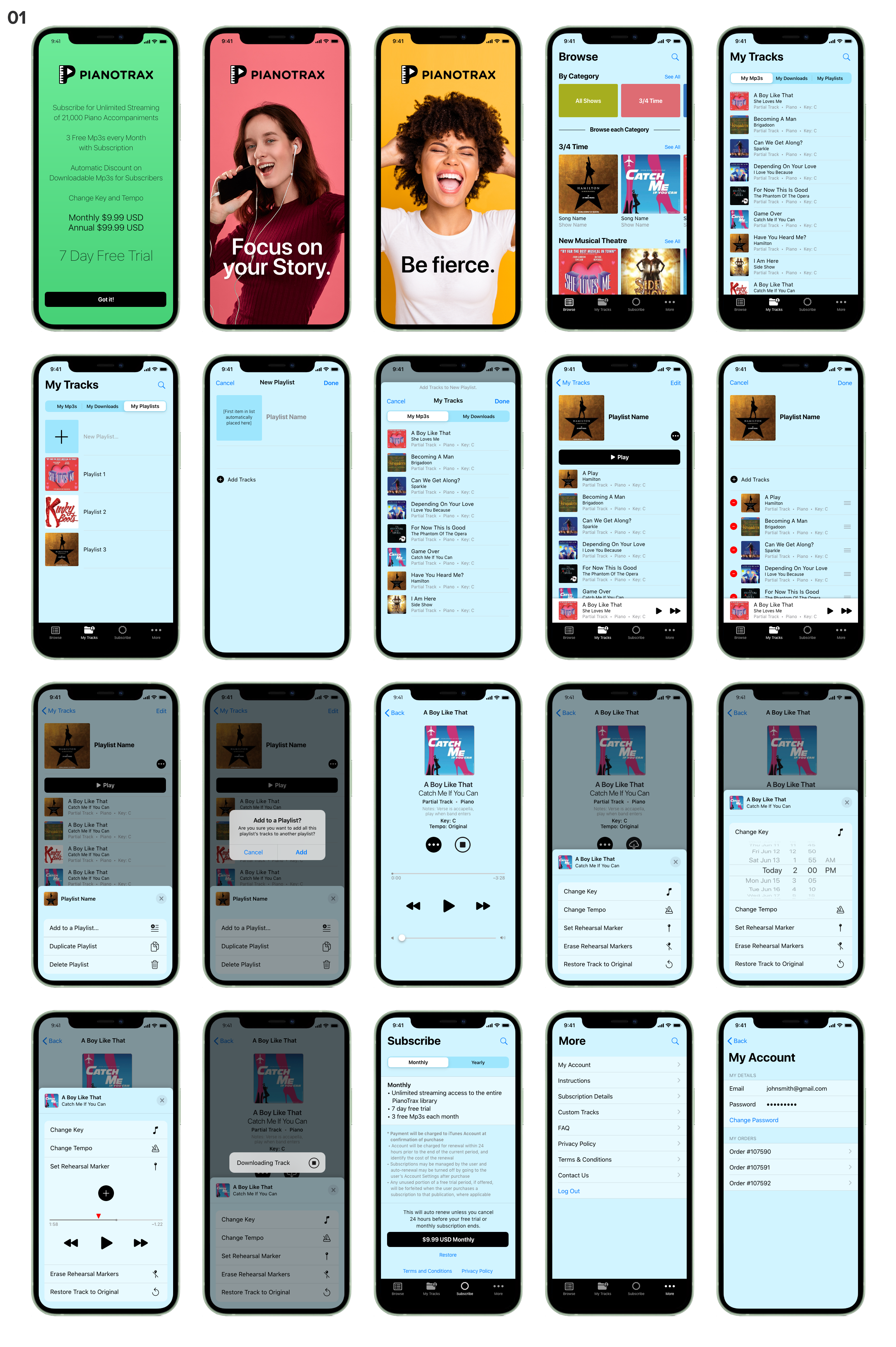
Visual design comp, showing (from left to right) the welcome screen, two of four landing pages that would rotate on further log-ins, browse screen, my tracks (mp3s), my tracks (playlists), create new playlist, add tracks to new playlist, playlist page, edit playlist, edit playlist actions, edit playlist popup, track detail, edit track detail, change track’s key, set rehearsal marker, download popup, subscribe page, more page, account page.
02
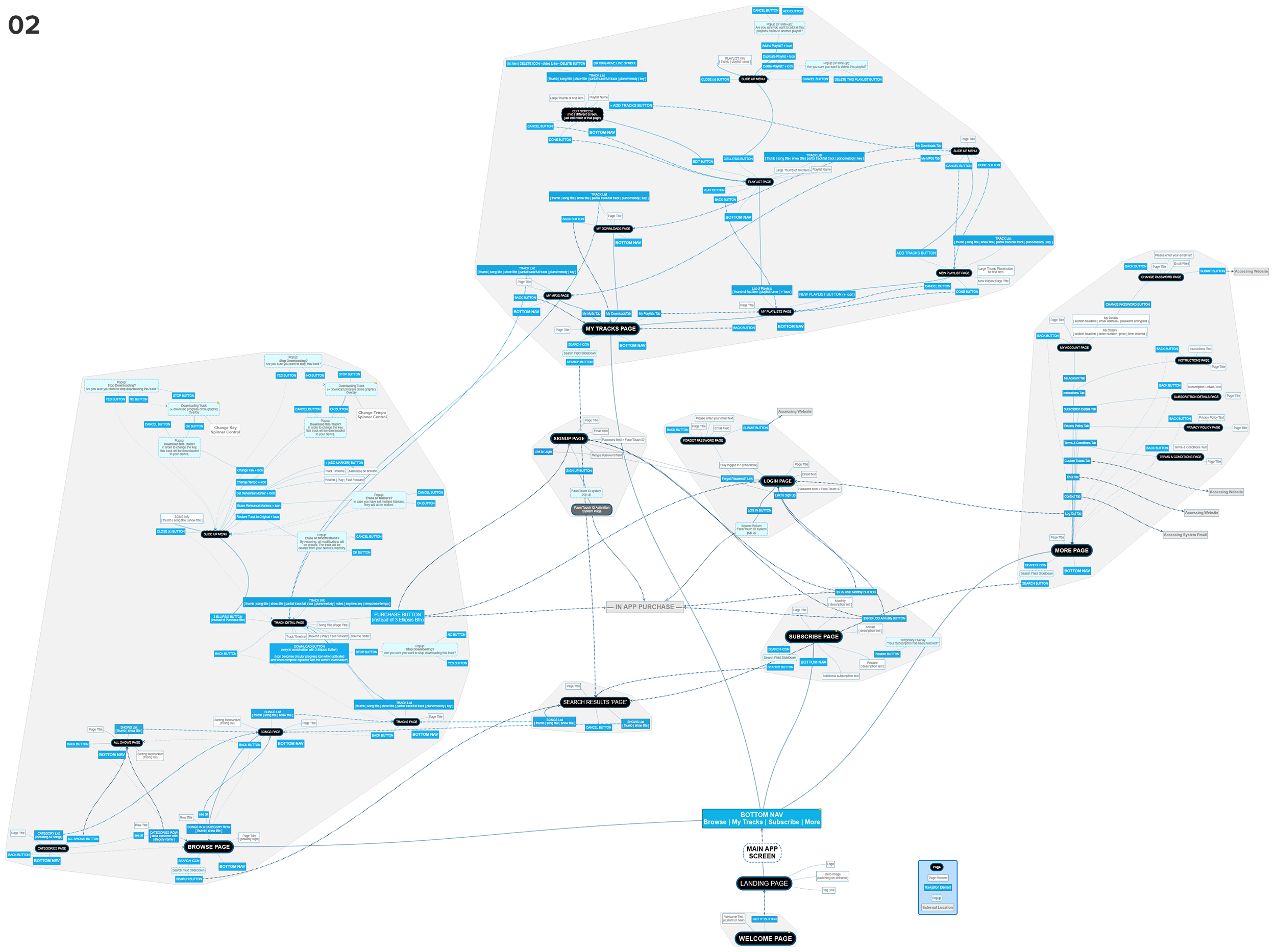
The flow points out all the app’s connections and interactions.
Tasks: UX Design, Information Architecture, Visual Design, Logo + overall Brand Design
Claim Search was one of the most heavily used — and most complained about — sections of the legacy NaviNet platform. Office staff ran dozens of queries a day, often under time pressure, across complex multi-entity billing structures where a single claim could involve multiple providers, adjustments, and status layers. The redesign had to serve power users who knew exactly what they were looking for while remaining navigable for staff who were newer to the workflow.
The solution introduced a tabbed search results model with configurable display preferences, contextual notifications for processing errors, and a layered detail view that surfaces claim status, history, and service line specifics without overwhelming the initial results page. Built on Feather DS and tested continuously with active NaviNet users throughout development.
01
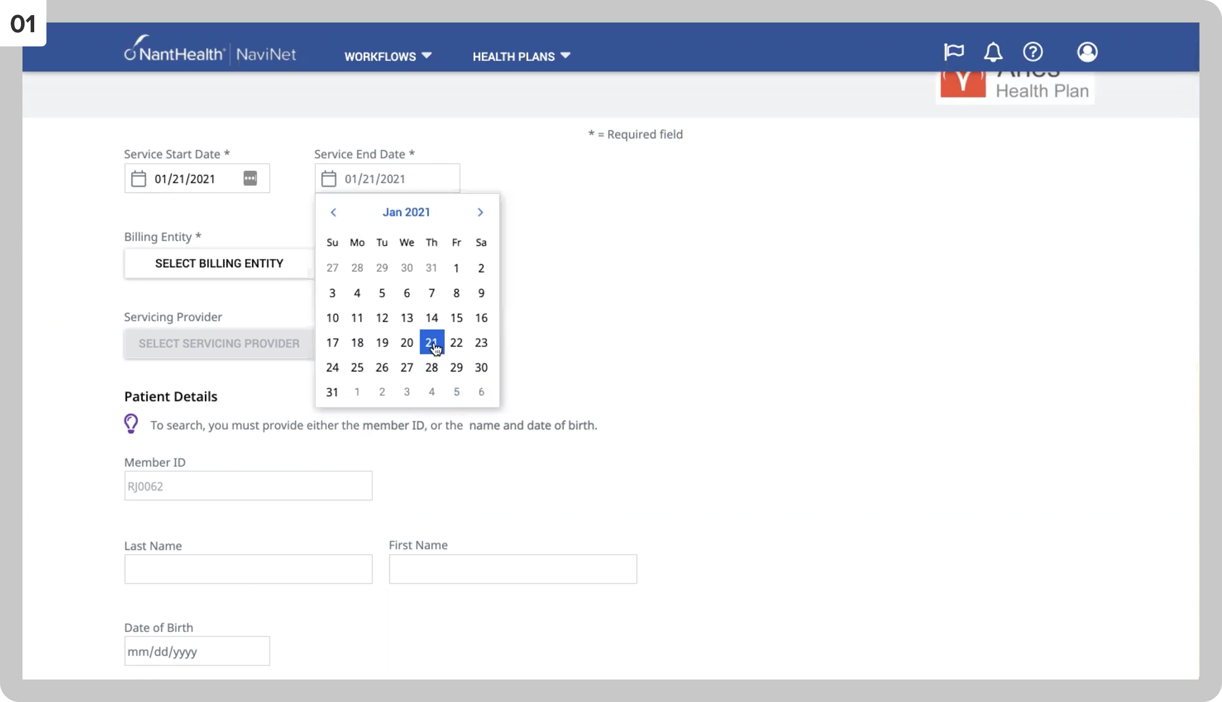
The initial search criteria page.
02
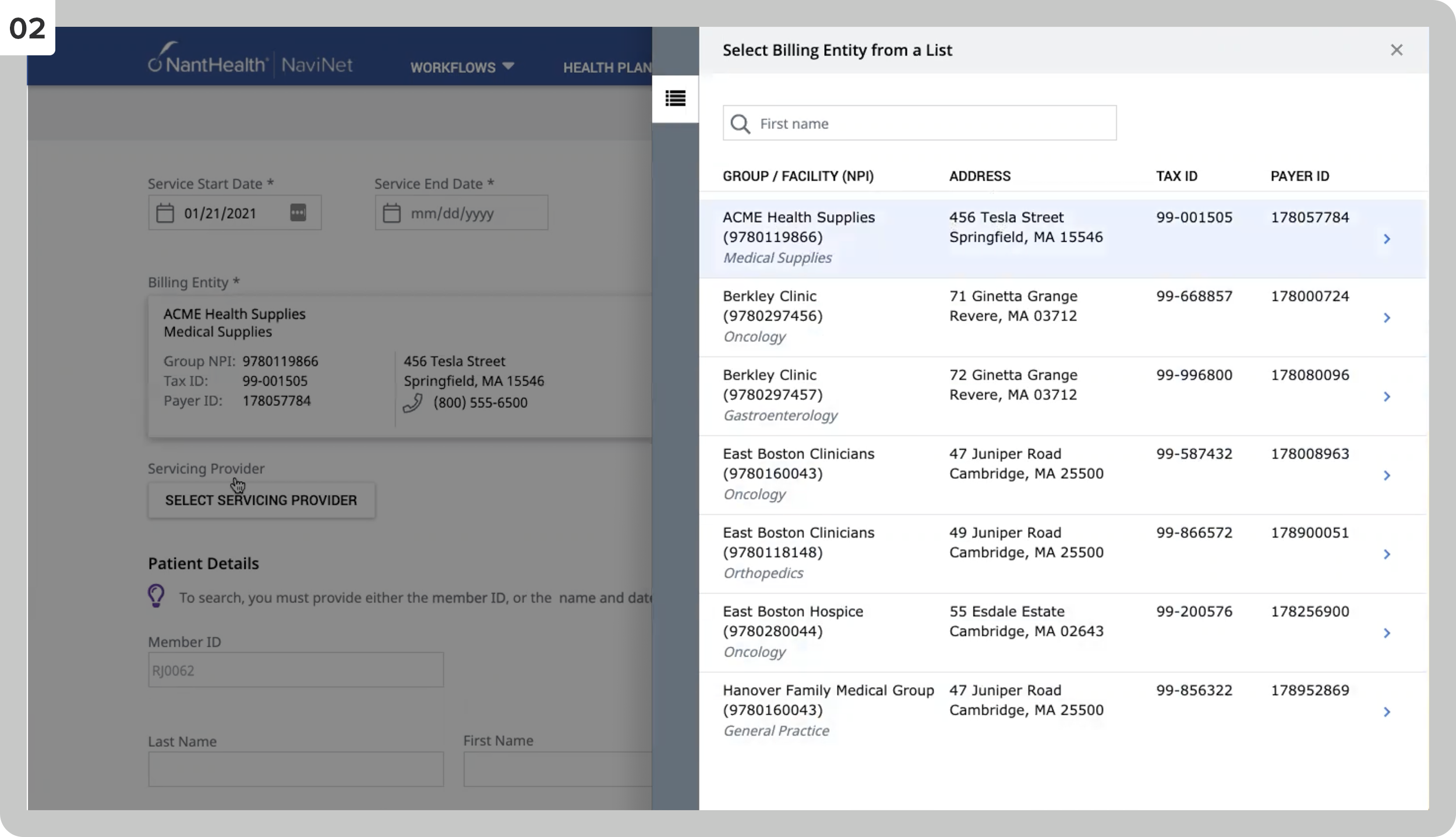
Choosing a billing entity.
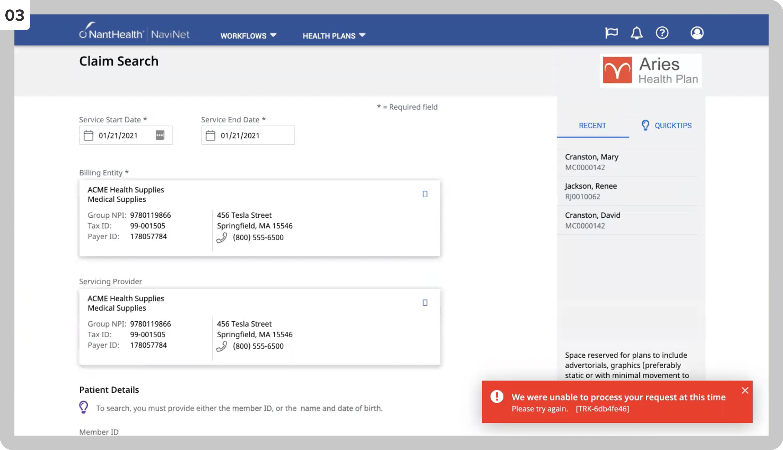
03
A view of the search page with two tabs (Recent, Quicktips) that users can select to display in their settings. This screen also shows a notification when the system cannot process a request.
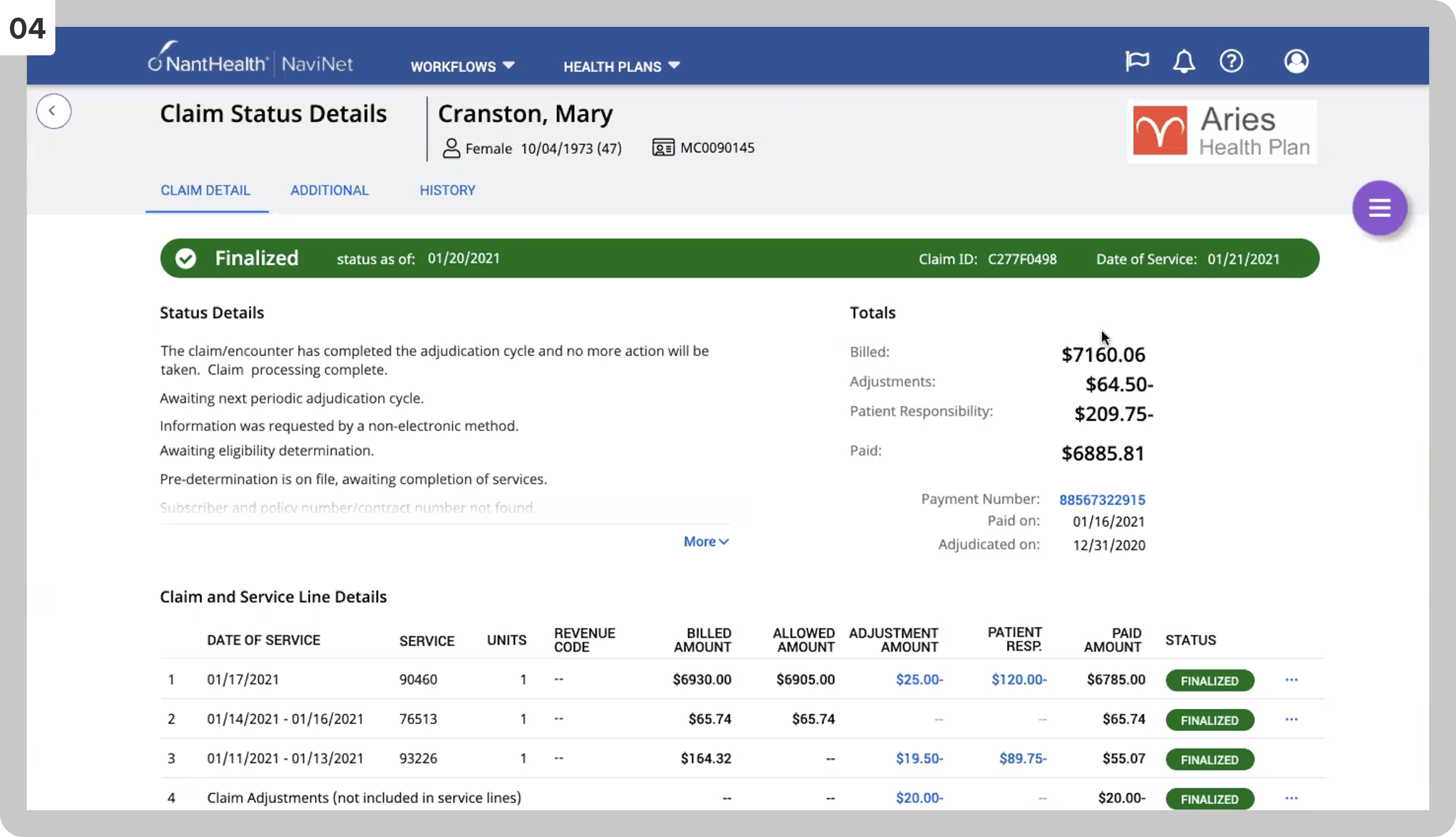
04
The Claim Status Detail page.
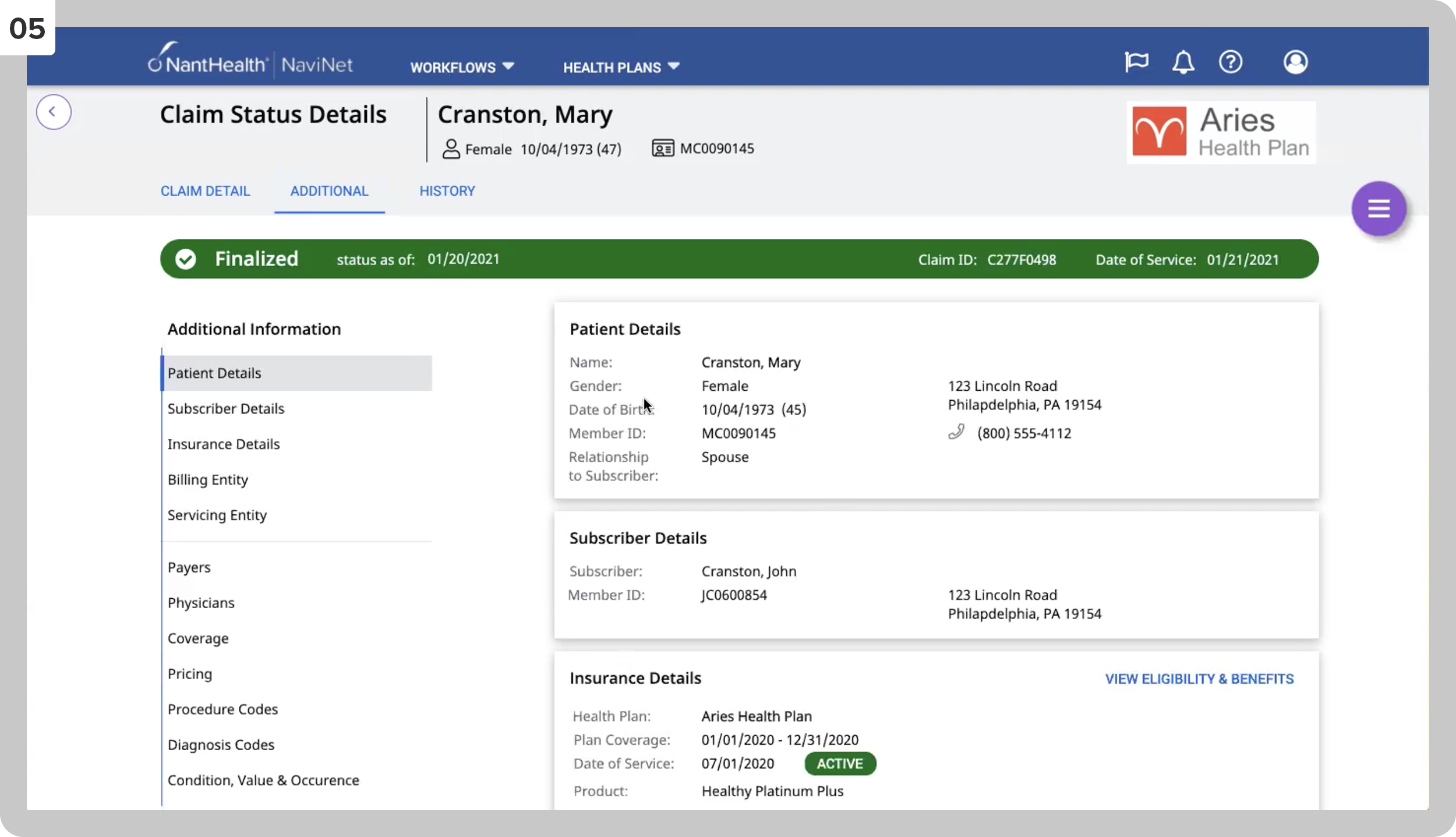
05
When selecting the Additional Information tab on the claim.
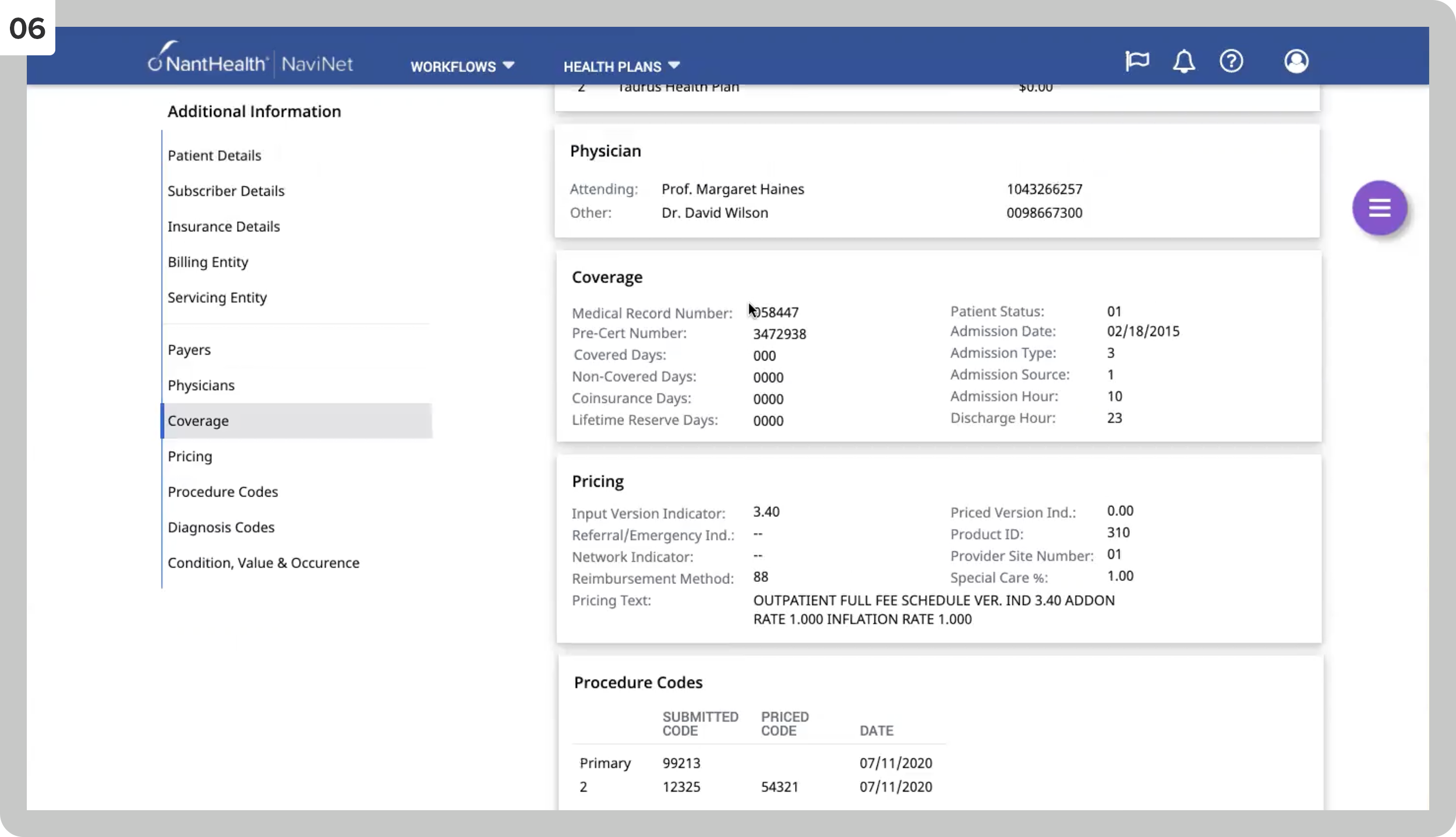
06
I was scrolling down on the Additional Information tab.
07
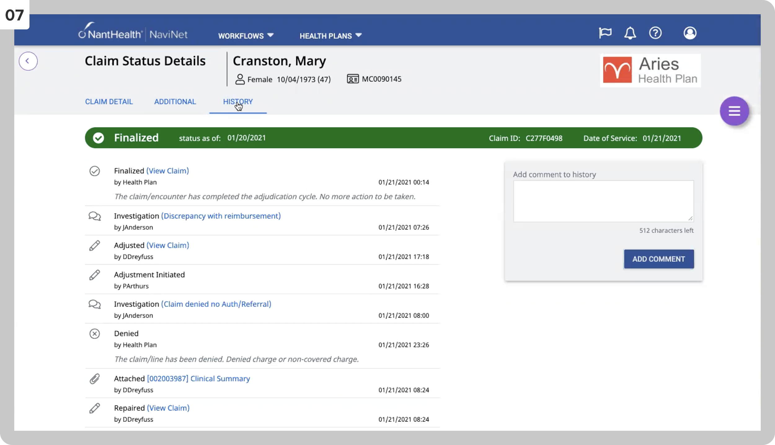
When clicking the History tab.
08
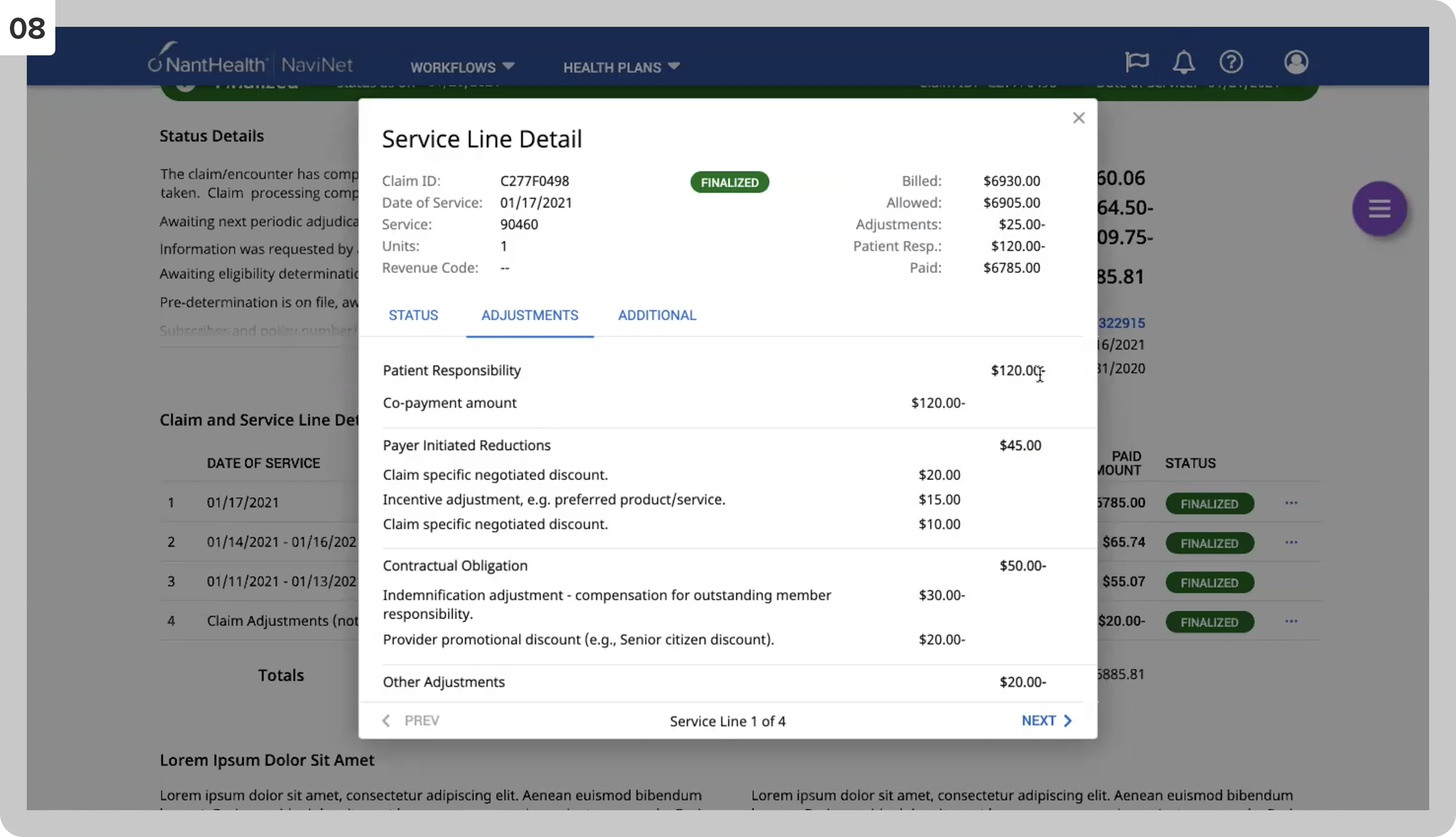
Service line details, Adjustments tab.
09
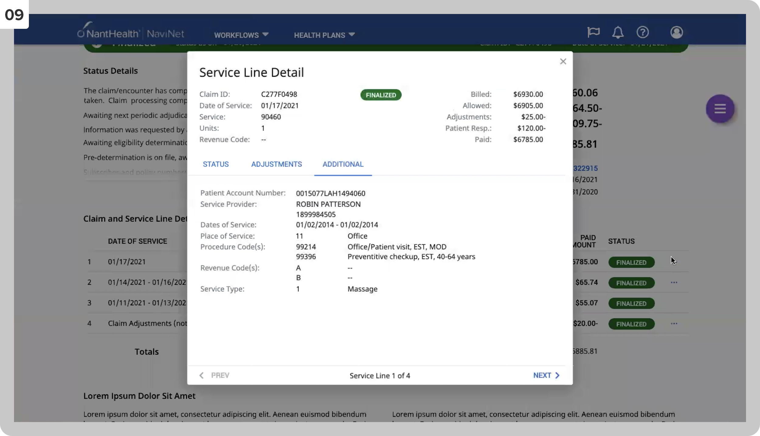
Service line details, Additional Information tab.
10
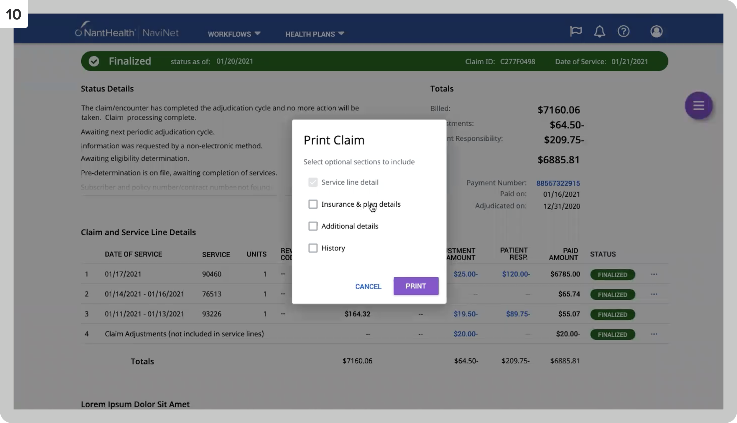
The interface where the user can select what features to print.
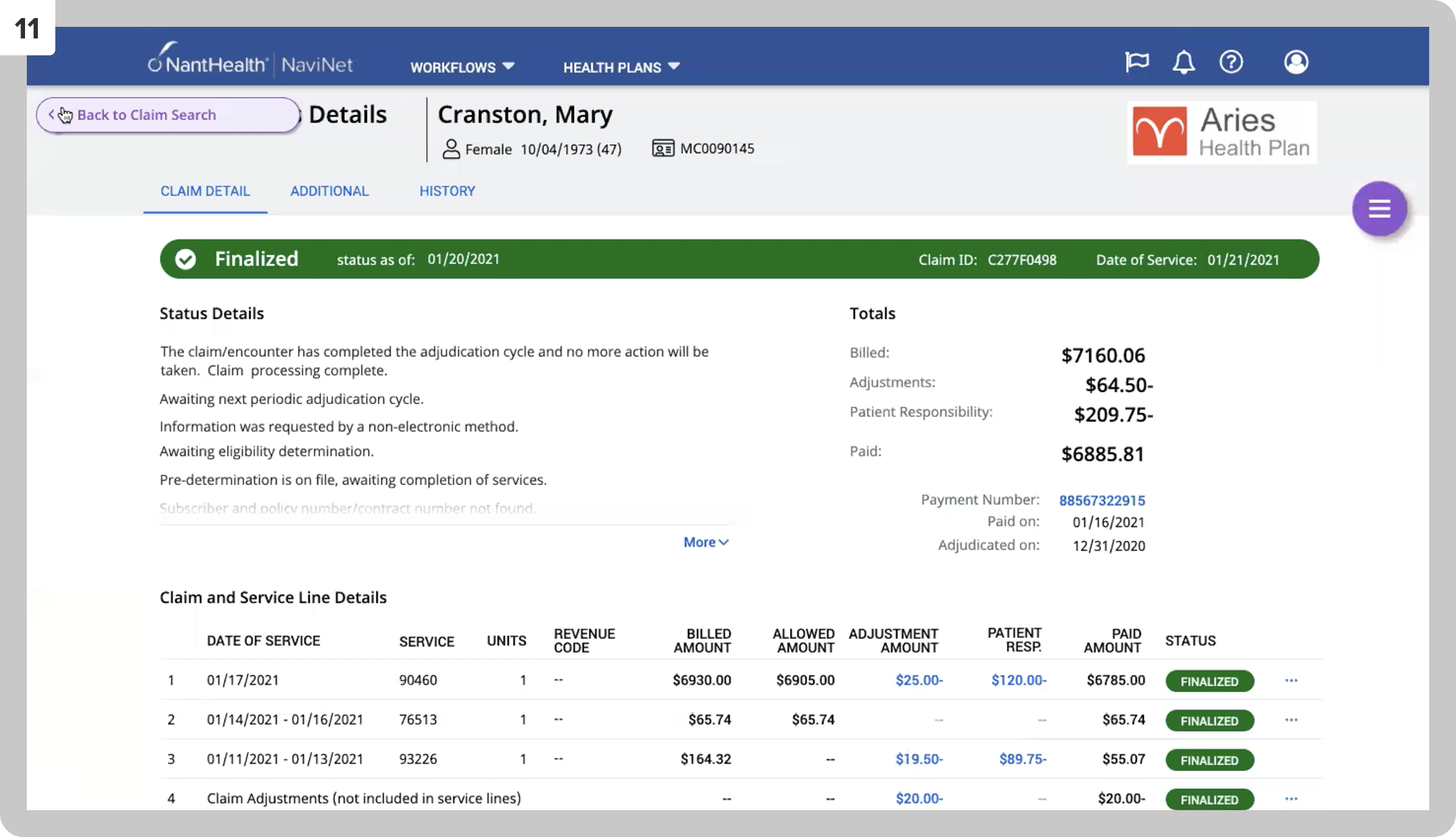
11
The arrow will return the user to the search results page.
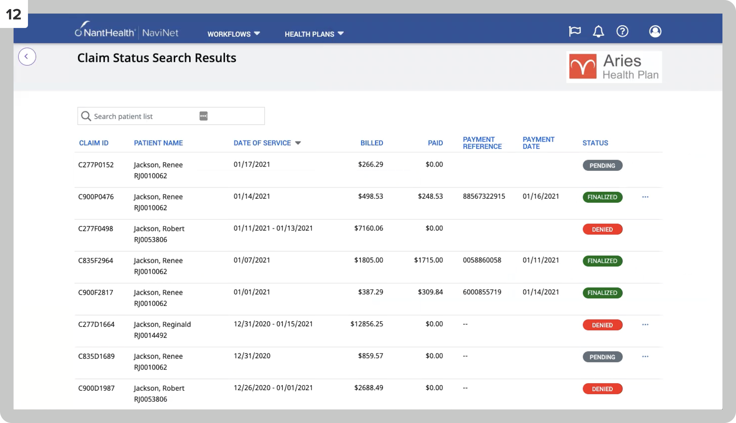
12
Back on the search results page.
Tasks: Ethnographic Field Studies, Accessibility Design, User Testing, Personas + User Journeys
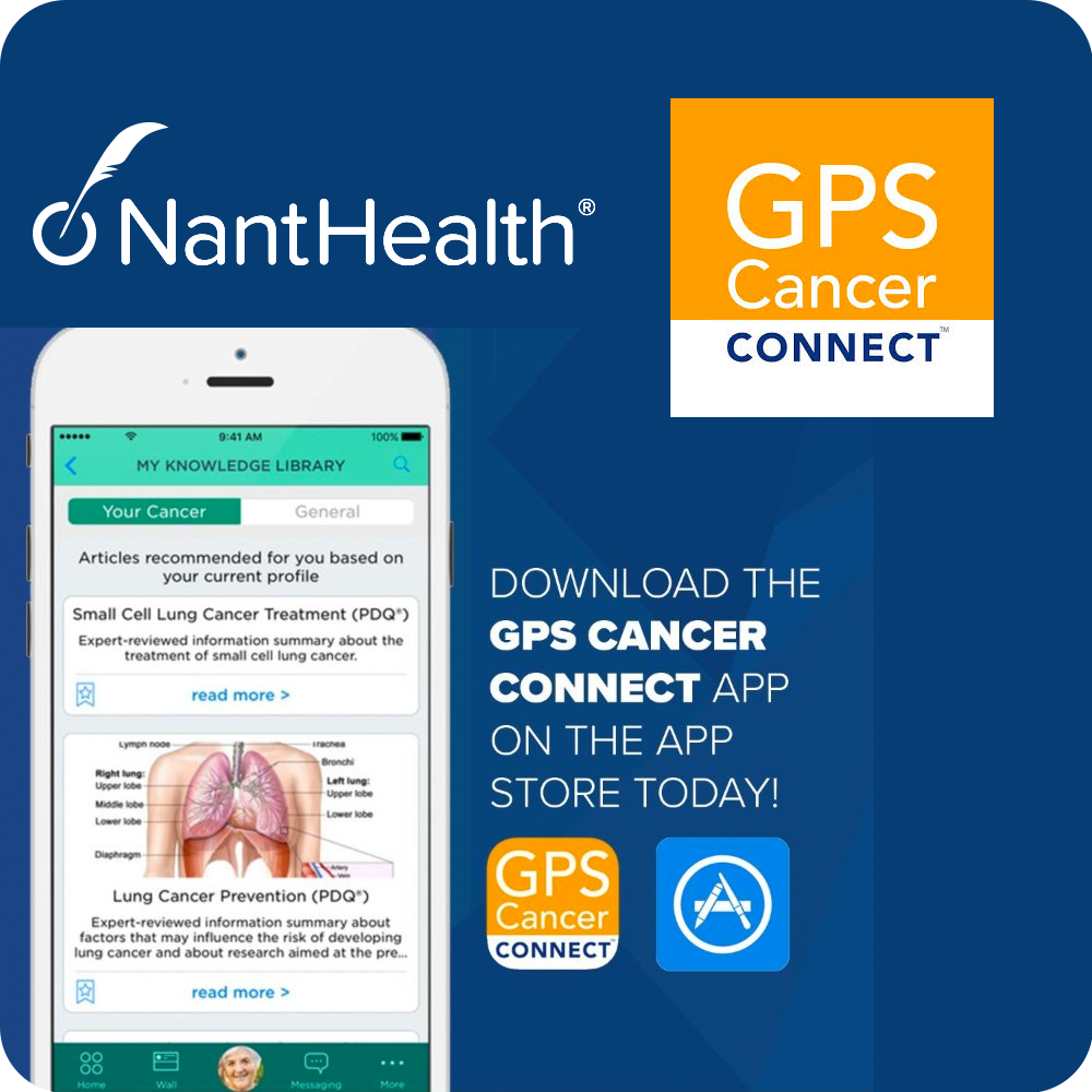
I joined the Cancer Connect team a few weeks before the iOS launch — inheriting an app with significant UX debt and immediately shifting into triage mode: prioritizing the most critical issues for post-launch iteration, establishing a persona framework the team hadn't had, and building a research practice from scratch.
Cancer Connect was the leading digital companion for understanding a cancer patient’s diagnosis and personalizing their care. The initial app was launched on the iOS App Store in 2016.
Some of the initial app features included: Knowledge library database, care circle for friends and family, messaging, personalized medicine, clinical trials, recording doctor appointments, uploading medical documents, adding bookmarks to knowledge base articles, onboarding, including cancer type/stage/biomarkers, forum, and several other valuable features.
In this endeavor, I managed a team of one UX professional and 4 mobile designers, while creating conceptual designs, low- to mid-fidelity wireframes, and personas. I was hired a few weeks before the app launched, and I did my best to fix the most prominent issues pre-launch. Immediately after launch, I worked closely with product management to schedule user-testing sessions and take on as many feature improvements as possible.
The main challenge of the app was that even though there were many beneficial features, there needed to be a way to provide them in an intuitive and easy-to-navigate interface. The interface felt cluttered and essential elements were required to be found.
01
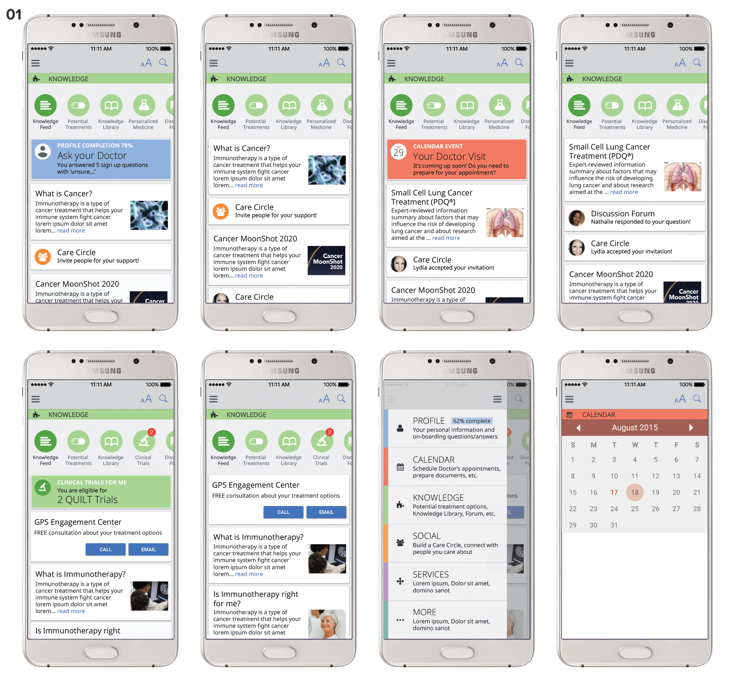
These are a few screens for an alternative Android version of the app where we proposed to reduce the overwhelming amount of features the user is presented with as they open the app. In this color-coded view, I suggested that the app only show the user content triggered by events like in-app scheduled doctor appointments or learning from the patient’s behavior to only display information applicable to the user’s current situation. The first six screens show the knowledge feed populated with information based on the user’s journey, the expanded hamburger menu, and the calendar view.
02
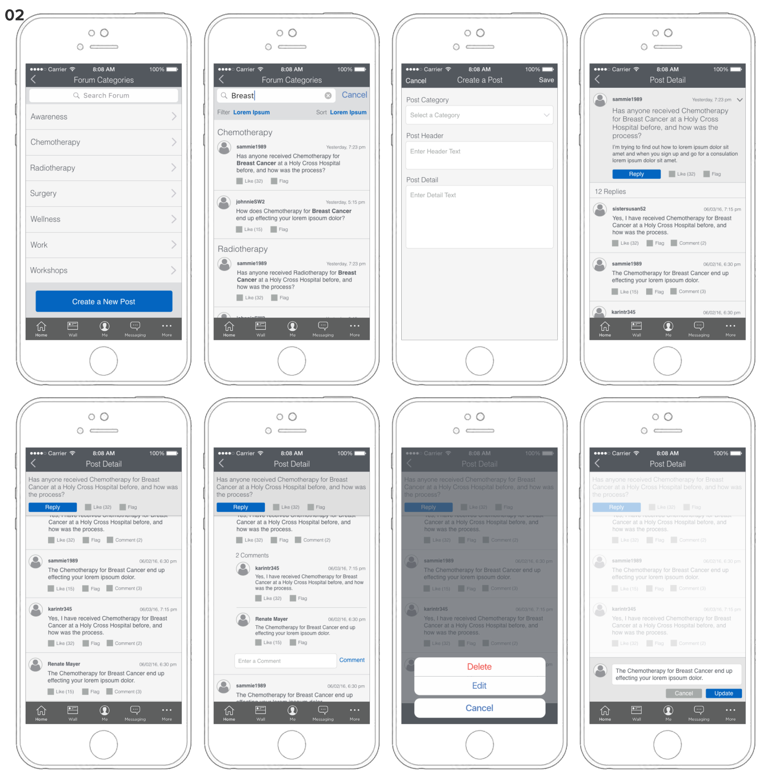
These low-fidelity wireframes were created for a proposed forum section as a post-launch add-on to serve as design guidance for the team to iterate.
03
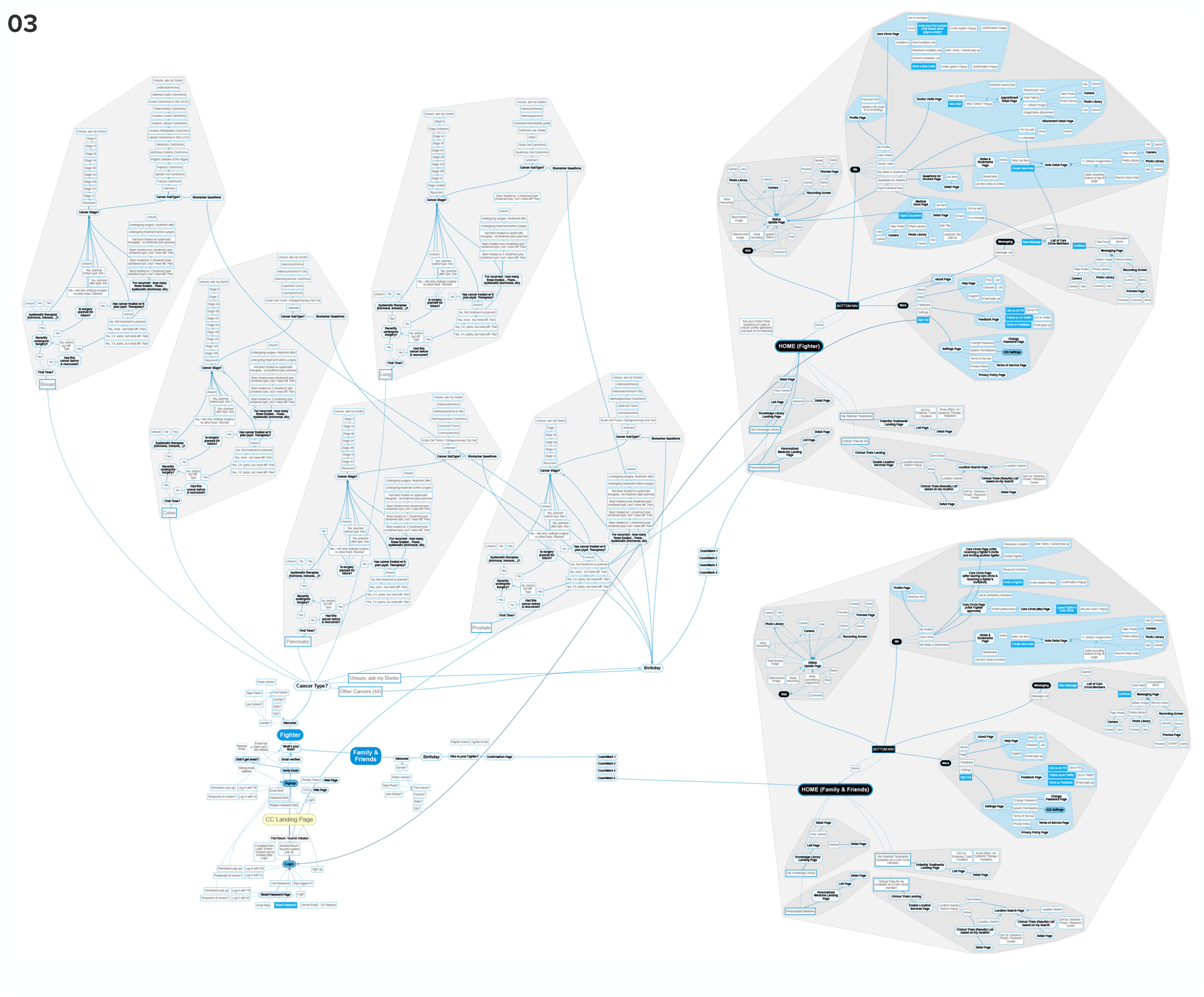
When I joined the team, the team worked screen to screen in a rather complex application without a flow chart. I immediately created this diagram to ensure that at any given time during the process, we clearly understood how any to-be-designed feature fits in the overall flow of the system.
04
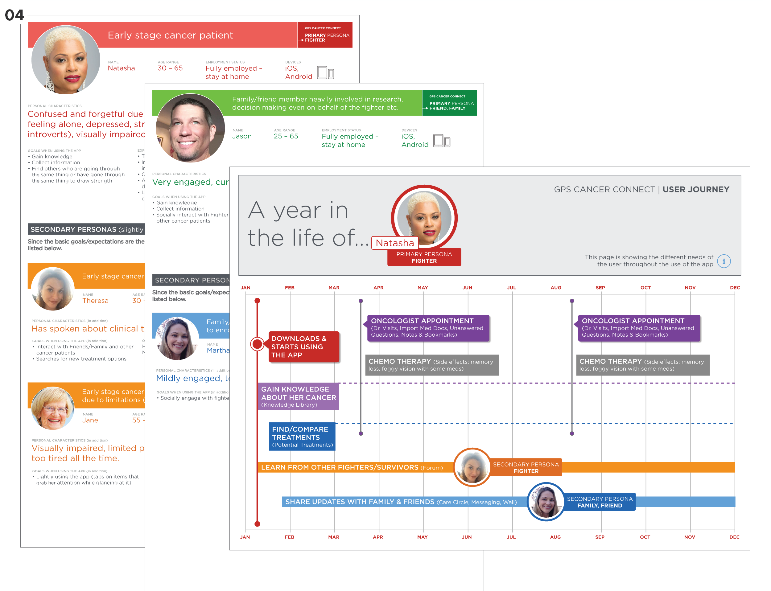
Rather than launching the app while having several critical questions unanswered, I scheduled an ad hoc persona workshop to collect the team’s existing knowledge and assumptions about the app’s users. This resulted in a few persona docs and some user journeys to ensure we carry on as user-centered as possible.
Tasks: UX Design, Information Architecture, Interaction Design, User Testing, Personas + User Journeys
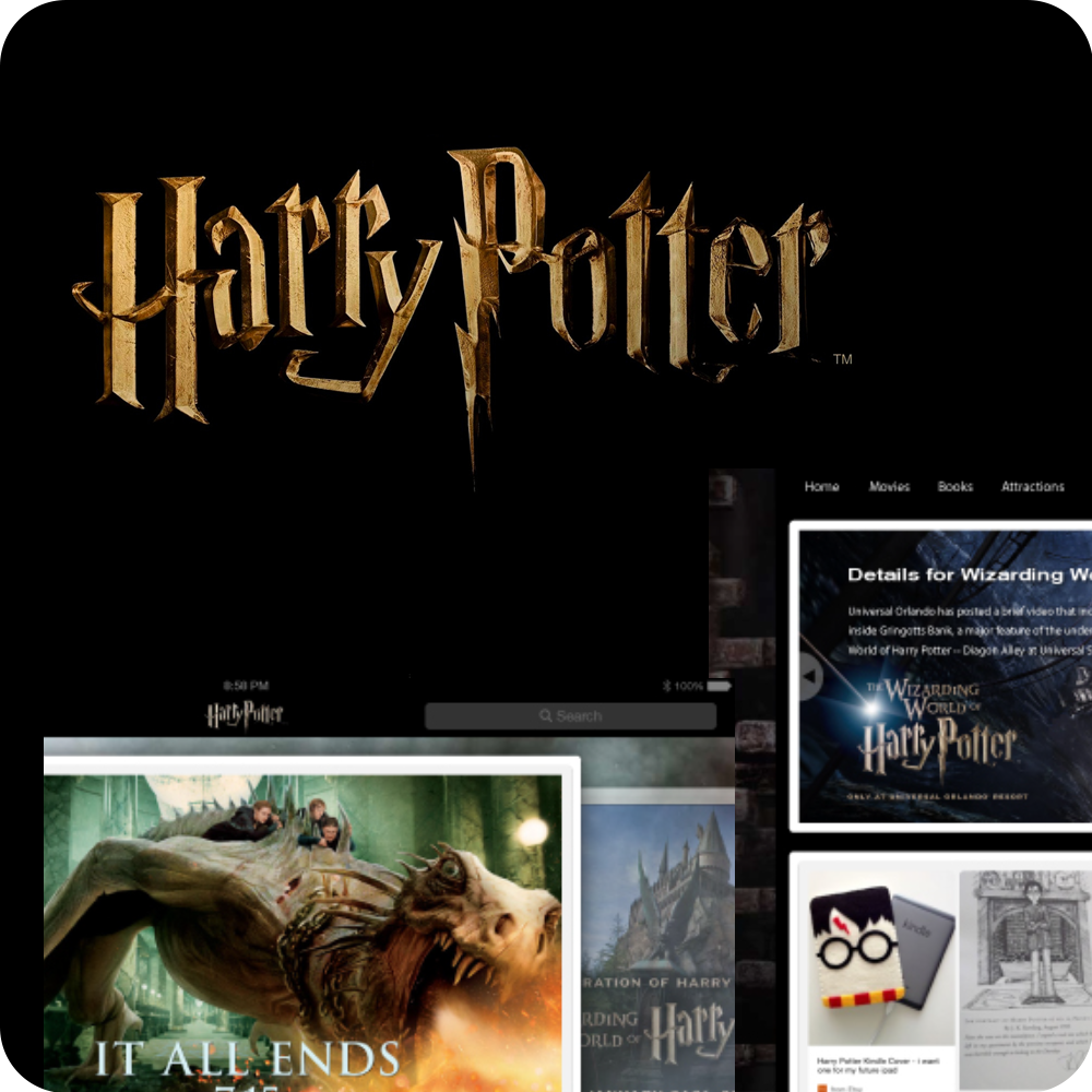
In this effort to re-engage Harry Potter fans right in time for the movie 'Magical Beasts and Where to find them,' release, we planned to create a website and native iOS phone/tablet app to strengthen the emotional connection with this brand—a fun project with many whiteboard sessions and lots of user engagement.
01
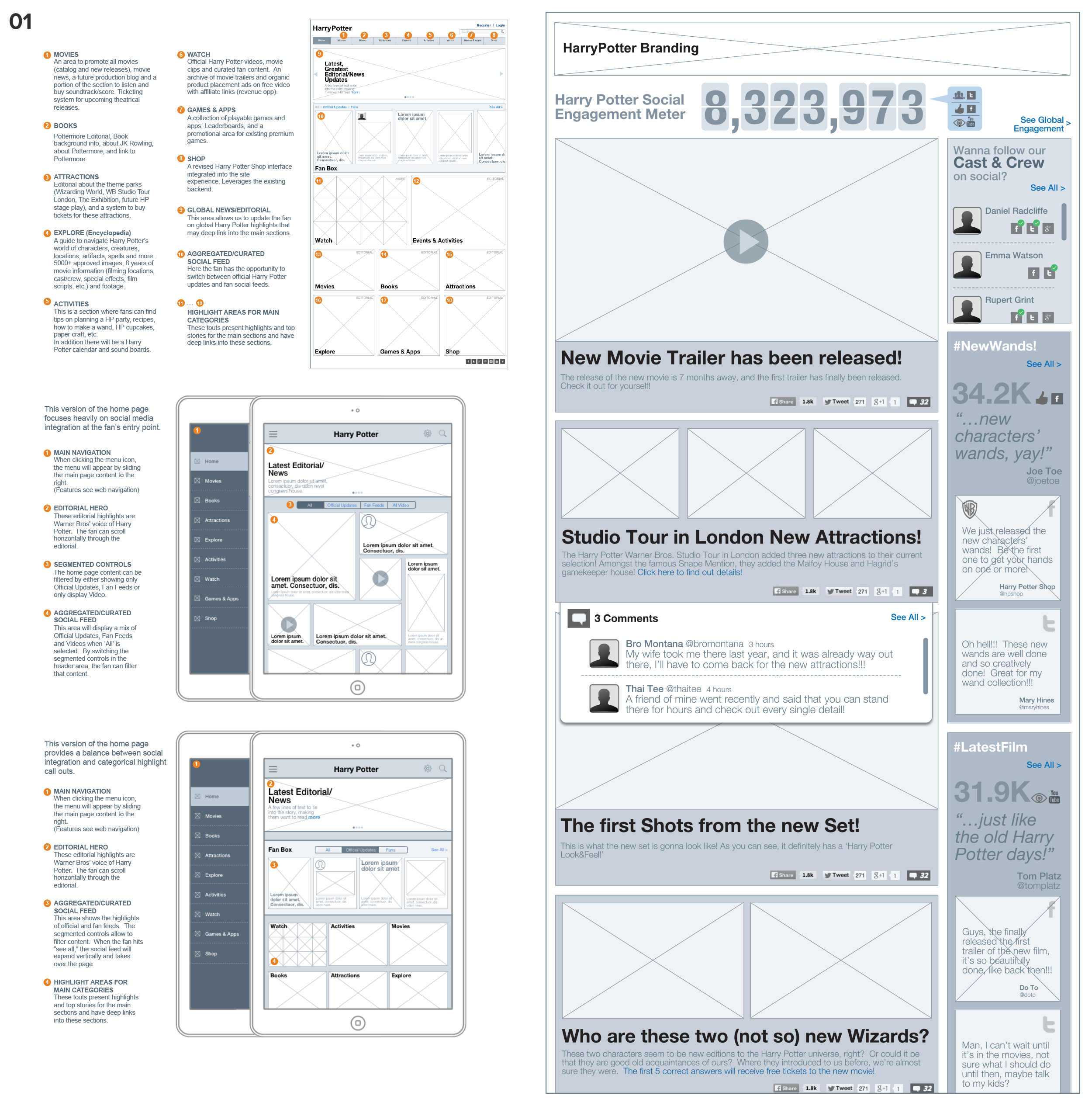
Wireframes served an information architecture, an interaction design, and a content strategy purpose while exploring social media's role in re-engaging fans on this new platform.
02
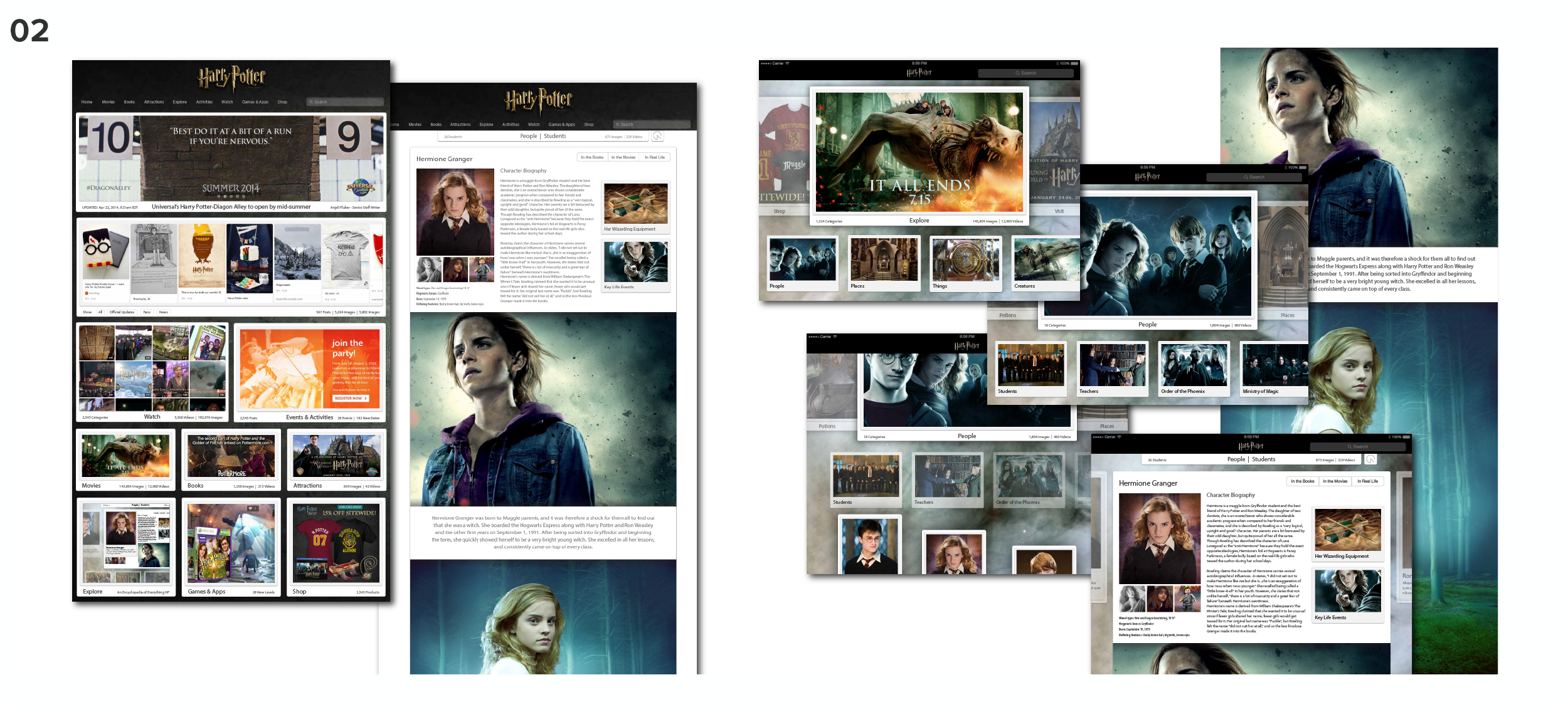
Visual design comps for the re-engagement campaign site.
03
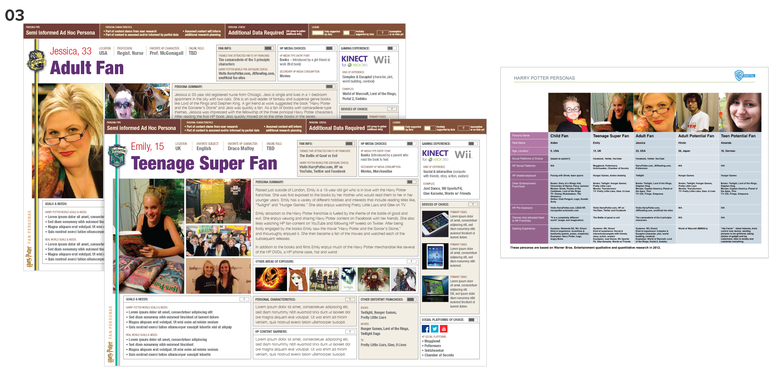
I created these ad hoc personas to reflect the existing fans’ ecosystems, trying to understand their role in interacting with the brand in a digital age, conducting ad hoc persona sessions, and exploring online fan culture. I needed ‘visual’ personas that mirrored the fans’ passion and a ‘visually sober’ version when we just needed clean data.
04
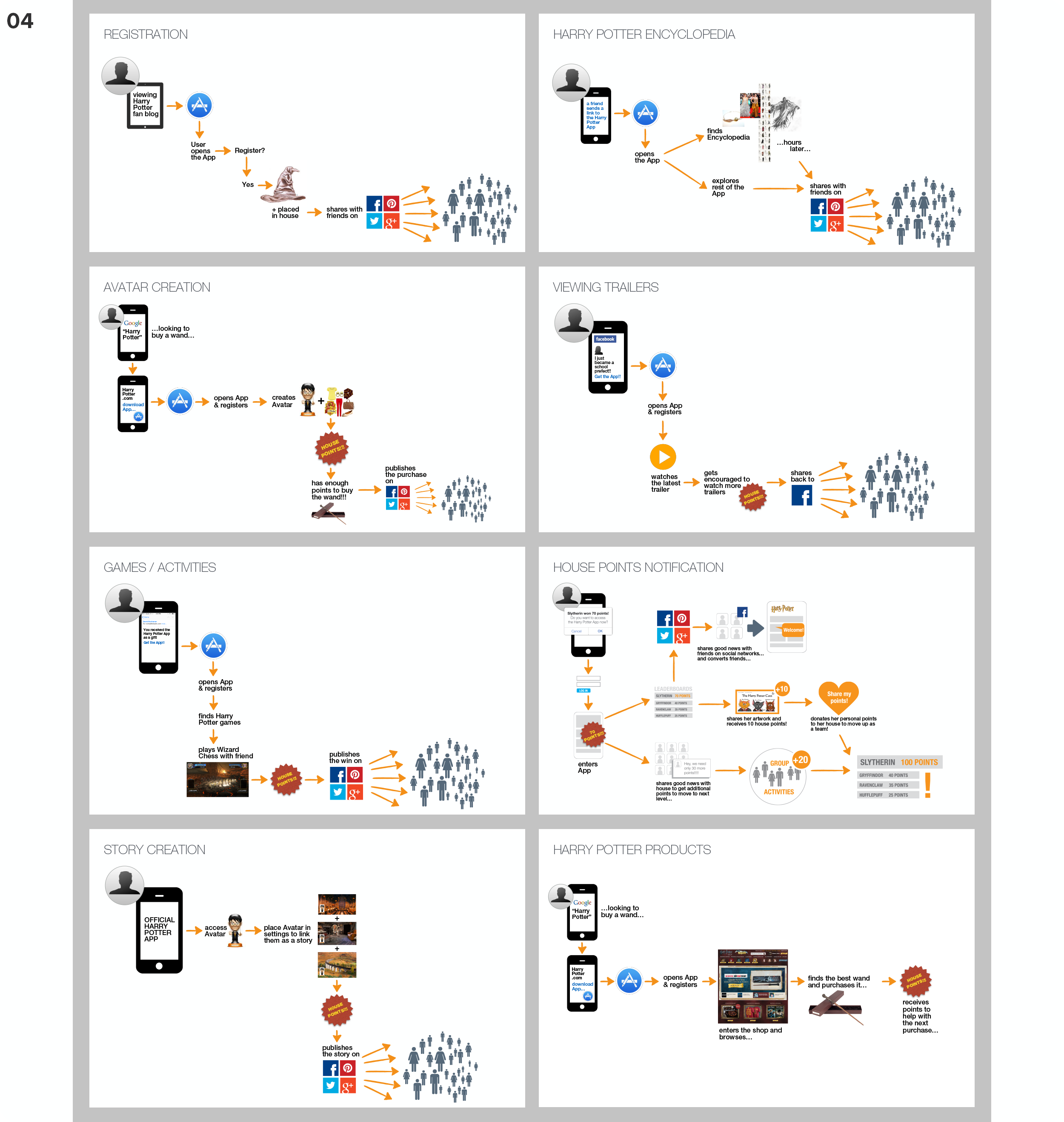
These are a few user journeys that resulted from our persona efforts combined with multiple stakeholder sessions. These also exist purely in written form.
05
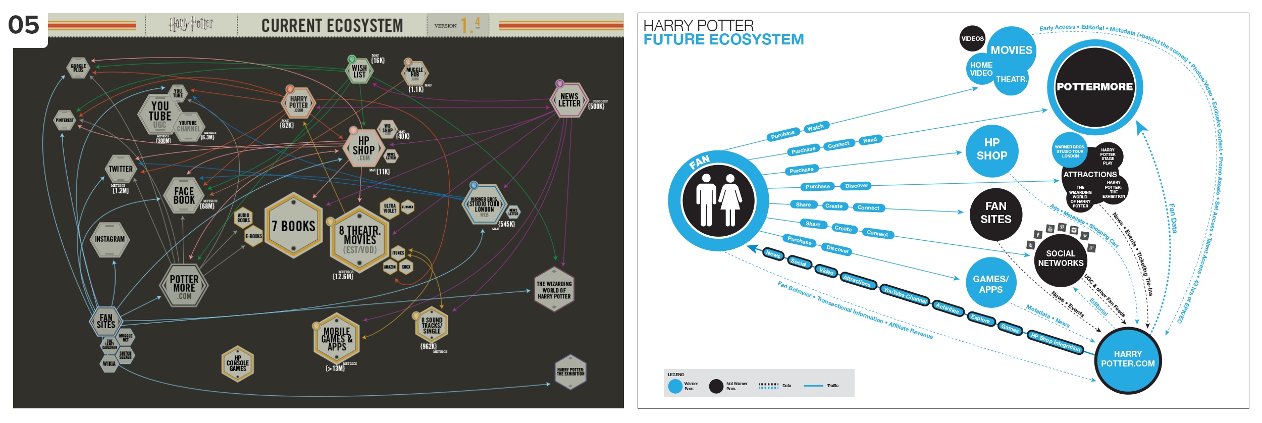
The map on the left reflects the current Harry Potter ecosystem at the time, while the map on the right presents our vision of re-engaging the fans in future efforts.
Tasks: UX Design, User Research, Personas + User Journeys, Information Architecture
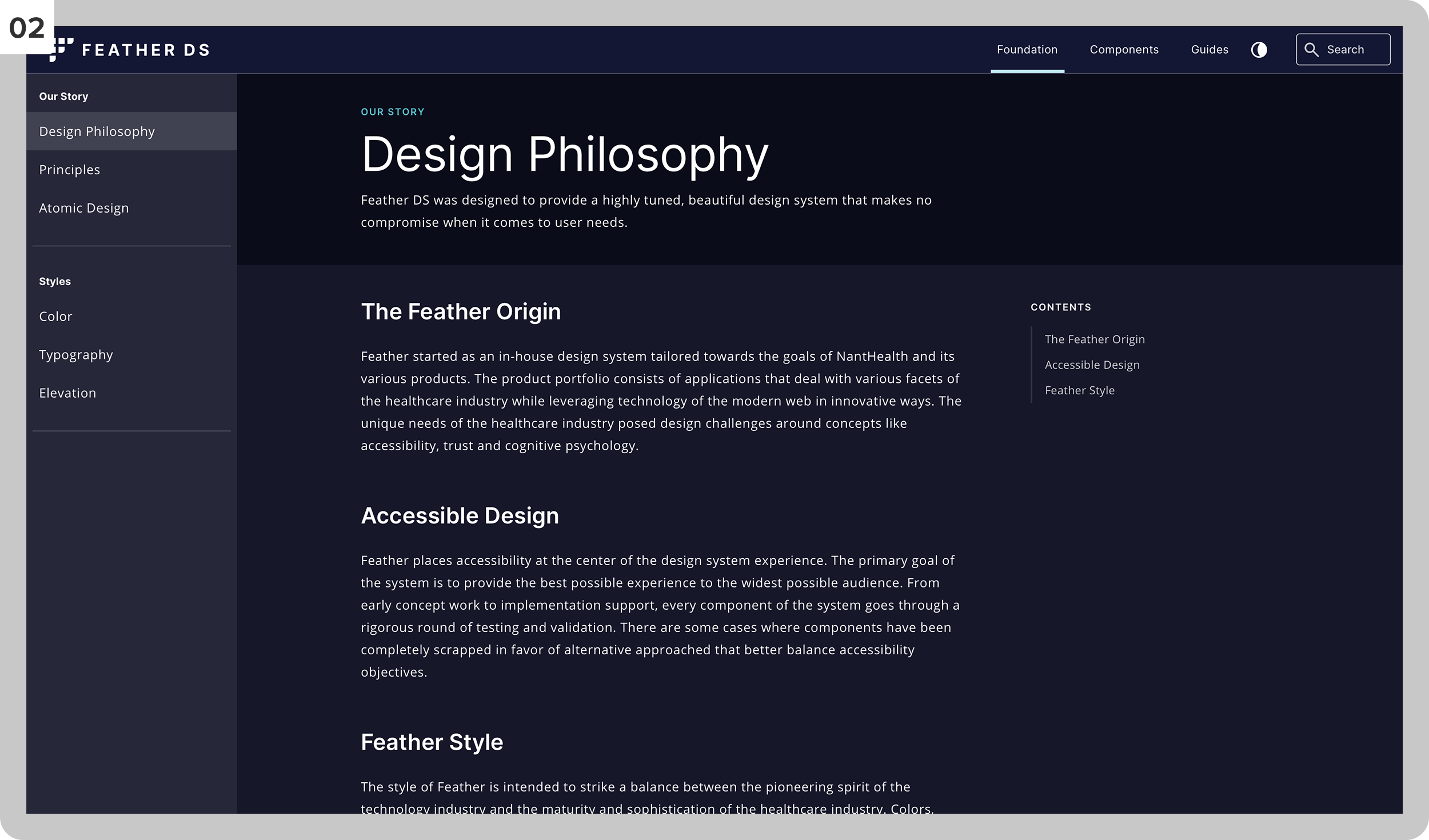
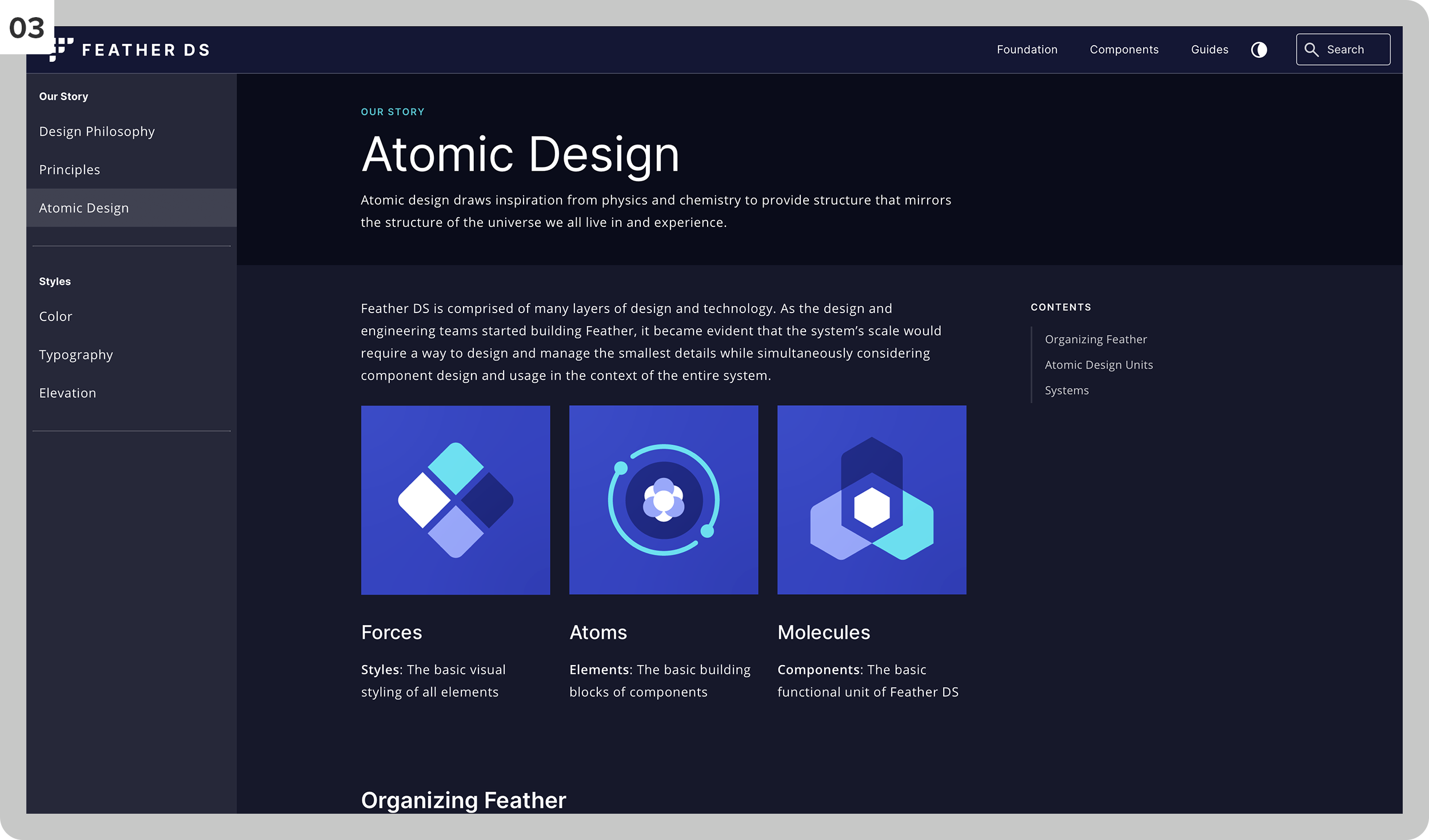
Feather DS started as an in-house design system tailored toward the goals of NantHealth and its various products. It places accessibility at the center of the design system experience. The plan was then shared with the healthcare community as an open-source design system. The system's primary goal is to provide the best possible experience to the broadest possible audience (https://feather.nanthealth.com).
I created components/organisms, participated in weekly design system sessions, guided and performed user testing of patterns, led accessibility sessions, and researched/created design pattern documentation.
01
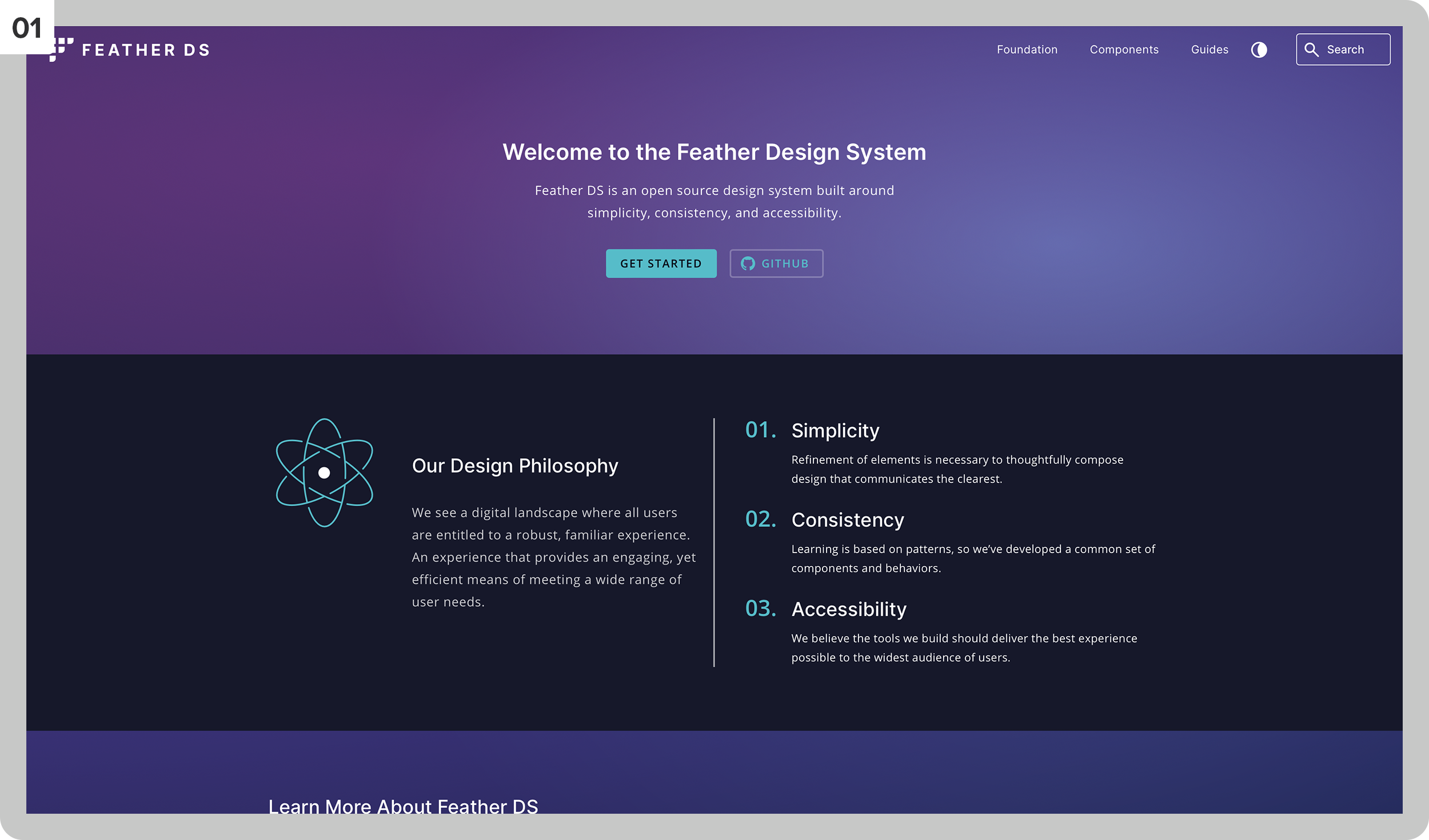
The home page has guide info and links.
02
The design philosophy section.
03
Design principles and guidance.
04
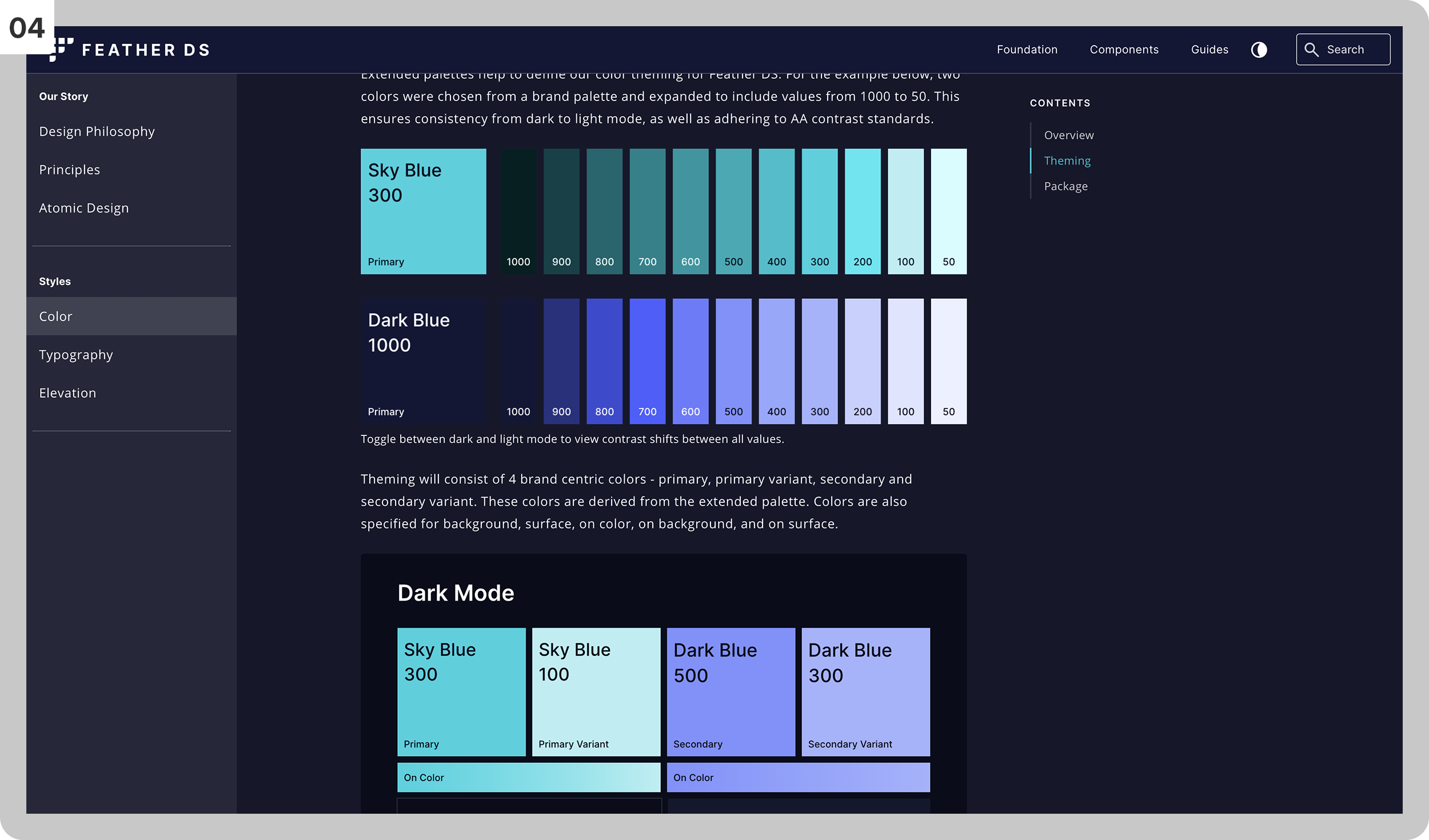
The color guidance section of the system (aa compliant).
05
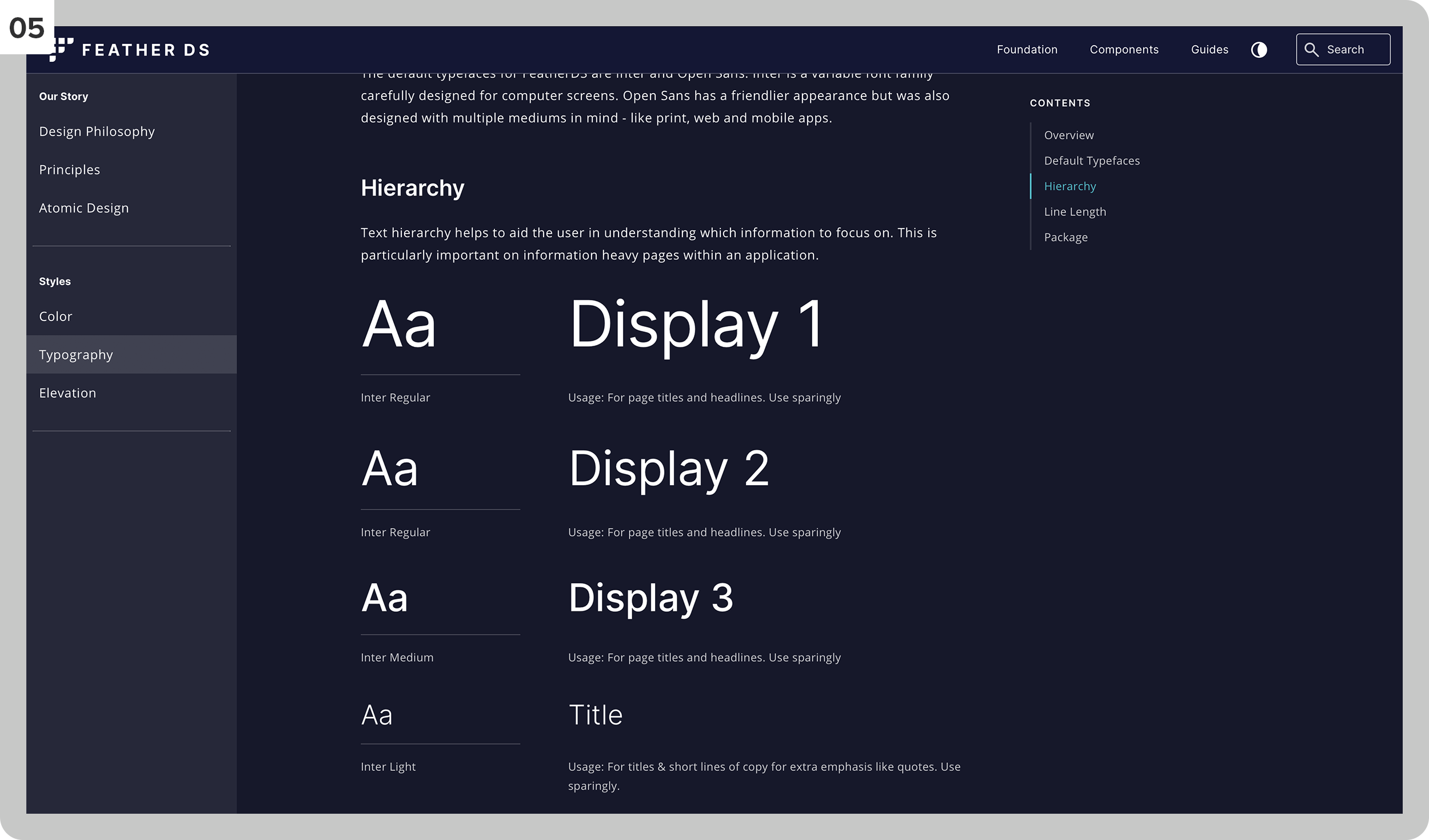
The typography section of the design system.
06
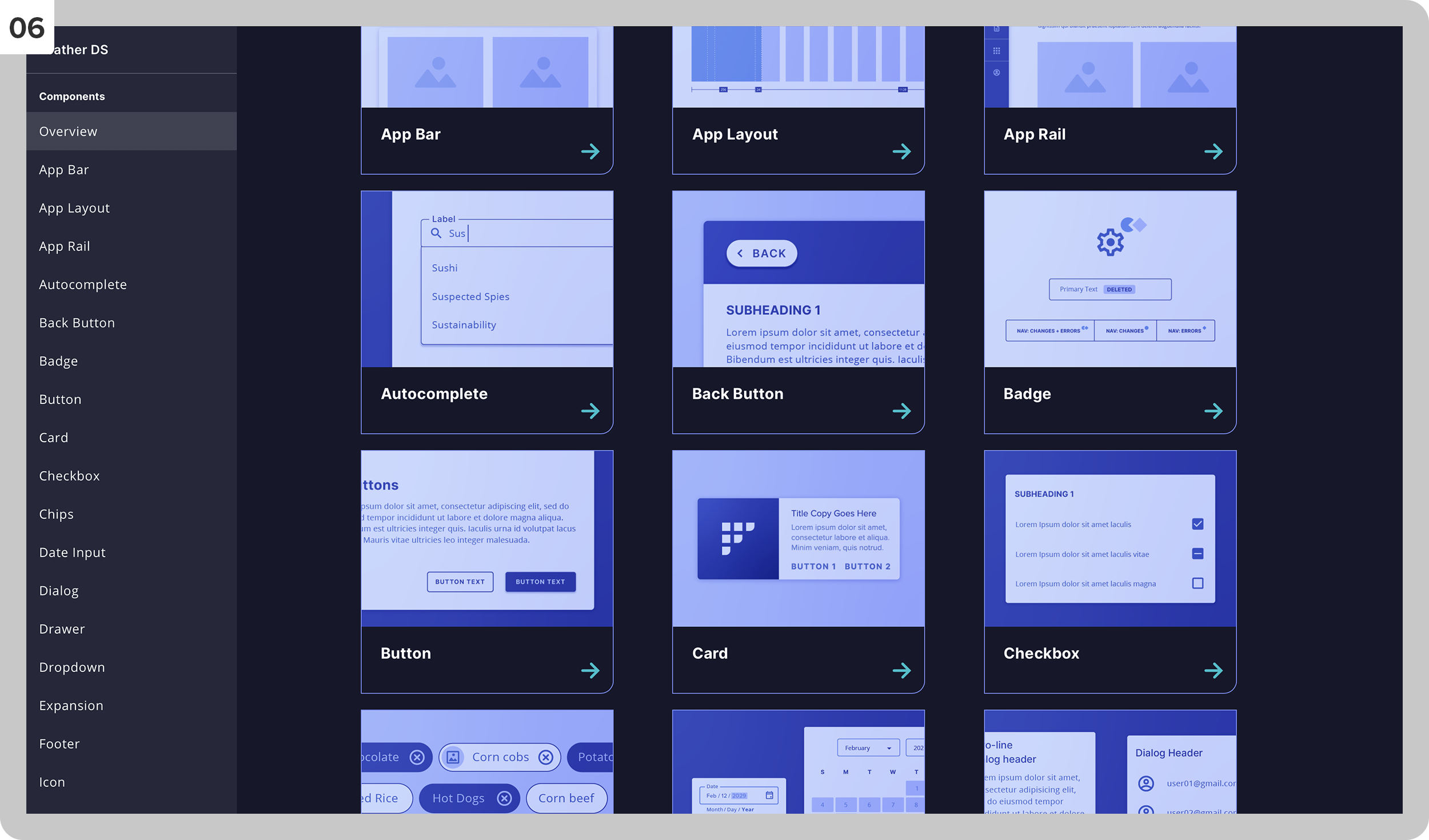
The component selection interface.
07
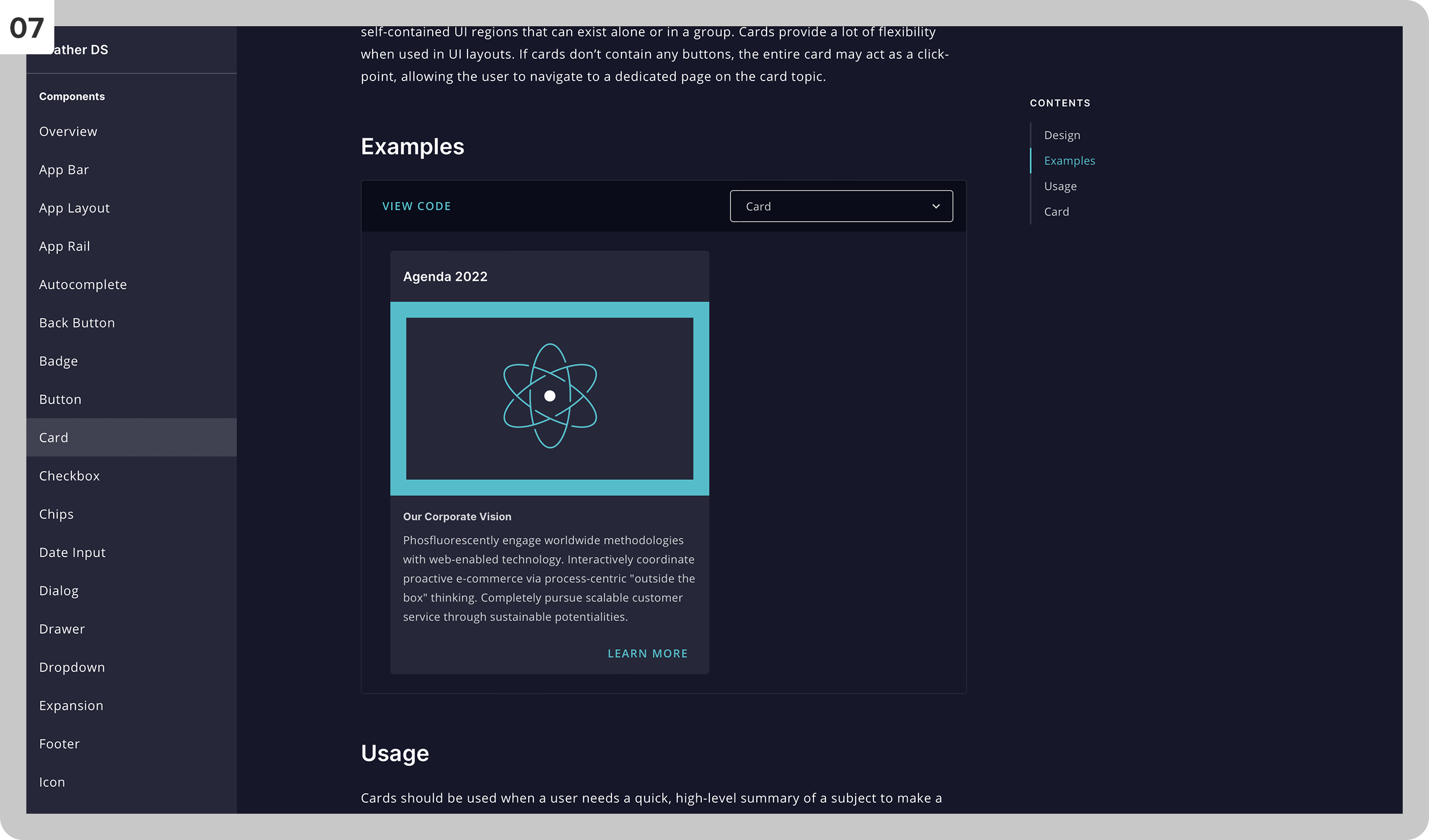
The detail page of a selected component with display, explanation, and code for developers.
Tasks: UX Research, User Testing, Pattern and Component Design
Eligibility & Benefits presented a different challenge than other NaviNet sections: the information itself is inherently dense, highly variable by plan, and deeply consequential — office staff rely on it to verify patient coverage before care is delivered. A misread benefit tier or a missed coverage detail has real downstream effects. The redesign had to make complex insurance data scannable without flattening the detail that experienced users depend on.
The result introduced a structured hierarchy that lets users move from a patient's top-level coverage overview down into specific benefit categories and tier customization — with an insurance card view that mirrors the physical artifact staff are used to referencing. Accessibility was central throughout, built on Feather DS and validated with real users across multiple testing rounds.
01
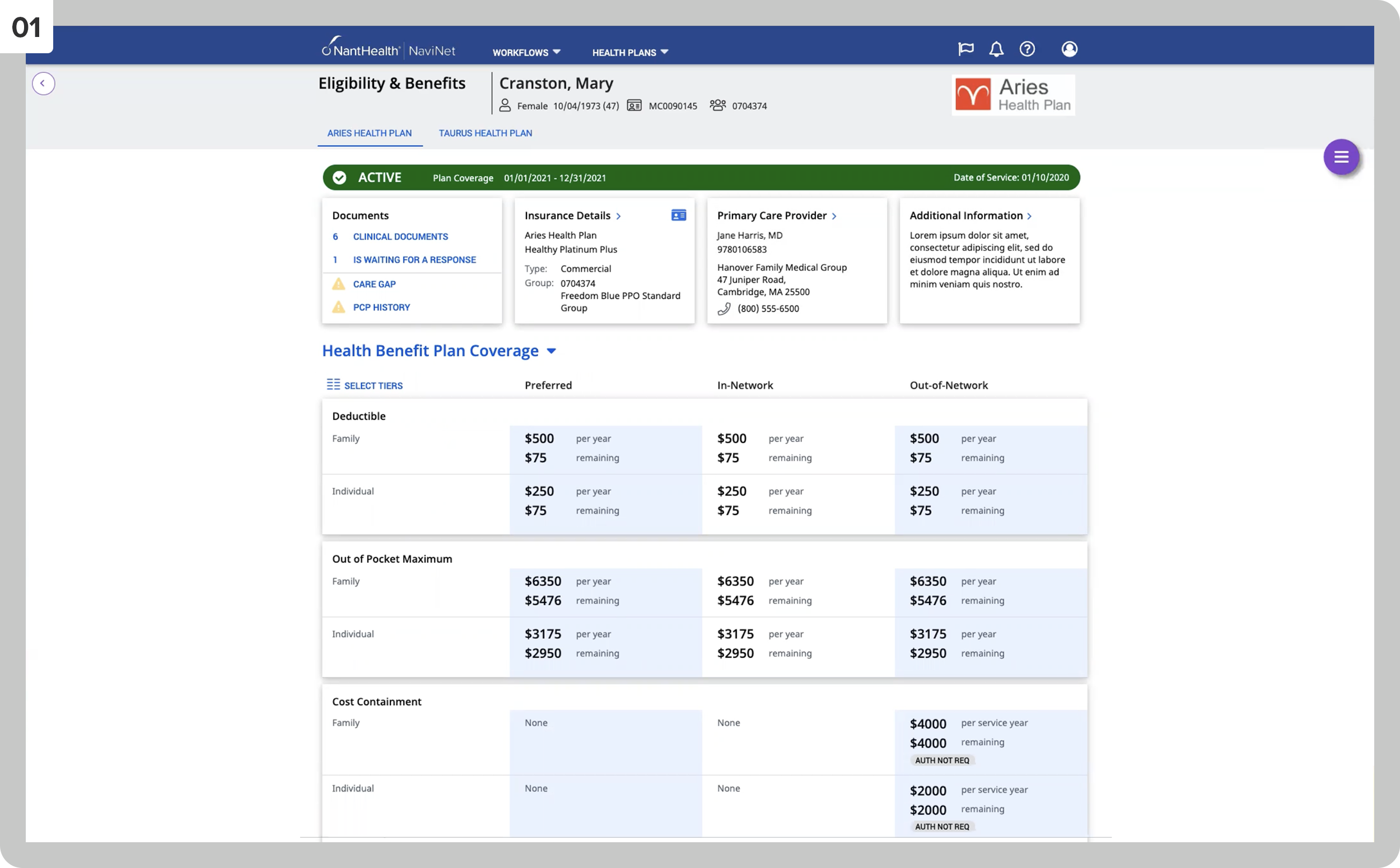
The patient’s E&B main page.
02
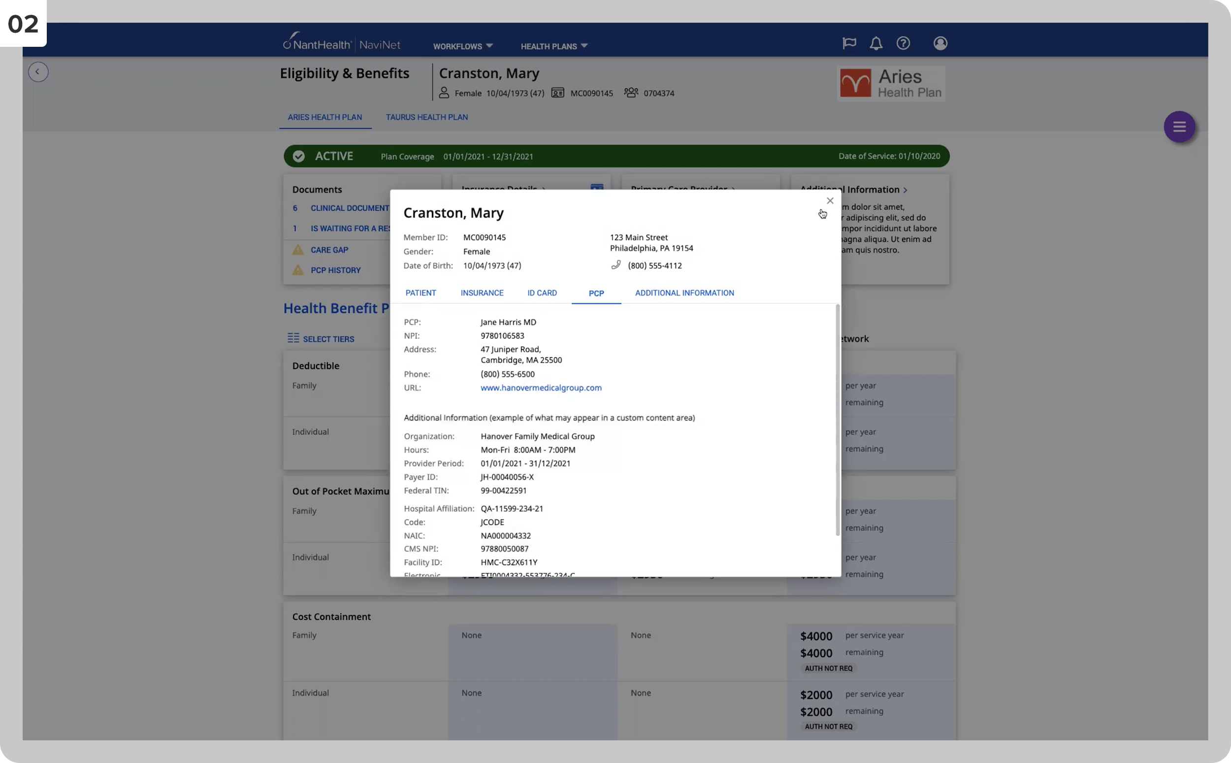
The patient’s insurance details.
03
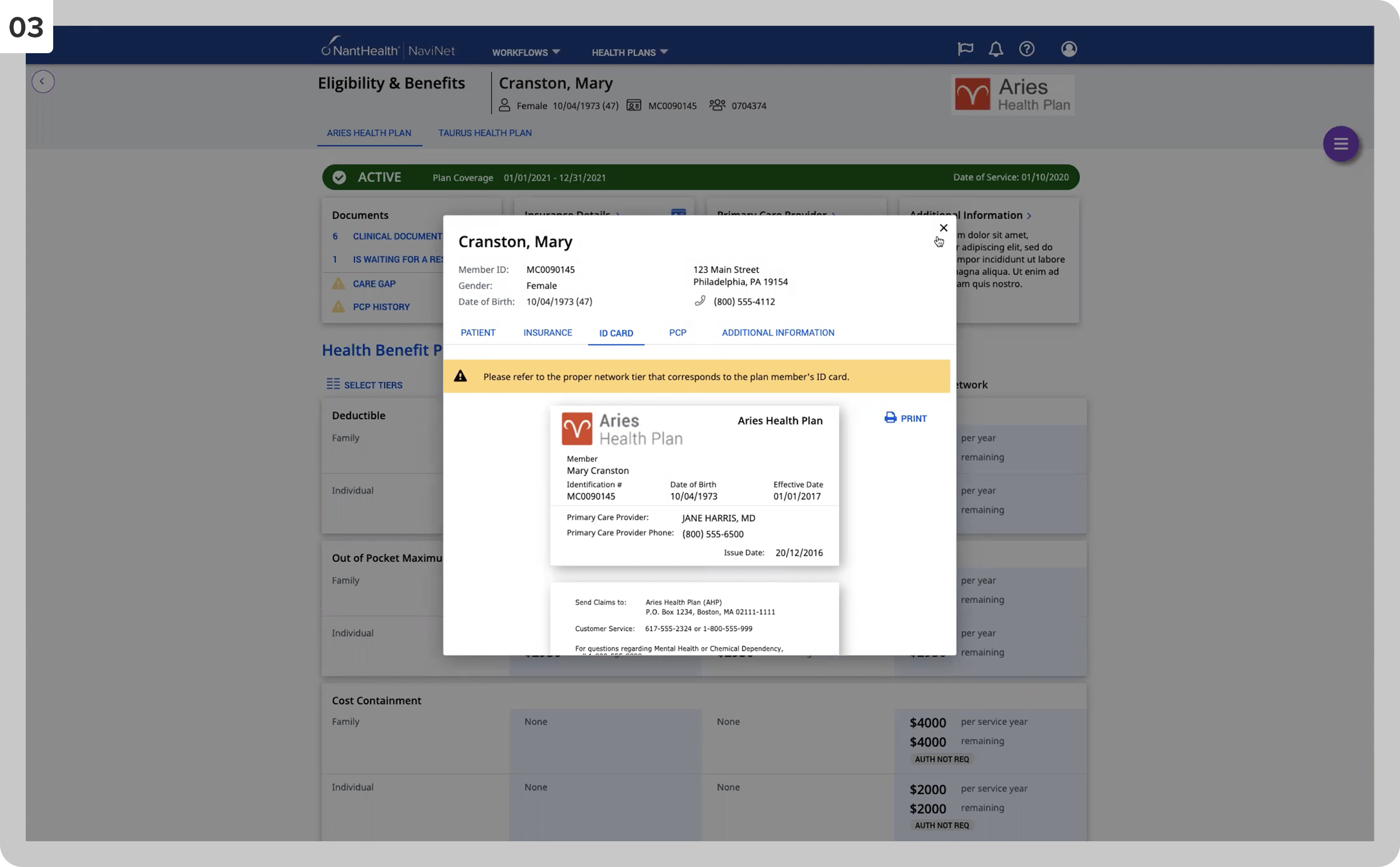
The patient’s insurance card representation.
04
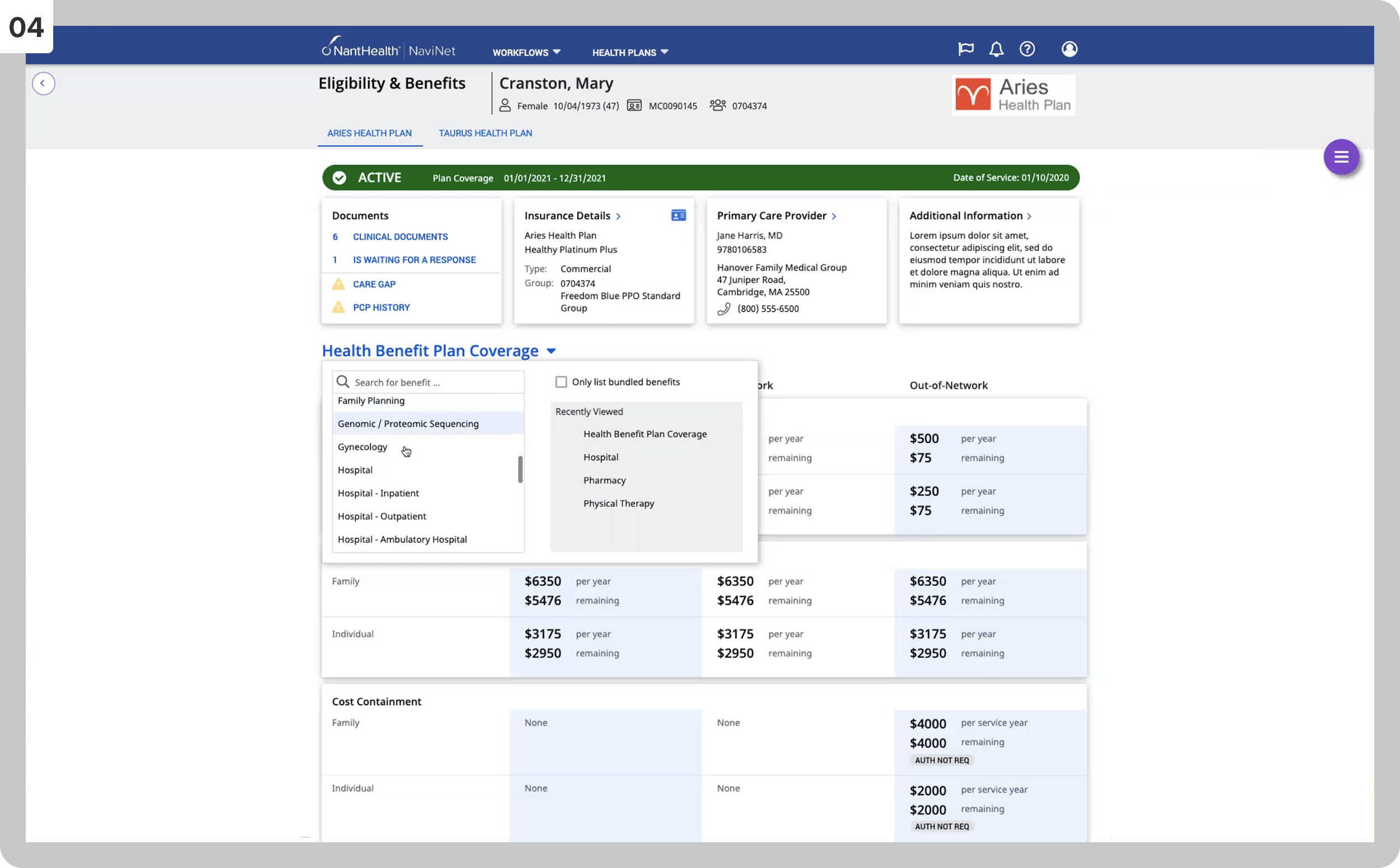
Searching for specific insurance coverage.
05
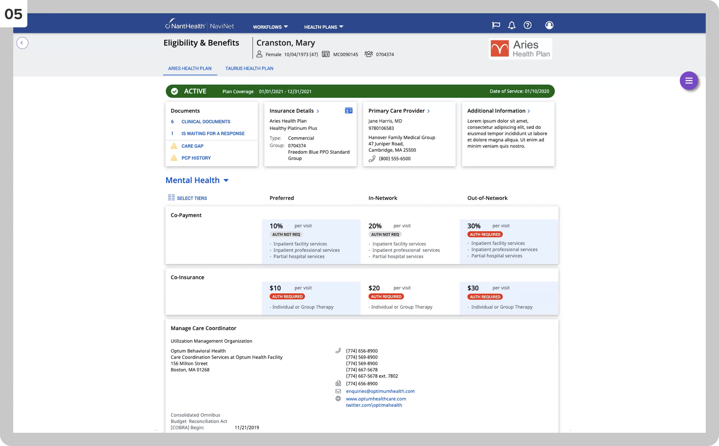
The display of the previously searched coverage, Mental Health.
06
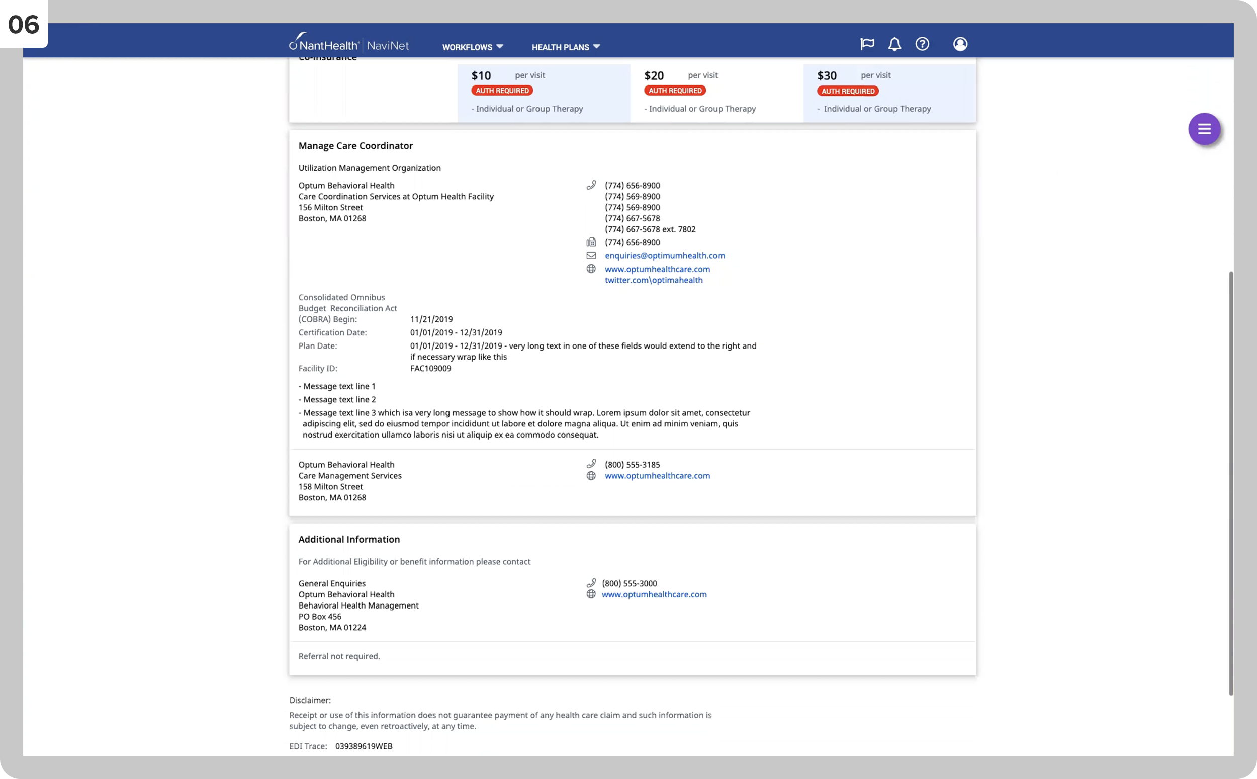
The Mental Health page scrolled down to display more information.
07
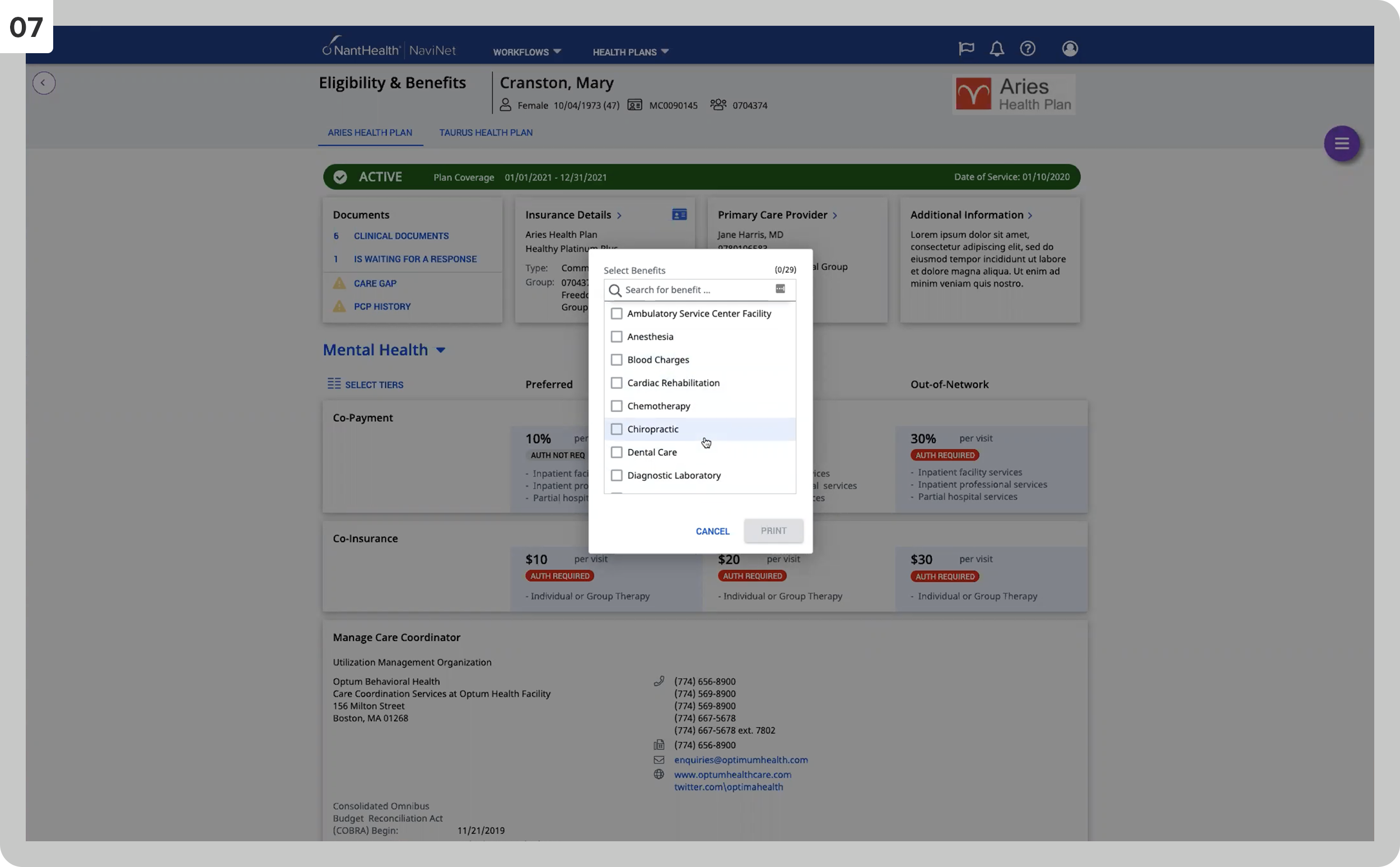
We are selecting specific benefits within a category.
08
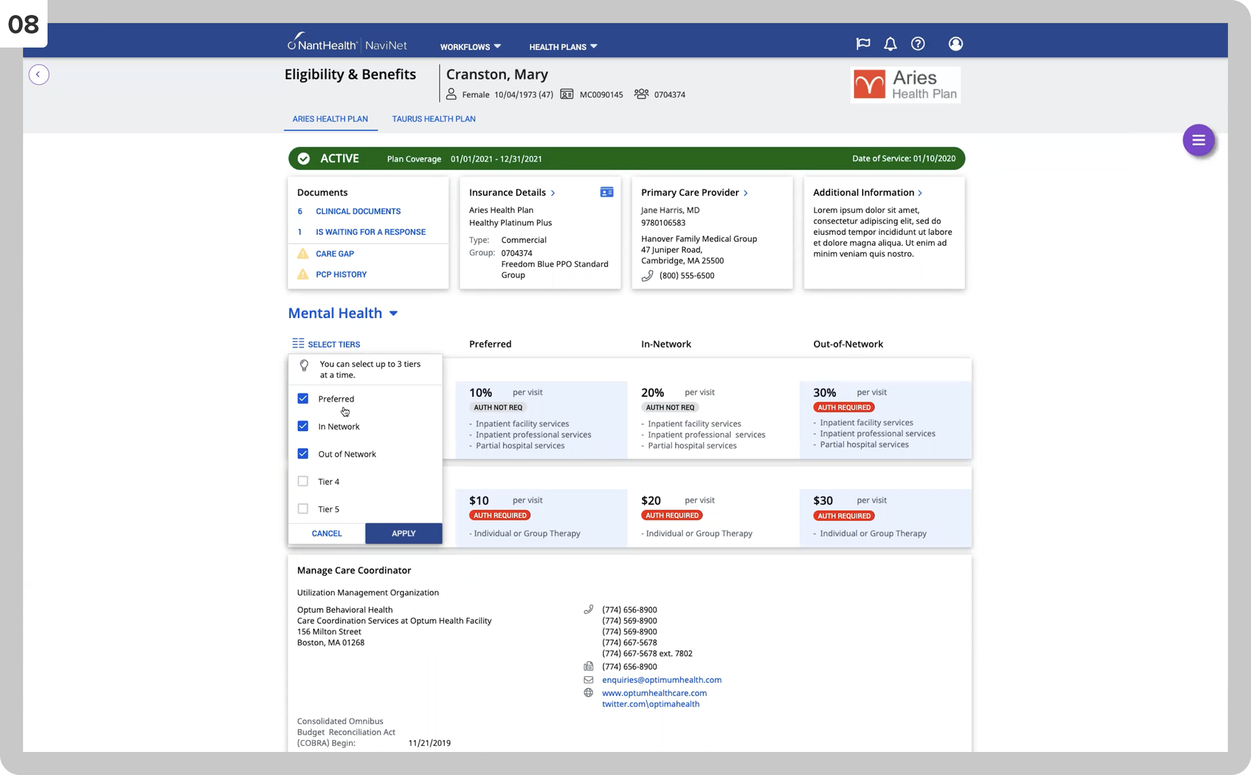
They allow the user to customize the interface by changing tiers.
Tasks: Ethnographic Field Studies, Accessibility Design, User Testing, Personas + User Journeys
In my freelance engagement with the agency Velvet Hammer, I created these wireframes to propose the new content strategy and information architecture for LinkedIn’s small business department.
The main challenge was to create a strong structure, messaging, and flexible layout that aligns with all other LinkedIn online experiences.
The chosen wireframes provide a view into four different content strategy options addressing LinkedIn’s small business offering.
01
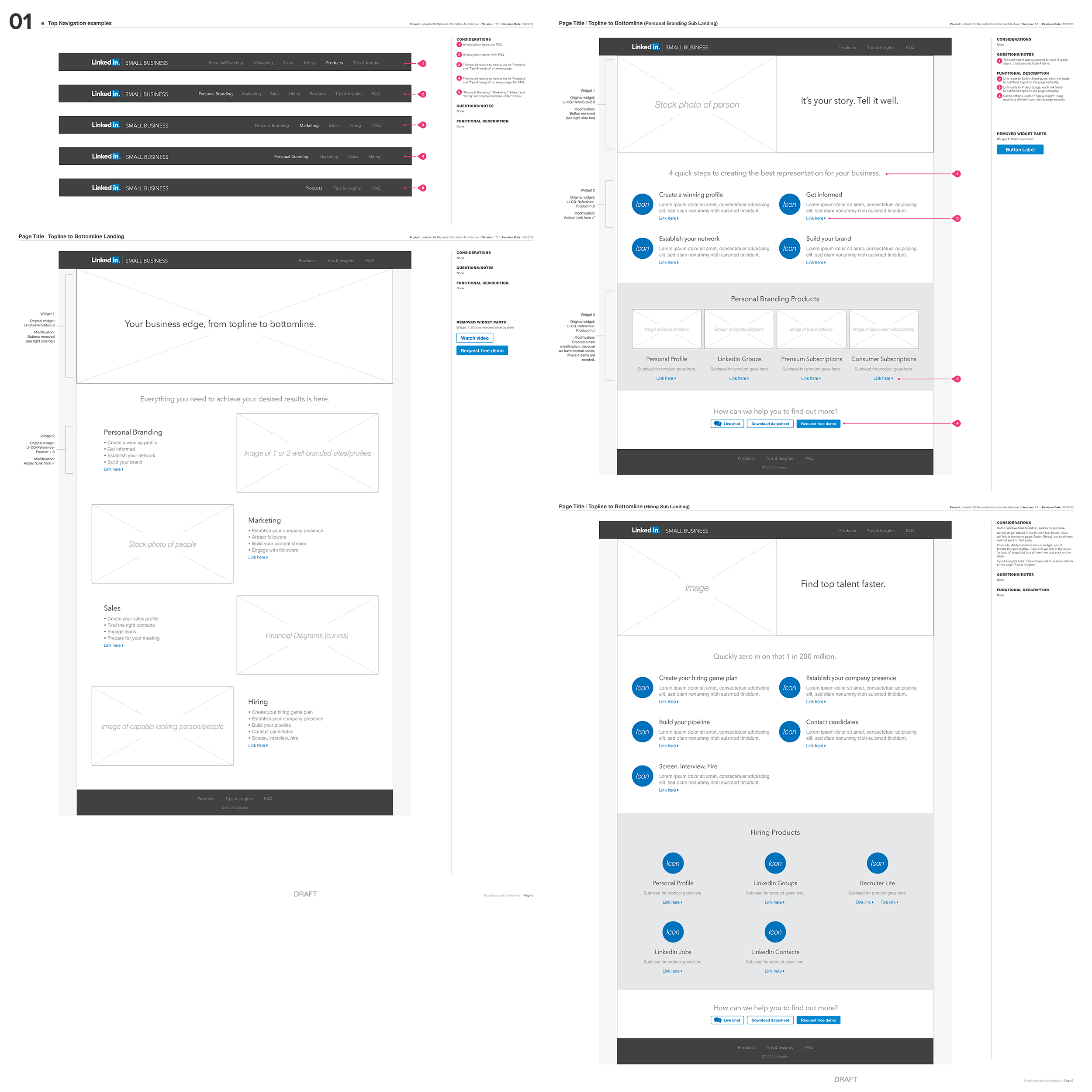
This section shows navigation bar options, a landing page, and two sub-landing pages (personal branding, hiring) for content strategy theme one.
02
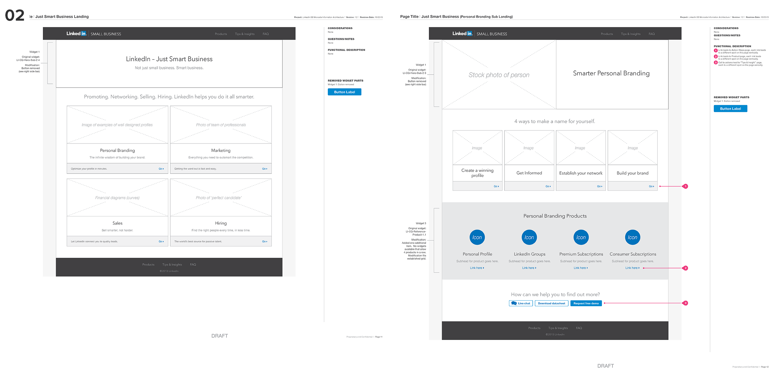
This section shows the landing page and one sub-landing page of content strategy theme two.
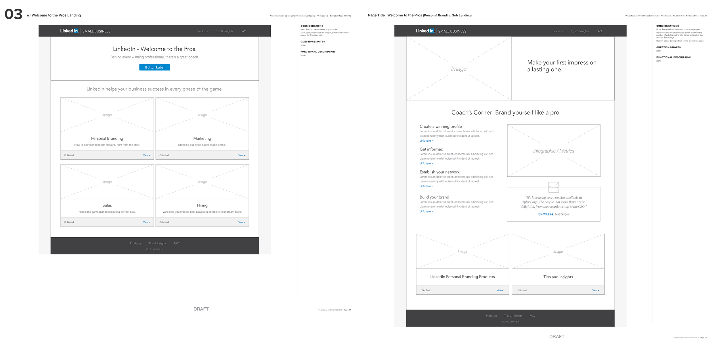
03
This section shows the landing page and one sub-landing page of content strategy theme three.
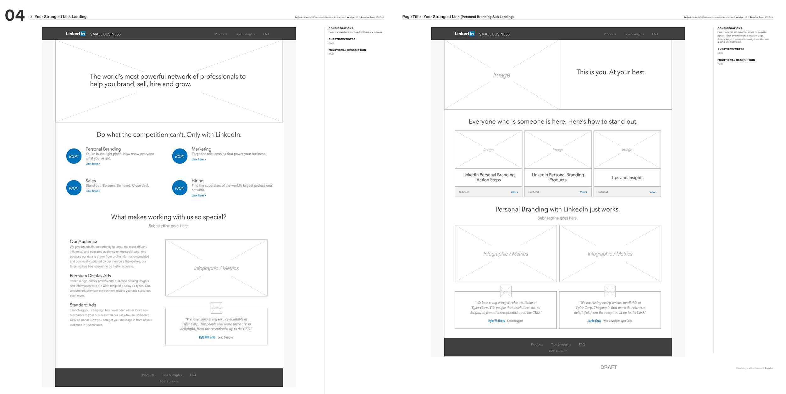
04
This section shows the landing page and one sub-landing page of content strategy theme four.
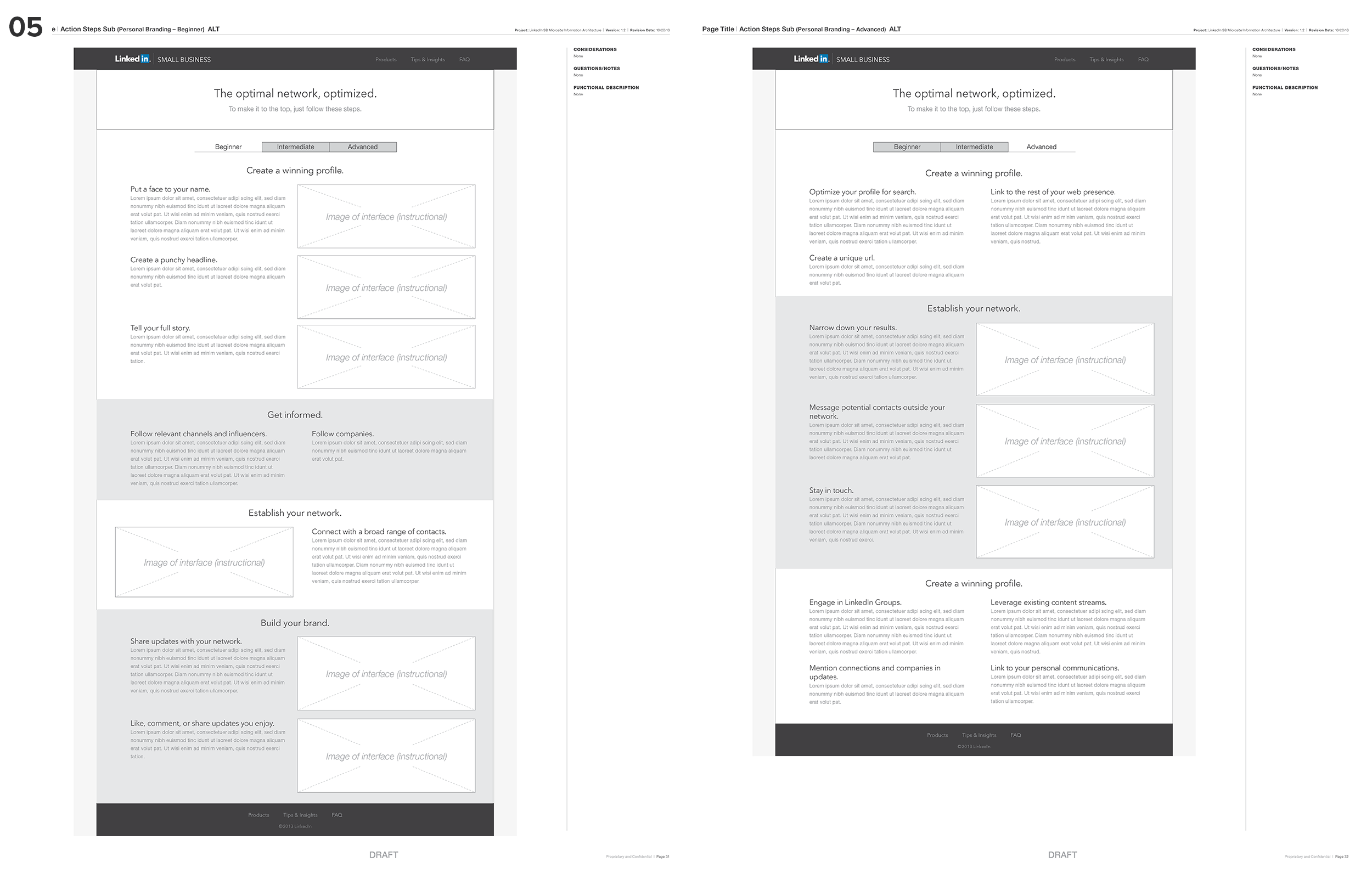
05
This section shows two sub-pages not tied to a particular content strategy theme.
Tasks: Information Architecture, Content Strategy, UX Design