Cancer Connect Tele-Oncology App
About Cancer Connect
NantMobile’s Cancer Connect was the leading digital companion for understanding a cancer patient’s diagnosis and personalizing their cancer care. The initial app was launched on the iOS App Store in 2016, and the tele-oncology concept was created in 2019/2020.
Some of the initial app features included a knowledge library database, care circle for friends and family, messaging, personalized medicine, clinical trials, recording doctor appointments, uploading medical documents, adding bookmarks to knowledge base articles, onboarding, including cancer type/stage/biomarkers, forum, and several other valuable features.
Tasks:
Information Architecture, Product Design, User Testing, Personas + User Journeys, Visual Design, Logo Design, Design Leadership
The Story…
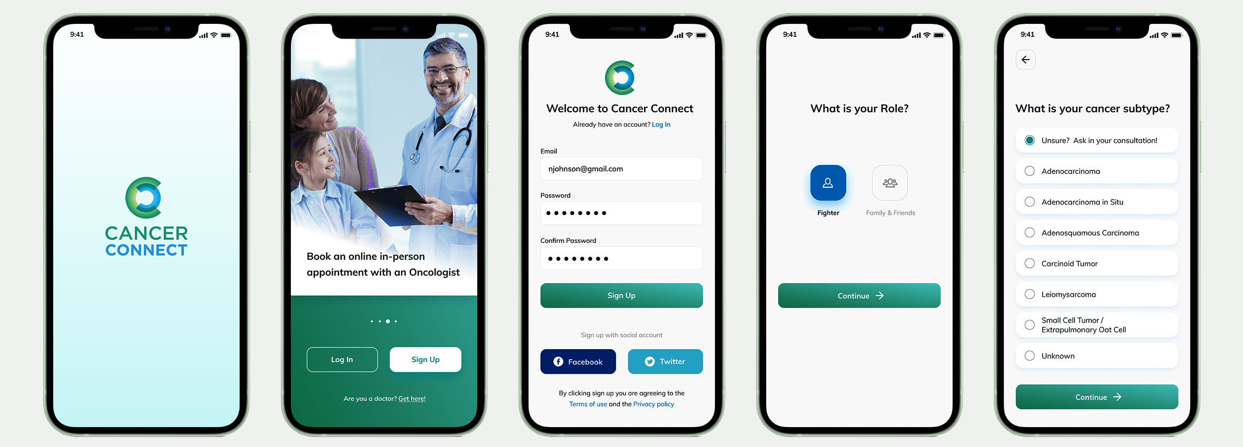
Screens of the initially launched iOS app.
A Few Weeks Before the Initial App’s Launch
I was hired a few weeks before launching the initial iOS version of Cancer Connect on the App Store. The application was ready to launch sometime soon. However, the worst usability problems must be quickly detected, addressed, and repaired.
The Need for a Map
Immediately getting acquainted with the application was necessary to detect the most significant usability issues. This was a challenging task without a map to understand the information architecture.
I addressed the most obvious usability issues first to keep the designers busy. At the same time, I created this map to clearly understand all the features, connections, and the complex oncology onboarding model.
After a few iterations, followed by stakeholder buy-in, I forwarded this map to our three other geographical team locations. The map improved the communication between UX and engineers. It enabled us to focus on specific areas of the map, getting results quickly and receiving faster approvals from product management.
This enabled us to fix the significant usability issues before launch.
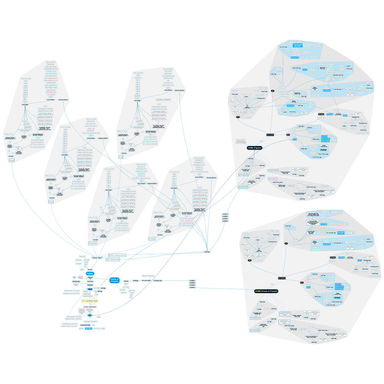
Map of the mobile application, all its connections and the complex oncology on-boarding flow.
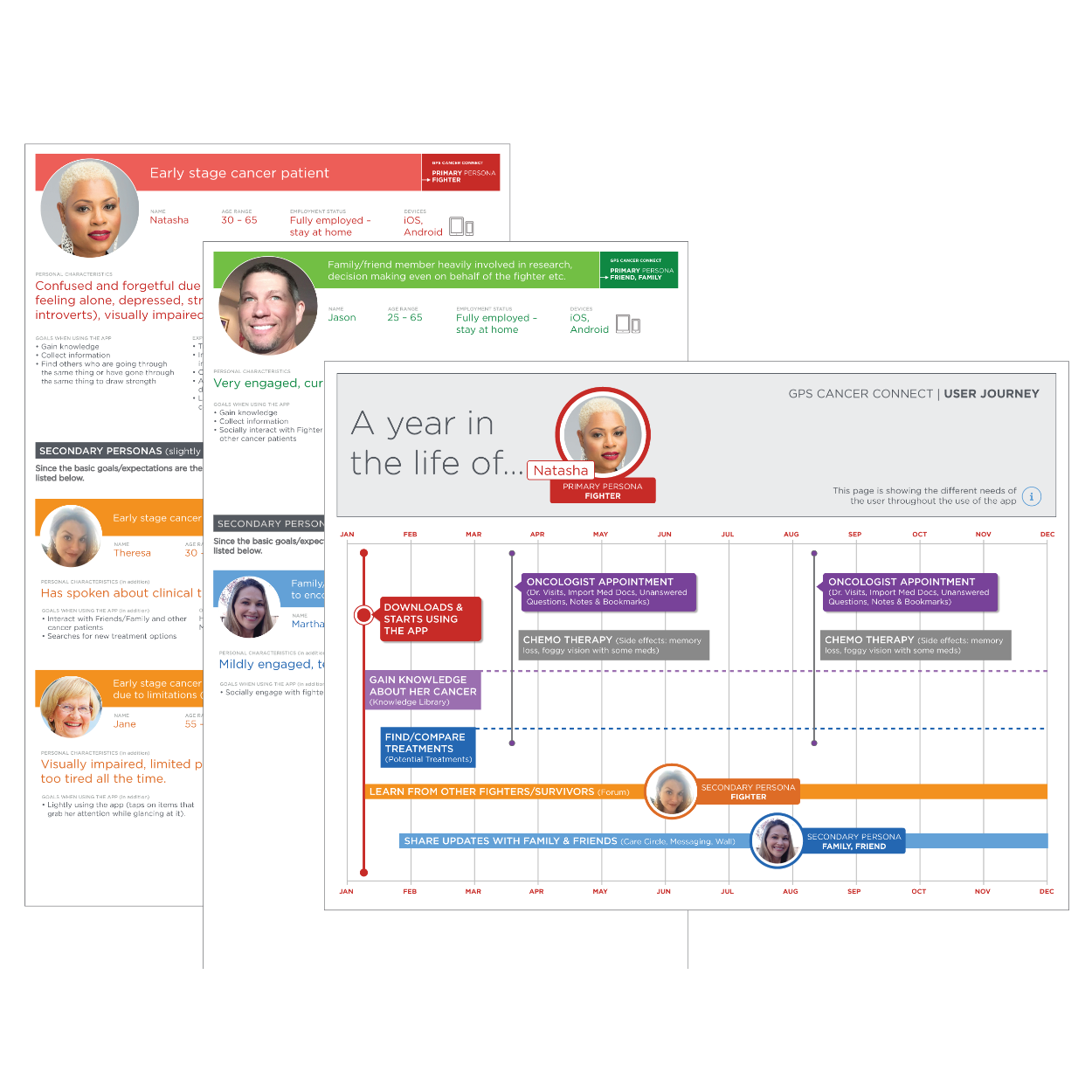
2 ad hoc patient/supporter personas and one of the patient user journeys.
Understanding our Users
Right after launch, we needed to address and fix all other issues before our first usability test session. The lack of personas and a concise time frame inspired me to set up ad hoc persona workshops, inviting team members to share their fragmented user knowledge and assumptions to develop them that had to suffice to move quickly with more guidance.
After creating the personas, we defined their journeys to have better guidance through the improvement process and the outcome of my heuristic evaluation.
The ad hoc user journeys confirmed that not all of the features needed to be presented to the user at all times. It became apparent that the user should only be offered what they need now. However, our product roadmap needed to be fit to accommodate a significant shift in functionality at the time.
Usability Test Sessions
During the ad hoc persona efforts, the team clarified the user roles, which gave us direction in recruiting for the upcoming usability testing sessions. After creating a solid test plan, we recruited patients and cancer survivors.
All participants provided us with beneficial feedback. The features and content of the app were handy to them. The app represented a compassionate and supportive resource in a challenging time in their life, but only after they demonstrated how to access the helpful features.
The reality was that there were too many valuable features. Most were deeply buried in the information architecture, and the interface needed to be more intuitive.
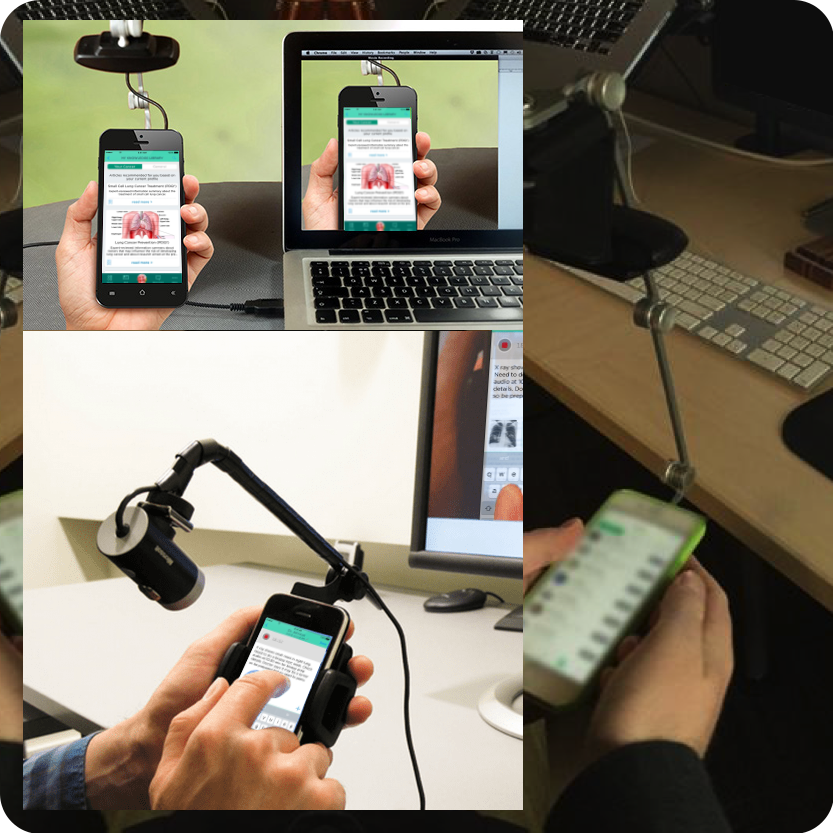
Usability test sessions with mobile testing equipment.
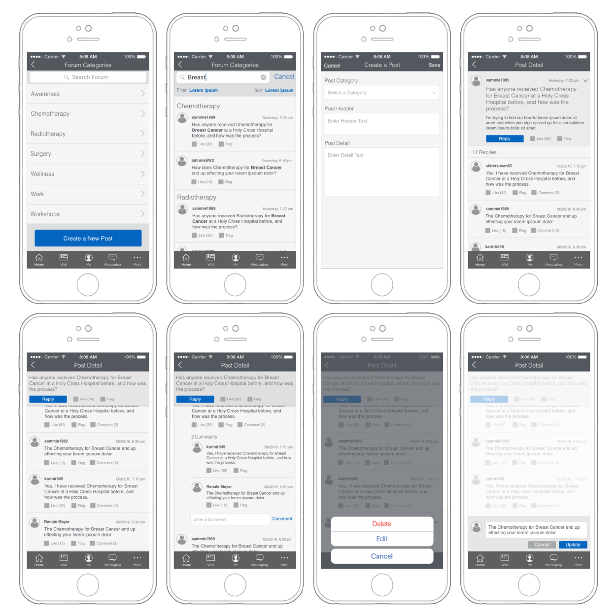
Post-launch forum section wireframes.
Improvement Efforts
Based on the testing feedback, we had to rethink the application’s information architecture while product management wanted to hold on to all the features. We added additional features, like this post-launch forum section (image).
There were many unsuccessful attempts to modify the information architecture to provide intuitive simplicity because there were too many features.
The team agreed that only a ‘smart’ app would work. An app that learns from the user’s behavior and only provides content when the user needs it. Product management did not support such a drastic change in direction.
A Different Direction for Android
While I managed the team in the efforts of improving (and continuously adding to) the iOS app, I convinced product management to try a different approach for the not yet addressed Android platform.
In this concept, my team and I proposed reducing the overwhelming number of features the user is presented with as soon as they turn on the app. In this color-coded view, we suggested that the app would only show the user content triggered by events like in-app scheduled doctor appointments or learning from the patient’s behavior to only display information applicable to the user’s current situation.
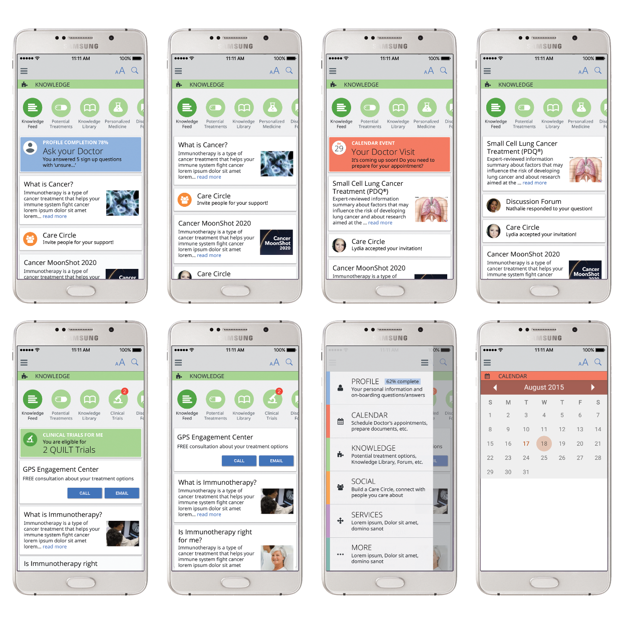
A few screens proposing a feed triggered by the user’s behavior and calendar events.
Not Giving Up
The Android version never made it past the conceptual stage, and the iOS app was at some point removed from the App Store when NantMobile was acquired by NantHealth.
The team never stopped believing in the app's contribution to cancer patients. A few years later, when telemedicine apps became a lucrative part of the mobile app market, I agreed to give Cancer Connect another shot and turn it into a tele-oncology app.
A Tele-Oncology Approach to Cancer Connect
My initial user studies, testing sessions, and additional research provided me with the following information:
New cancer patients don’t trust doctors and tend to appreciate a second opinion.
Some medical documents may need clarification, and Googling is a straining and untrustworthy activity.
Because of Cancer Connect’s academic connections, it provides a trustworthy source of information. However, the onboarding process demands a lot of medical knowledge, so asking doctors in online sessions would be highly beneficial.
Online consultations with image uploads may be beneficial if patients need quick answers on skin irritations from possible medication side effects.
These points seemed strong enough to propose a tele-oncology version of Cancer Connect.
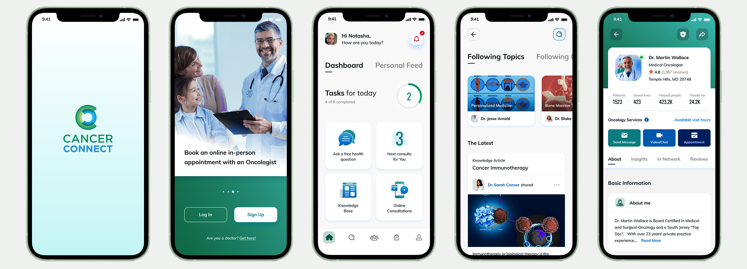
The New App…
The landing page and a few screens of the lengthy onboarding process to determine the user’s role, the patient’s cancer type, stage, subtype, if surgery is planned or has already been performed, etc.
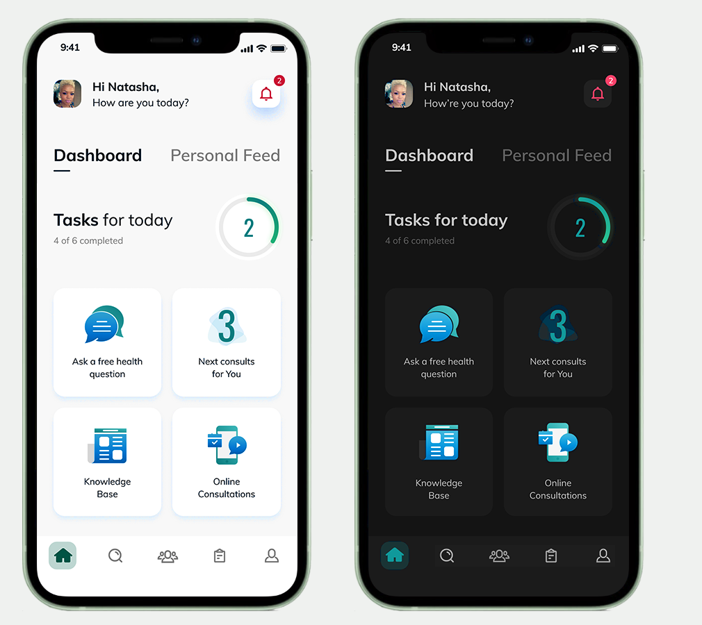
Dashboard & Personal Feed
The dashboard is the central location of the app. The dashboard will display the information most applicable to the patient’s journey as the app learns from the user's behavior.
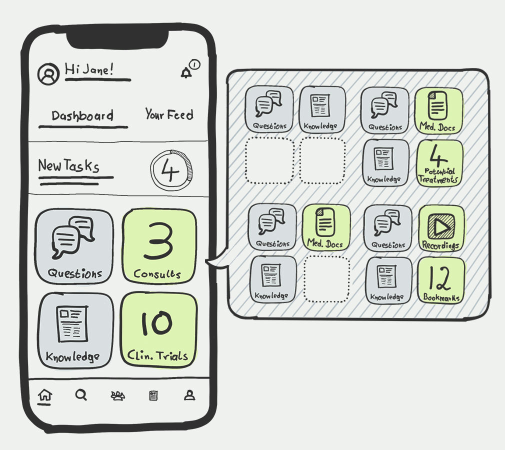
This sketch stems from the ideation phase, aiming at finding the best way to create a simple and intuitive dashboard. I was playing with the idea of displaying varying kinds of information at different times in one or two tiles, depending on the patient’s journey (asking questions, following consultations, knowledge base, clinical trials, available medical documents, potential treatments, recordings, bookmarked articles, etc.).
It was necessary to keep steady content in the other two tiles to balance the newly available content and maintain a sense of grounding in the range the user remembers from previous app visits.
As the dashboard will provide tasks for the patient to complete, activities, and areas of interest, the personal feed will provide the latest articles, posts, and other information applicable to the patient’s journey.
I have also provided the opportunity for the app to switch to dark mode at night time.
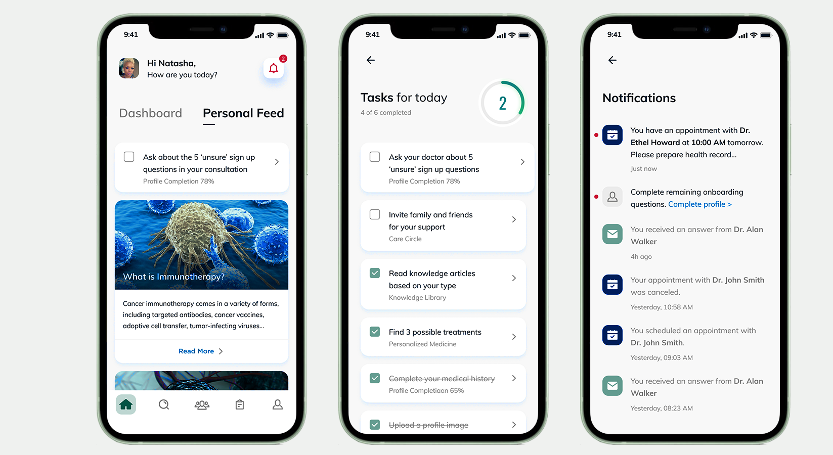
The personal feed provides the latest information and articles based on the user’s behavior, consultation results, and possible treatment details.
The ‘Tasks for today’ screen can be accessed from the dashboard.
Notifications are called out in the top right of the dashboard and personal feed screens and serve as reminders.
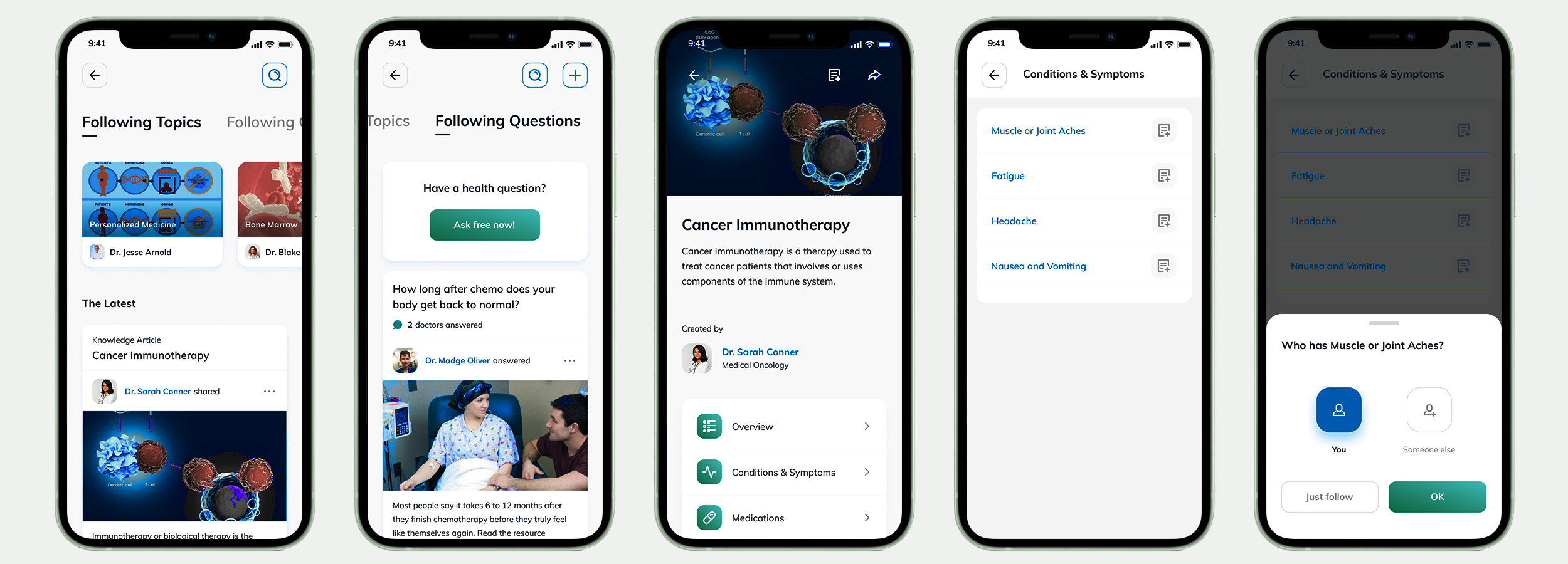
Knowledge Base
The Knowledge base with the latest articles from sources the user decided to follow. The second tab shows answers from the database in the ballpark of the user’s questions and the option to ask a question. The database is populated with knowledge base articles from trusted sources, verified by a team of professionals. Reports usually provide additional knowledge, such as conditions, symptoms, and possible treatment information.
The Search Section
The main search interface with trending topics, articles, answers, and a specialty search to find doctors.
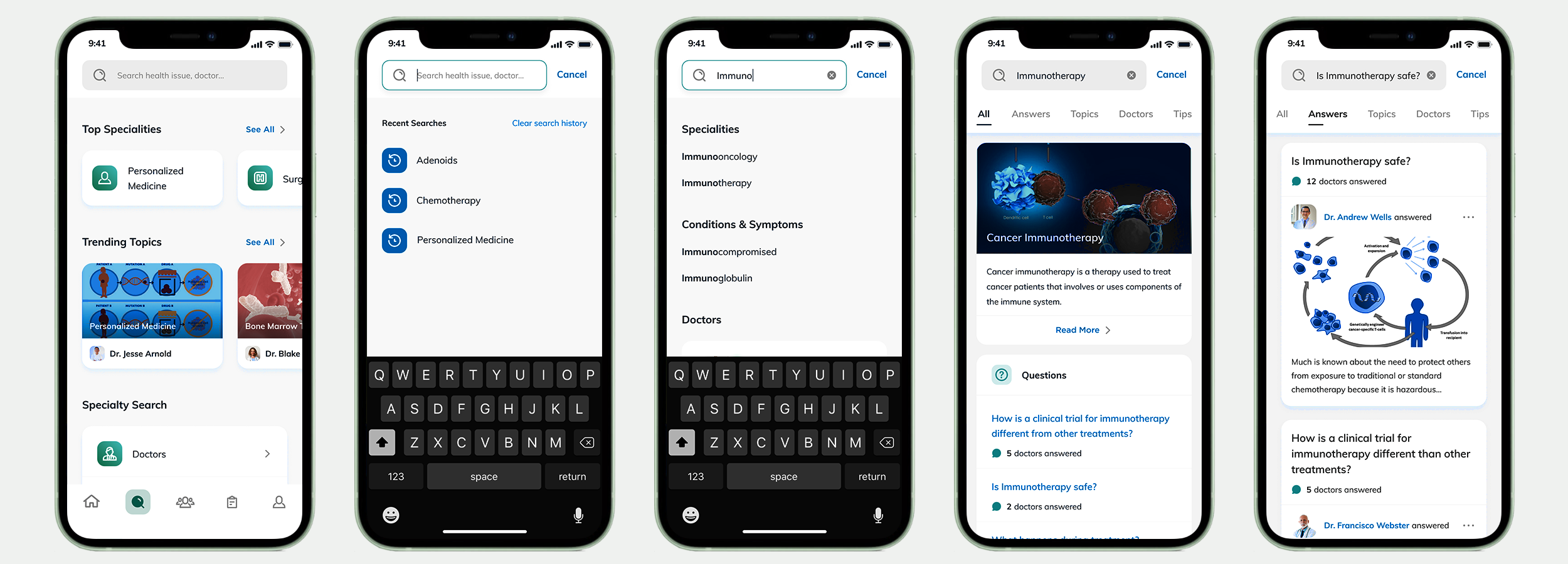
They are searching for doctors in the patient’s surrounding area and information about the facilities where they perform their services.
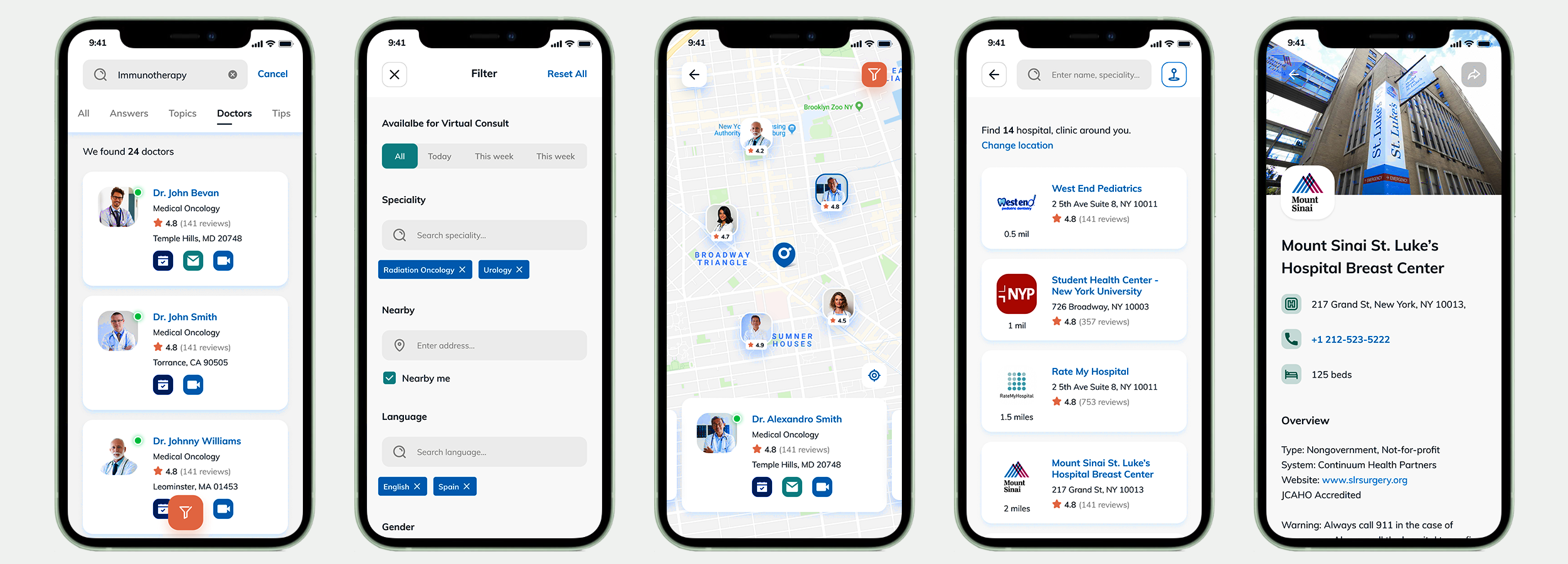
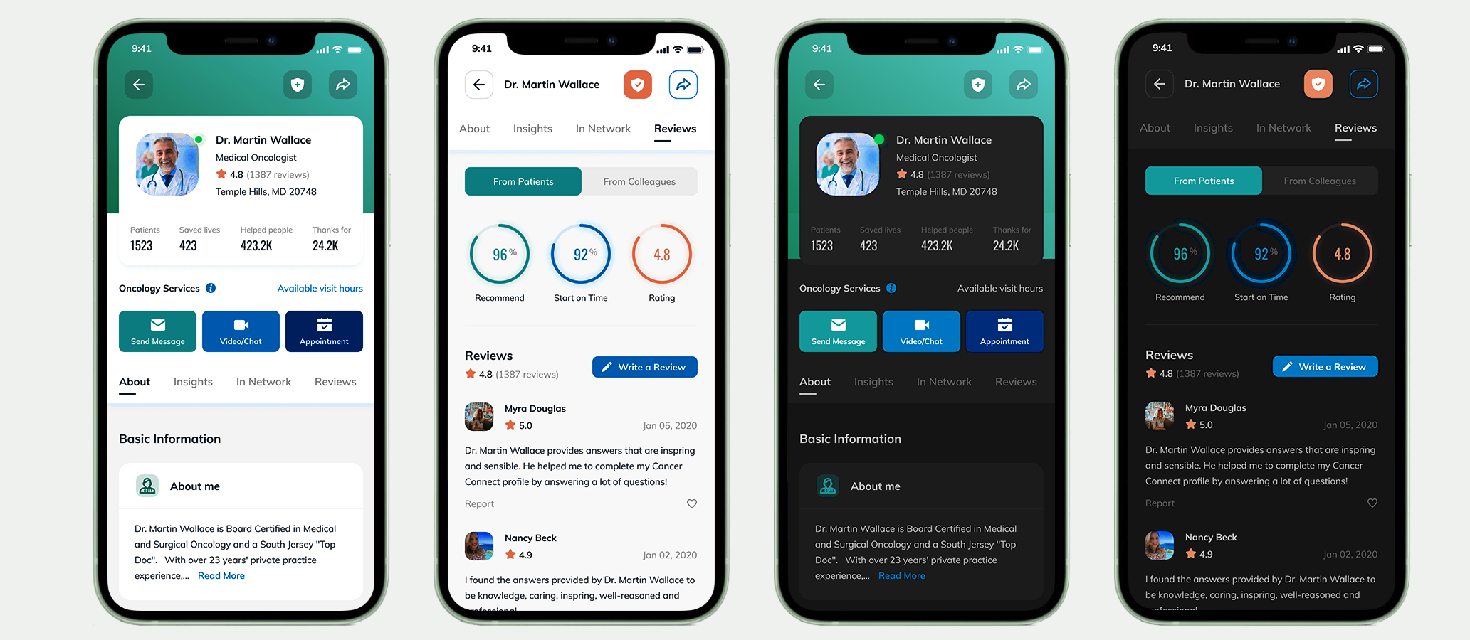
The Doctor UI
Several layers of information are provided before the user decides on a particular physician.
I decided to show the physician’s landing page and reviews screen in light and dark mode.
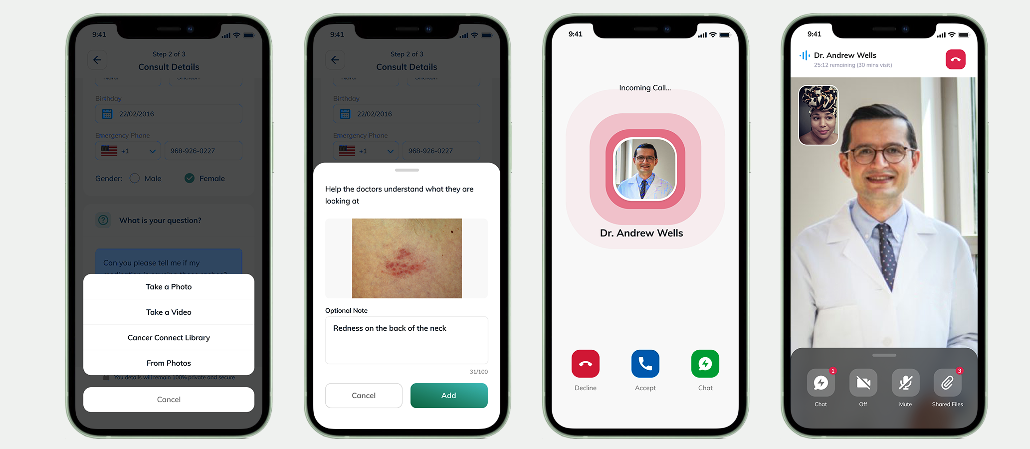
The Consultation
The user has the option to upload images for clarification during the consultation.